Illustrated Journalism Studio
- Social Entrepreneurship
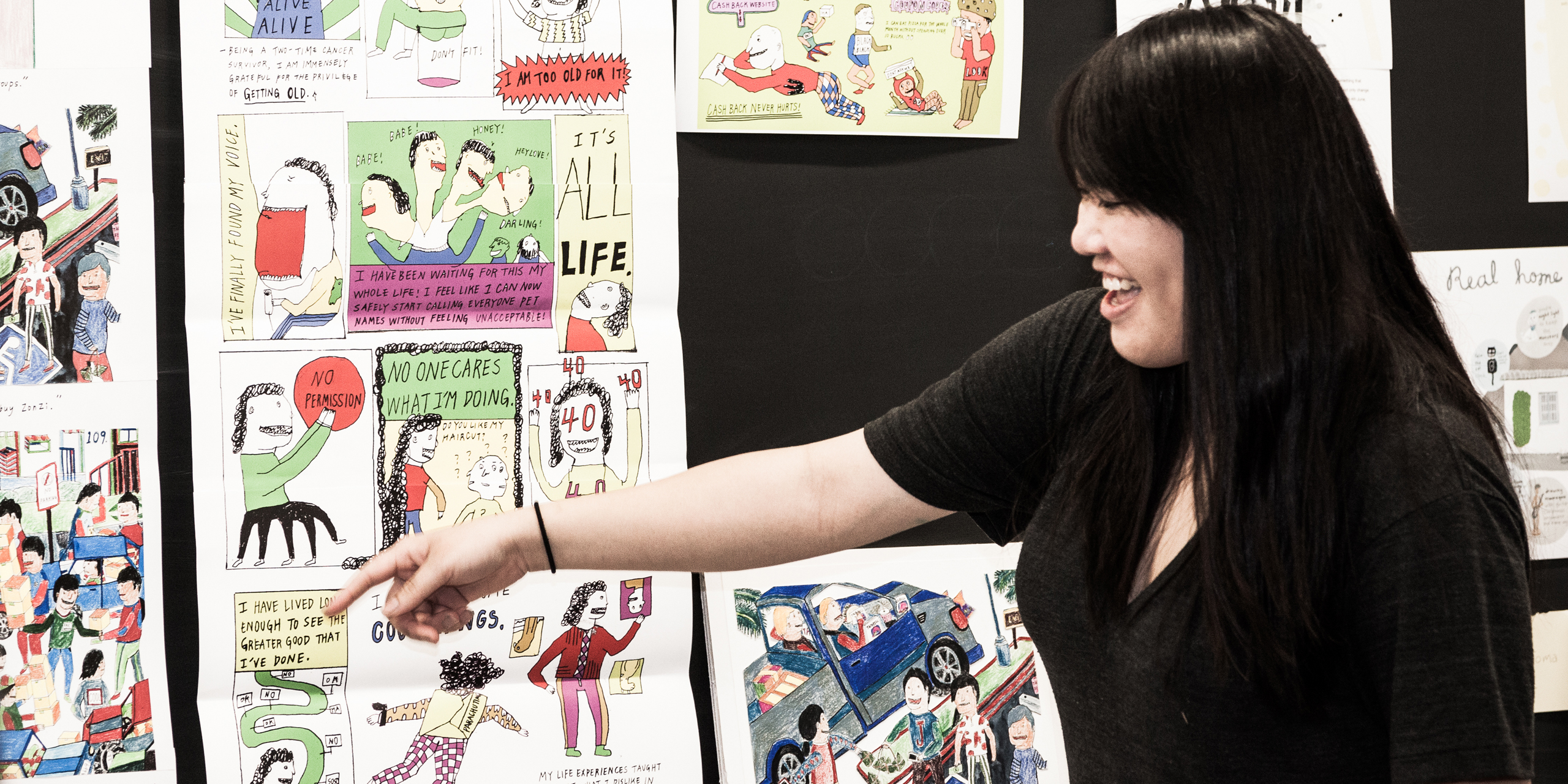
This Designmatters studio presented students with the skill sets to reimagine how illustration is used on all of today’s fast-paced media platforms. Building on contemporary topics of social concern, as well as personal revelations, students became informational storytellers as they explored text/visual pieces, traditional print outlets, and the ever-changing landscape of multimedia digital formats.
Background and Project Brief
Today, visual language is used over many different mediums, and thoughtful images can enhance editorial text and propel a story forward while offering a distinct point of view. With this comes a shift in the role of the illustrator from one who is merely reactive to the needs of the art director or editor, to one as versatile artist/author who can articulate a particular point of view through visuals and text, creating the voice of the entire project. More than just entertainment, the visual language created by illustrated journalists today are transformative catalysts for change as they present the complexities of a social issue, raise awareness and inspire action or thought.
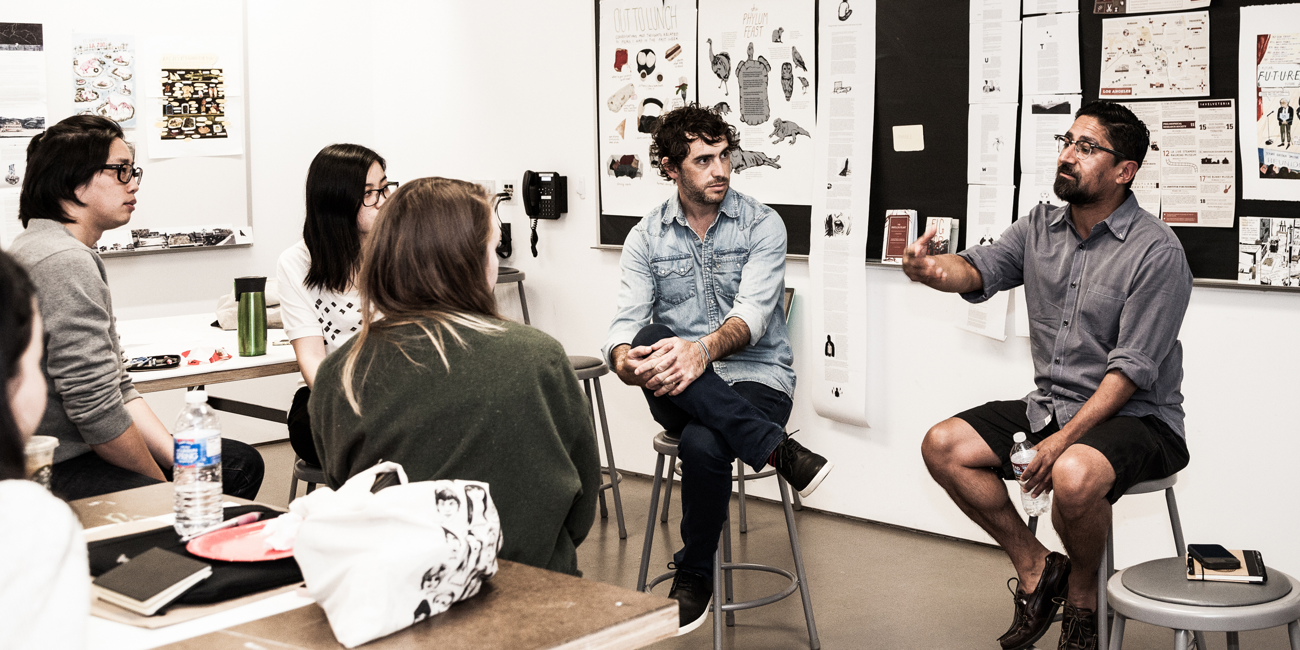
Students in this class learned how to translate dense information, dramatic events, politics, fashion trends, statistics, facts, how-to’s as well as personal reflections and journalistic queries into a visually compelling story. The goal was to be able to craft illustrated journalistic pieces which instantly offer readers the intention and idea of what is being presented at first glance. Largely inspirational in the course’s creation, the work of illustration artist and journalist Wendy MacNaughton provided a case study for students to learn powerful and bold illustrative techniques and presentation. MacNaughton herself provided a compelling talk as a guest speaker early on in the studio.
Approaching projects with the eye of an art director, students constantly asked themselves about selections of typeface, color, font, layout, “noise” level, and hierarchy of information, overall tone and more. Information could be presented in numerous ways and the pacing of their pieces became like orchestrating a musical score, matching words with illustrations to create big moments and quiet ones, to create final products that were both effective and visually well balanced.
With this class, it’s about the journey, and developing illustration students who have strong writing and who will have longer artistic careers as illustrators because they can tell a story in a smarter, unique and individualistic way.
– Brian Rea, Faculty, Former OpEd Art Director for The New York Times
Research and Project Development
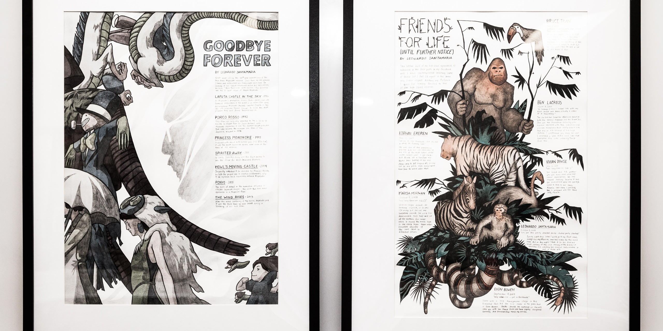
For projects in this studio, students were advised to adhere to a 70/30 ratio – 70 percent visual and 30 percent written. Students often refined their written content, corresponding with the instructor as they reworked and reworded, stripping away the unnecessary for lean, concise text, cementing the lesson to trust the effectiveness of their illustrations.
Research - Continued
The four main projects during the studio included:
- Tell a personal story on a familiar topic. Options included: “My Week in Social Media” or “My Dream Home vs. My Actual Home.”
- Create an op-ed piece about the world outside, choosing a theme or issue that has personal meaning.
- Respond to an already published article with a series of illustrated pieces that relate to each other on a vertical scroll (web-based presentation). Include an animated component (gif) that will propel the story forward.
- Design a piece/project based in Los Angeles that incorporates a social concern or city issue.
In addition to MacNaughton’s talk and weekly classroom critiques, the students’ work was also examined by many renowned guest speakers throughout the course of the studio: Sam Potts (graphic designer and instructor), Alexandra Zsigmond (Associate Art Director, Op-Ed, New York Times) and Leonardo Bravo (Director of School Programs, L.A. Music Center and founder of Big City Forums).
Speakers critically dissected student projects on artistic execution and the effectiveness of each image’s ability to visually relay the story being told. Students were encouraged to consider how seemingly simple design choices could evoke a specific sense, mood and point of view.
Guest speakers also shared their personal journeys to their current positions and discussed the realities of the job and, for some, qualities they look for when they hire an illustrator.
As the students progressed in project complexity, they realized the power of their artwork could be used as a tool to spark discussion, raise awareness and inspire action and thought on a variety of social issues and contemporary challenges.
For their final projects, students flexed their newly learned skills to create an engaging art/text piece that could be a catalyst for change. Students researched and examined a social or community concern specific to Los Angeles and, through text and images, told that story with a distinctive voice and viewpoint.
It’s very hard to incorporate text and image and portray the story’s voice with your voice, matching those two together is tough. My biggest challenge was taking a step back [in my final project] from [my subjects] and not putting my own personal spin on it, respecting these people’s stories and not poke fun at them and present them in a very honest way.
– Juliette Toma, Student, Illustration
Project Outcomes
 close
close
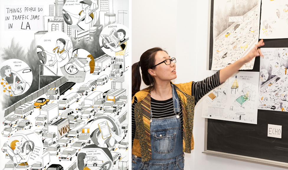
Things People Do in Traffic Jams on LA Freeways (Visual Page)
Read moreEcho Li
A congested freeway is the landscape of this illustration that features a varied representation of typical activities that commuters engage in while stuck in traffic. The busy art piece is accented with telescoped bubbles of actions (i.e. reading, eating, applying makeup) that portray a sense of isolation and urban separation.
 close
close
West Coast Nature General Goods (Product Label/Design Concept)
Read moreAlexander Djungo Vidal
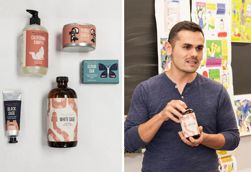
To raise awareness of the native plants and animals that exist in Southern California, this series of bath/care products (hand lotion, soap, face wash, etc.) is inspired by the area’s natural resources and wildlife. Text and illustrations depict and describe local flora and fauna and the overall connection they have to the immediate environment.
 close
close
Asian Black Market Community on the West Coast on Facebook (Visual Page)
Read moreLacy Yang
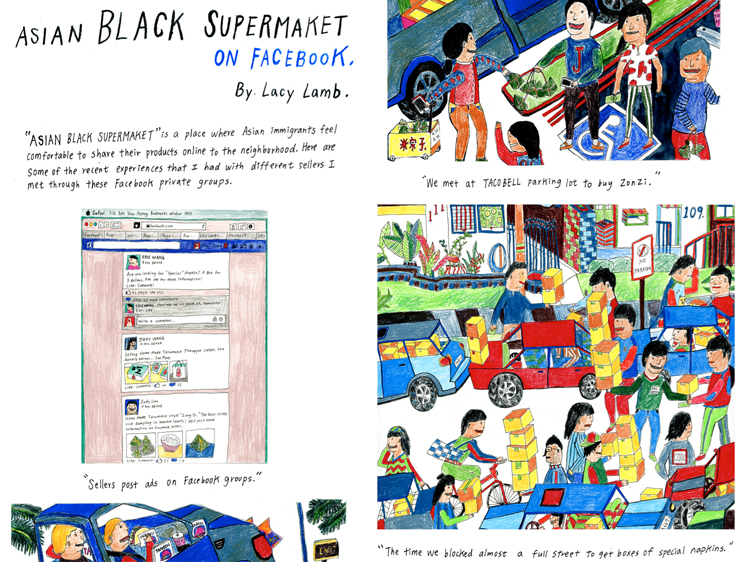
Drawing on a personal experience of a Los Angeles phenomenon, this colorful page illustrates how the Asian community’s craving for home cooking spurred a Facebook networking group that sells homemade foods/products via unusual drop-off locations. The lively illustration/text shows how one culture strives to keeps its identity and ethnic connections alive in Los Angeles.
 close
close
Guide to Women’s Jail in LA (Zine)
Read moreJuliette Toma
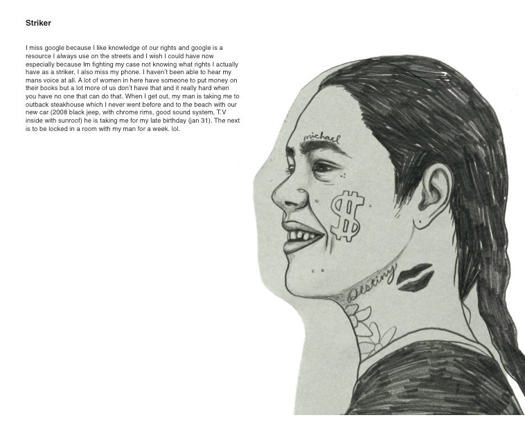
A “guide book” type-format presents prison recipes, drawings, personal stories, reflections and poetry from incarcerated women in Los Angeles. The visuals and text shines a light on the lives of these women, many who have drug-related issues which led to crimes. The raw, unadulterated material is often juxtaposed with gentle imagery and ideas.
 close
close
Handbook of Disappearing History (Booklet)
Read moreAshley Pinnick
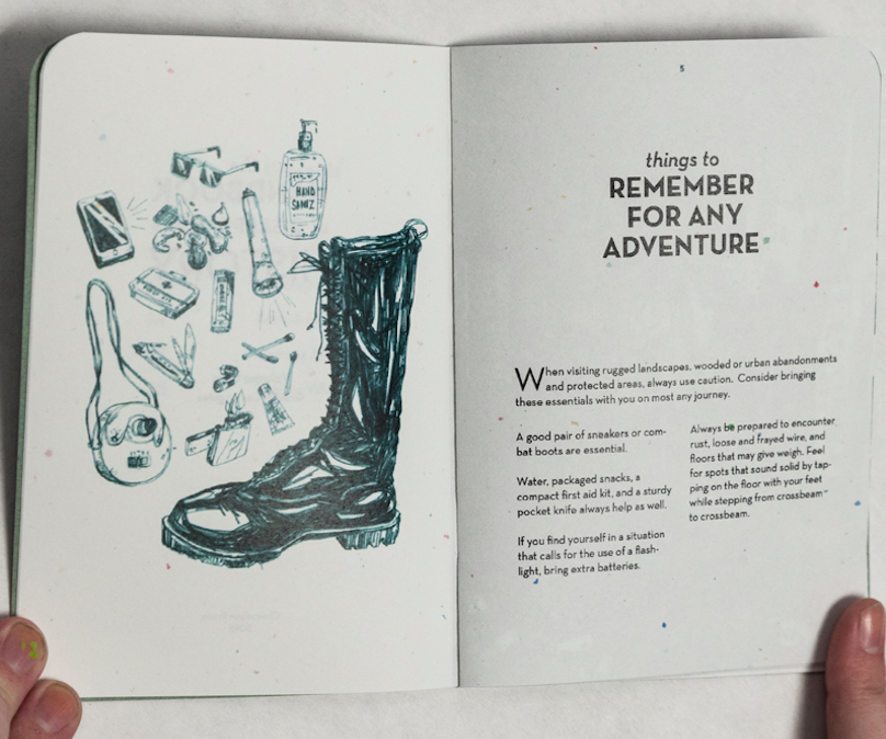
To call attention to the quickly deteriorating history of the Los Angeles area, this handbook highlights notable locations (i.e. Santa’s Village in Lake Arrowhead, Murphy Ranch, aka Hitler’s Bunker, in Hollywood, etc.) that are quickly declining. Through icons, maps, photos, drawings and text, historical information invites readers to learn and experience before historical locations are gone forever.
 close
close
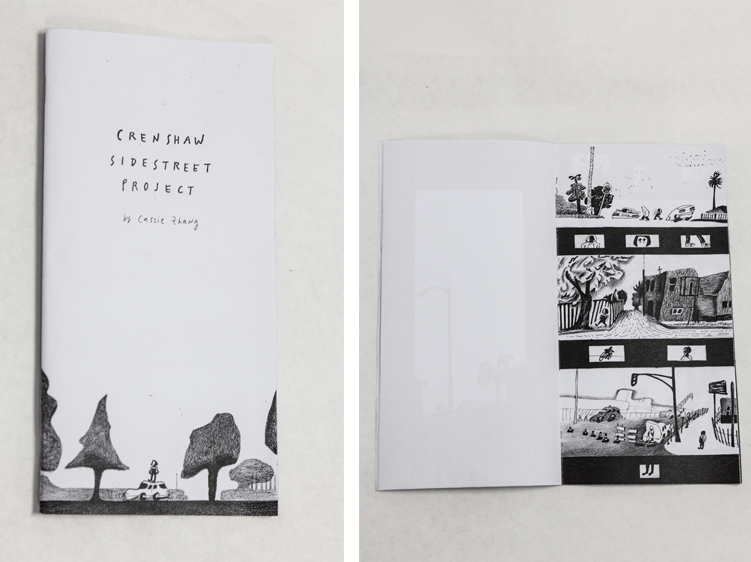
Crenshaw Side Street Project (Zine)
Read moreCassie Zhang
A blog format piece follows a personal experience into an unknown Los Angeles neighborhood to discover the stories of its residents as well as addressing the larger issues of racism and fear. This self-reflecting piece employs first-person visuals alongside questions that challenge readers to examine their own possible prejudiced views.
 close
close
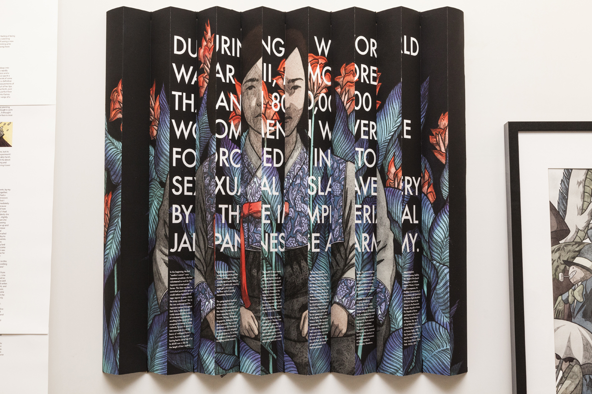
Memorial to Japanese Comfort Women (3-D Poster)
Read moreLeonardo Santamaria
A memorial statue in Glendale is the inspiration for this work that honors and raises awareness of the plight of sexual slaves by the Japanese Imperial Army during WWII. This quiet and powerful work incorporates two-sided views – an artful depiction of the Glendale statue, depicting a young slave on one side and text that describes the atrocities these women endured.
 close
close
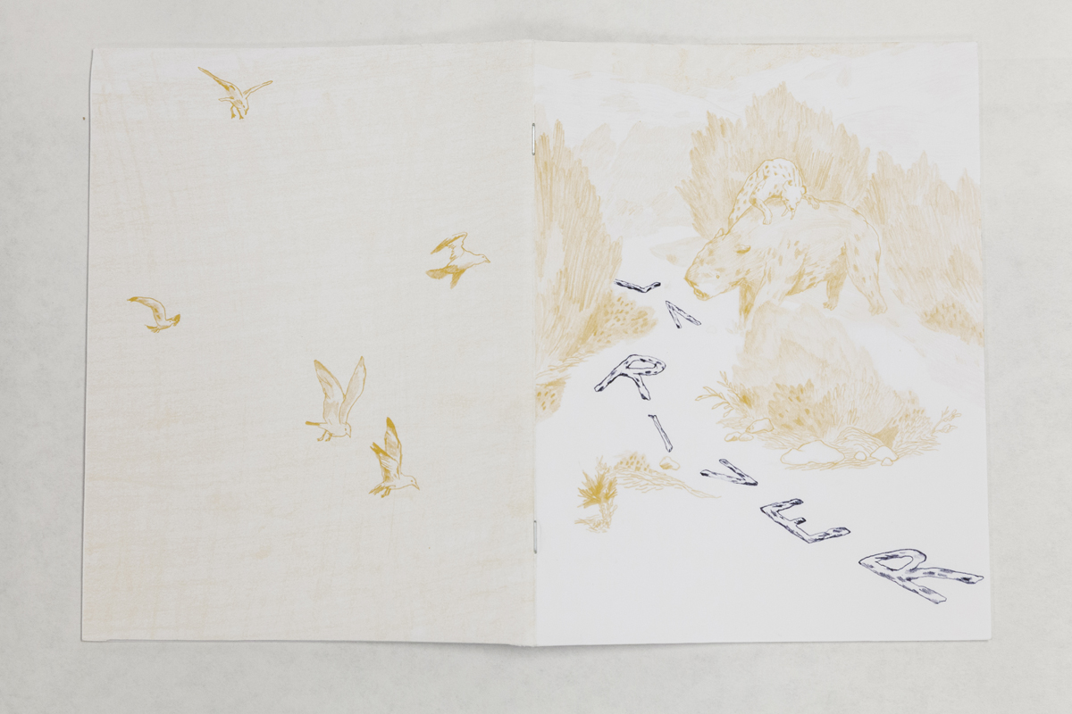
LA River Booklet (Booklet)
Read moreChris Ezra Chen
To educate and call attention to the beauty and current state of the Los Angeles River, this booklet illuminates a journey down the river following a mannequin’s head from the Glendale Narrows to Long Beach. Interlaced with River facts and observations, this piece features sketches of lush greenery, industrial zones, trash and wildlife.
 close
close
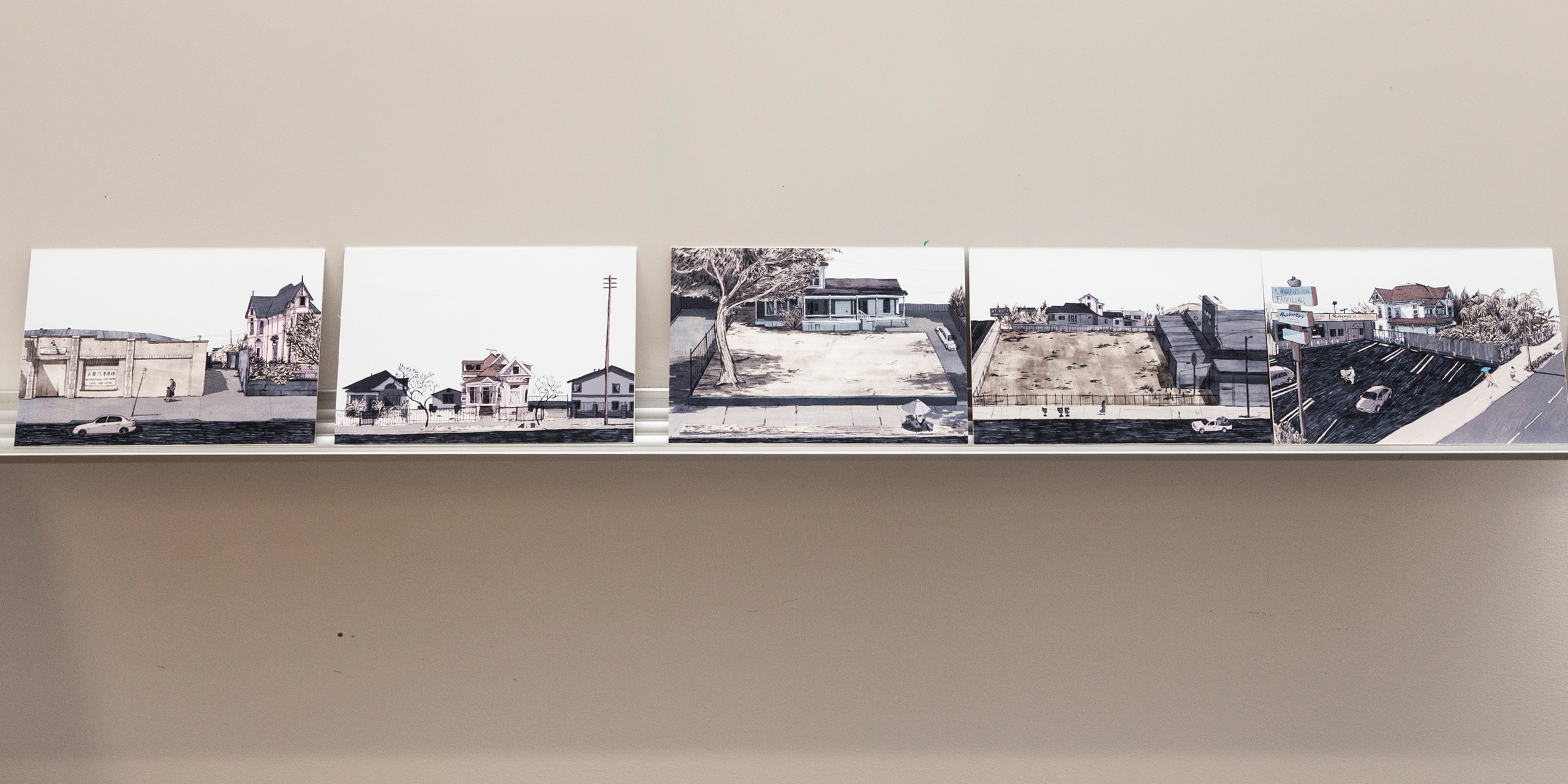
Old Victorian Homes in Lincoln Heights (Postcard Series)
Read moreSally Deng
Recalling the splendor and grandeur of Los Angeles’ early history, this series of postcards are portraits of aging Victorian homes that are currently found in a low-income suburb of Los Angeles. Showcasing the houses and their environment, this project is an architectural and sociological study and mini-history.
 close
close
Fig for All (Booklet)
Read morePhoebe McMahon
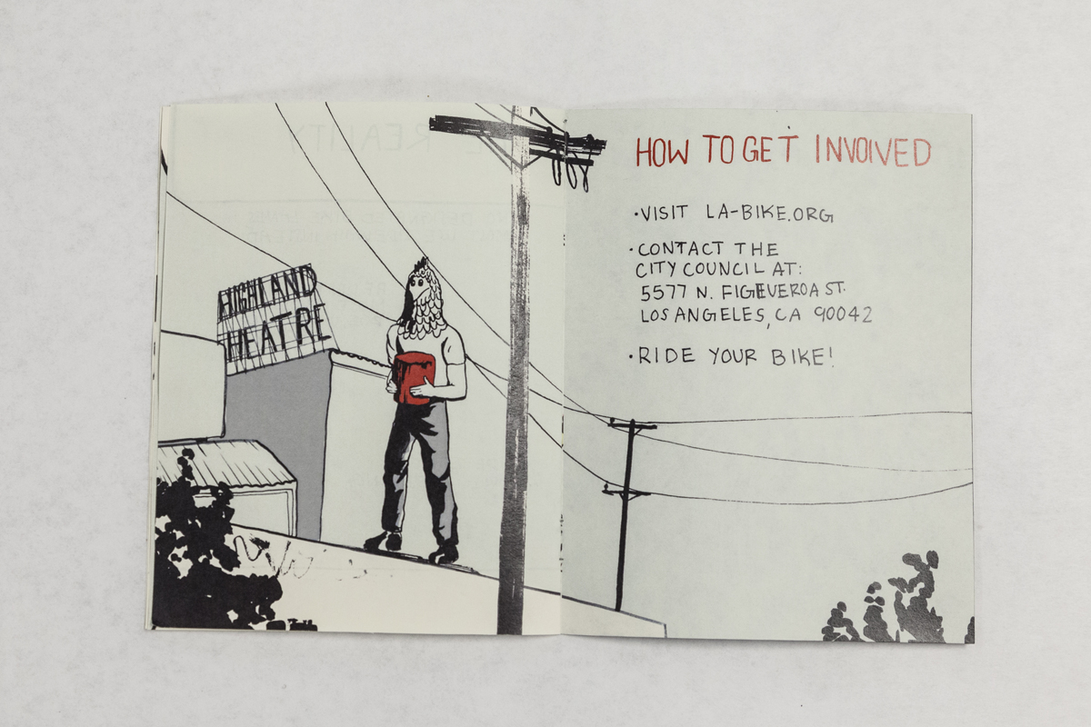
Historical tidbits, maps, drawings and factual information compile this booklet that raises awareness on bicycling one of Los Angeles’ major thoroughfares, Figueroa Boulevard. Readers are encouraged to see the benefits of bicycling and advocate for the creation of more bike lanes on city streets.
 close
close
Off Beat Museums in LA (Foldup Map)
Read moreCamily Tsai
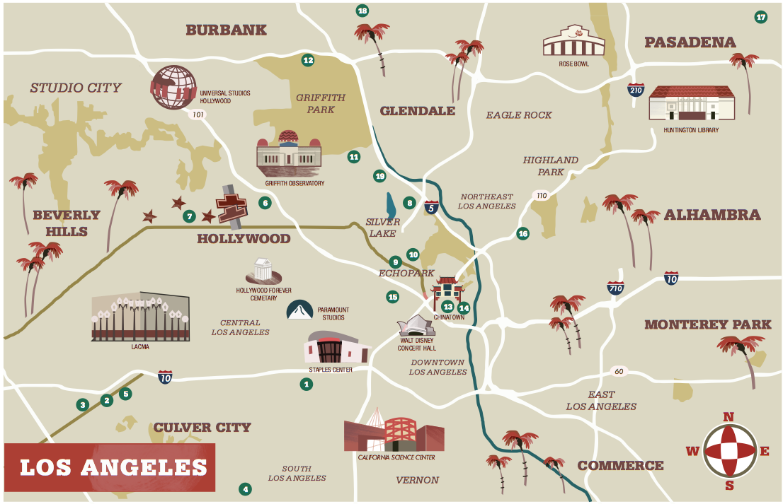
To experience Los Angeles’ often overlooked culture, history and architecture, this project uses colorful art, design and text in a map format to engage readers to explore their own neighborhoods. Small cultural venues and museums (i.e., Heritage Square Museum, the Bunny Museum, etc.) are highlighted in this distinctive map.
 close
close
Riding the L.A. Metro Rail (Brochure)
Read moreAngela Lee
An accordion-fold project that offers tips on how to ride the L.A. Metro Rail, this project features drawings, cartoons and practical advice. A die-cut image of the Metro rail conductor car covers the small, easy-to-carry brochure that seeks to encourage ridership by taking the mystery out of using public transportation.
 close
close
Koreatown During the L.A. Riots (Booklet)
Read moreBryan Sang Park
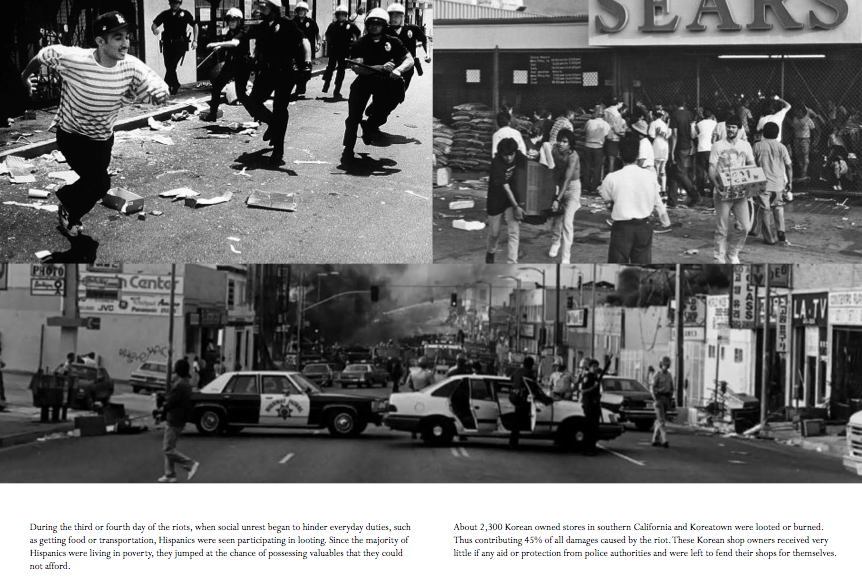
This personal account of the L.A. Riots uses text and black and white photographs to recount the racial tension of the city in 1992. Personal photographs along with newspaper photos illuminate the story of the author’s own attitudes about different races and cultures, opening the door to how racism continues in America today.
My biggest problem as an artist is making things that are too inward looking and personal or if they are research-based, they feel too sterile and academic. How do you find that personal voice and the fun, as well as having that backed-up with content? This class gave me a way to find that intersection and I’m stronger for it.
– Ashley Pinnick, Student, Illustration + Designmatters Concentration