Rethinking the Food Label
- Global Health
- Public Policy
Summer 2011
A team of four ArtCenter students from three design majors were challenged to redesign the nutrition food label and related packaging to help consumers make more educated decisions about what, and how, they eat.
Background
As the U.S. wages battle against an obesity epidemic and rising health care costs, there is an increased interest in the way nutrition labels play a role in our daily lives, in particular how they guide our consumption of food. In the past 20 years alone, obesity rates rose dramatically in the U.S., and in many states nearly a third of adults are now obese. The written information on nutrition labels is often too small, making it hard to read, and often the type of metrics provided aren’t very useful for consumers hoping to make educated and healthy decisions about what to eat.
Design Brief
To address this major public health challenge, UC Berkeley’s Graduate School of Journalism’s News21 program and GOOD Magazine launched a contest this past summer inviting the public to redesign the nutrition facts label. To coincide with this contest, they also formed a partnership with ArtCenter’s Designmatters Department to create a studio in which students would tackle the issue of food labels within a larger context—taking into account branding, some of the social issues surrounding the packaging of food (e.g. carbon footprint, BPA levels, etc.), as well as the grocery store environment and food buying experience.
“I’ll admit, I used to eat food based on its taste alone. This project has opened my eyes to good food as a priority as well as a holistic opportunity.”
—Joy Lin, Environmental Design Student
“This is a very compelling and timely subject. As with any new subject a design team looks into solving, communicating or developing, you find out so much during the research and design process that the true gems of knowledge that lie deeper come from some great individual experiences that add to the team’s group knowledge.”
—Gerardo Herrera, Graphic Design Faculty
Research and Project Development
Early on during the term, the four students decided to focus their energies on rethinking the private label brands of four high-impact supermarket chains—Walmart, Ralph’s, Target and Vons. These chains already have a robust private label business, and so the students believed that changes to their food labels could dramatically change they way Americans consume food. To narrow their focus, each student chose a different food category to explore: breakfast, vegetables, meat and seafood.
As faculty member Gerardo Herrera explained, the biggest challenge was taking the subject of rethinking the food label and expanding it to rethinking the complete package and in-store experience at retail. “The students had multiple elements to deal with regarding packaging, identity, naming, Point of Purchase display, Planograms, innovative materials and a proposed vision for a national supermarket chain that could provide a roadmap for change,” he said. “This was much more encompassing than just developing a new nutrition facts label. The label had to be supported by all touch points and designed experiences, which made this a bit more challenging.”
During the research phase, the students conducted an audit of their chosen supermarket and food group while doing more general consumer and packaging research. Shirleen Lavalais, for example, discovered that 17 percent of the American diet comes out of cans. She also learned that the canning process of vegetables contains no preservatives and retains more nutrients than she imagined. Armed with this information, she decided to focus her efforts on rebranding canned vegetables for Ralph’s. Jim Bogenrief, meanwhile, who had chosen to rebrand fresh meat for Target, learned about a new regulation that beginning January 1, 2012, USDA Food Safety will put nutrition information on 40 of the most popular cuts of meat and poultry.
The class also discovered a variety of misleading information on current food labels, including inconsistent information and icons, a lack of information on unhealthy foods, and unclear percentages in relation to relative values. Each sought to address these discrepancies through their design explorations of nutrition labels.

Outcomes
The students presented their design solutions and prototypes during the final critique, creating private label brands to inspire better nutrition literacy. While their designs and packaging solutions were created for certain food groups, all agreed that these could be applied to different food categories as well.
Student Projects
 close
close
Waltons
Read moreKenji Huang
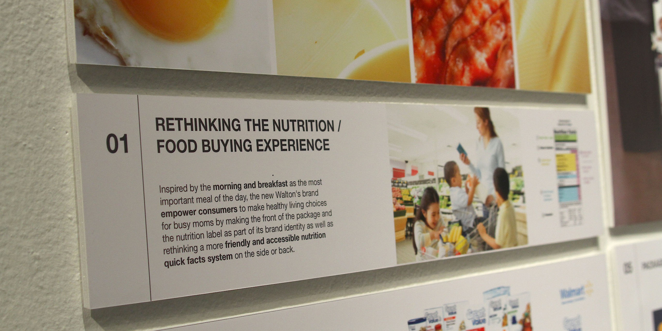
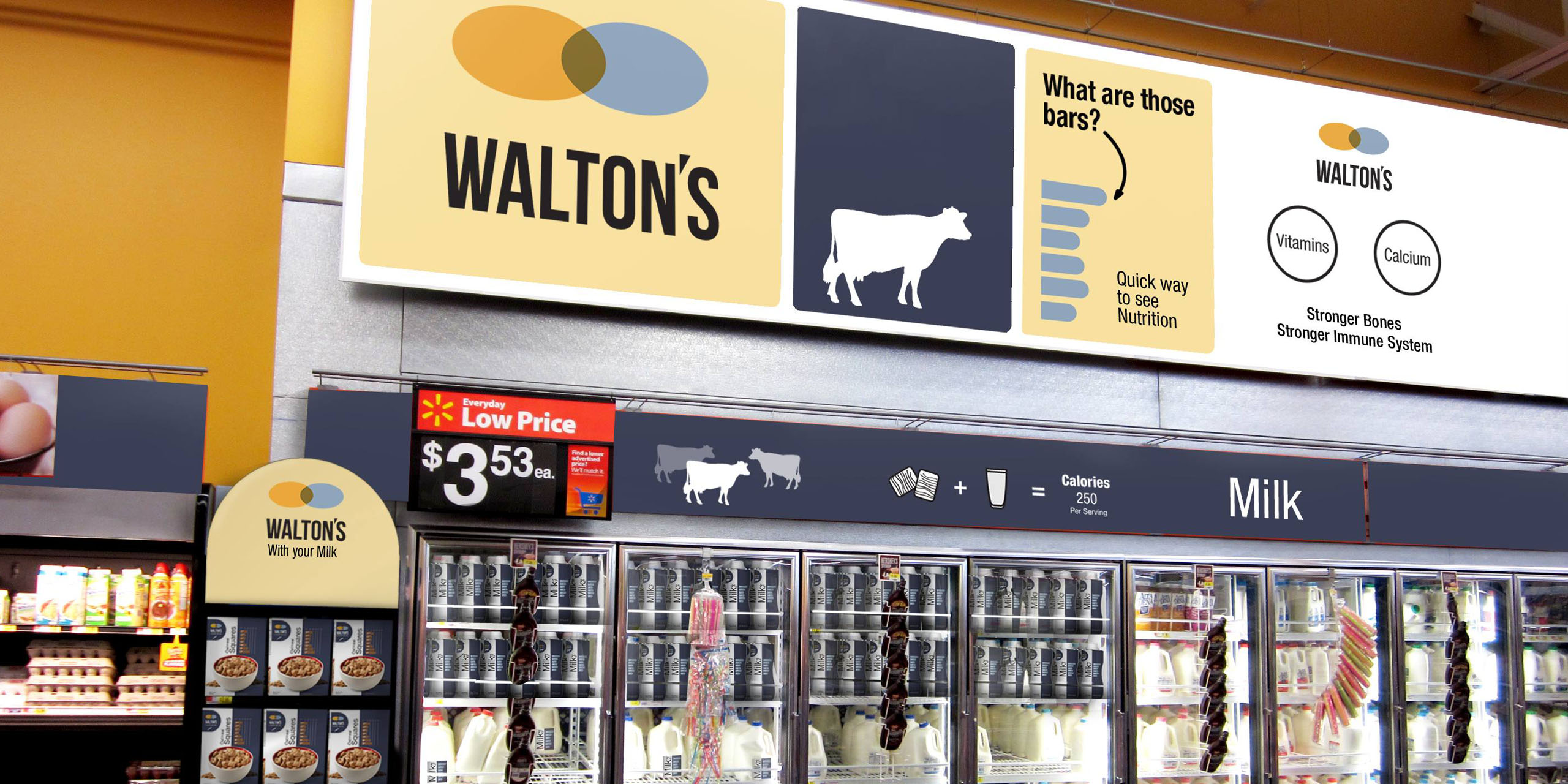
Kenji Huang developed a new breakfast brand for Walmart called Walton’s, with the tag line “Living Better Made Easy.” Huang explained that Walmart’s current private label brand, Great Value, “looks like hospital food,” and that his new system aimed to be more inviting. His logo consisted of two interlocking circles, representing the concept of dusk to dawn and “where value and quality meet.” Explained Huang, “I was inspired by morning and breakfast as the most important meal of the day, and the new Walton’s brand infuses my design philosophy of purity, discovery, joy and empowerment.” The front of the package and the nutrition label are part of its brand identity, and Huang also conceived of a more friendly and accessible nutrition quick facts system on the side or back of the package, where he also visually represented a serving size. The photography on the package is straightforward yet attractive, and the ergonomic design of the milk carton is contoured to fit into hands.
 close
close
Coastal Catch
Read moreJoy Lin
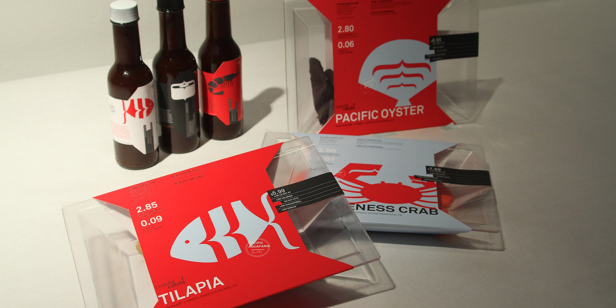
Joy Lin developed the private label brand, “Coastal Catch” for the supermarket Vons to bring attention to the nutritional and sustainable aspects of consuming seafood. Her elegant logo includes a typographic mark representing life on the sea—“a fishtail, an ocean wave or the casting of a fishing net,” explained Lin. Her main goal was to capture the essence and vitality of oceanic fishing while encouraging holistic, informed decisions about the seafood consumers buy and eat. “What exactly is in my seafood?” was the driving question that guided Lin’s design, which features an easy-to-read bar graph listing four key nutrients on the front of the trapezoidal package for easy stacking (calories, saturated fat, sugar and sodium); transparent packaging to reveal the freshness of the fish/seafood inside; color-coded package labels that reveal the geographic source of the fish/seafood (wild caught is blue, farmed is red), and even the stamp/signature of the individual fisherman; and a scoring system that rates the seafood/fish on sustainability and toxicity. She also created an area to list health benefits and any potential concerns of a specific seafood on the front of the packaging.
 close
close
Corner to Corner
Read moreShirleen Lavalais
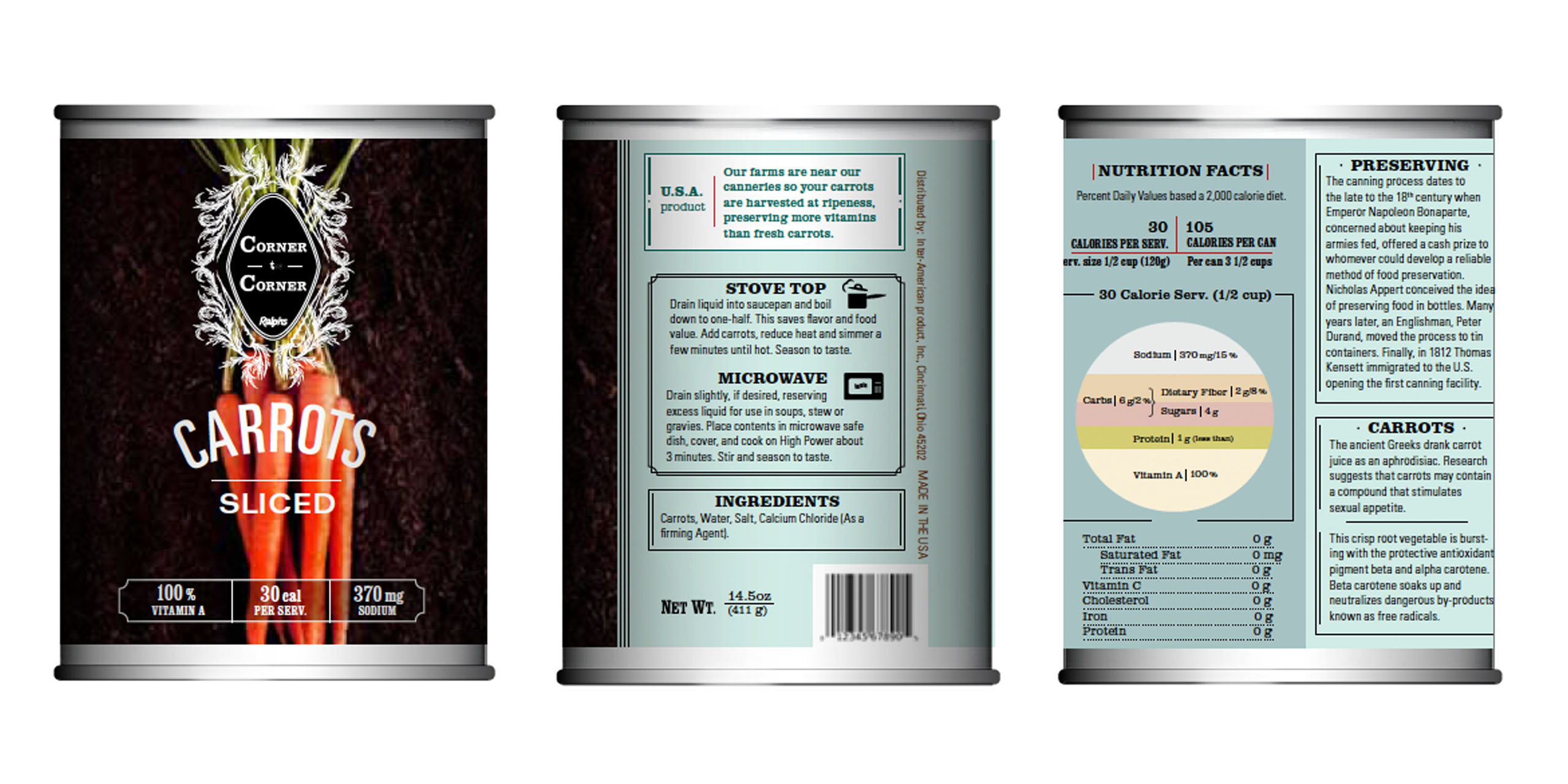
Shirleen Lavalais developed a private label brand of canned vegetables and bottled juices for Ralph’s supermarket, a store that has been a staple in California for 125 years. She chose the name “Corner to Corner” to give the brand a warm and trustworthy tone, and to communicate that Ralph’s values local produce and high-quality ingredients for its canned goods. To highlight the supermarket’s long history, Lavalais developed a design with a nostalgic quality referencing classic Americana—the typeface and ornamental illustrations are examples of this approach—while making sure the brand would still appeal to today’s health-conscious customers who long for easily-digestible nutritional information. Based on market research she conducted earlier in the term, Lavalais opted to simplify the amount of nutritional information on the can: On the front, for example, she lists vitamins, calories and sodium per serving. The back labels list the nutrition facts in an easy-to-read language and typographic choice. One of Lavalais’ main goals was to make the presentation of canned vegetables look more high-end and to dispel the notion that canned vegetables are inferior to frozen or even fresh produce. “I learned that the vegetables used for canning are harvested at peak ripeness, and that the canning process preserves much of the nutrients,” she said. The cans feature enticing photographs of the specific vegetable, paying homage to artists like Wayne Thiebaud and Edward Weston, and include short and colorful historical descriptions of the food item. In addition, she exposed part of the aluminum can to highlight the beauty of the can and to provide a dramatic contrast to the label. In addition to applying her design to cans, Lavalais also created bottled juices and vegetable snack bags. She said the studio experience was an excellent experience to create design elements that “can evolve the way we perceive and select food.”
 close
close
Rural Road
Read moreJim Bogenrief
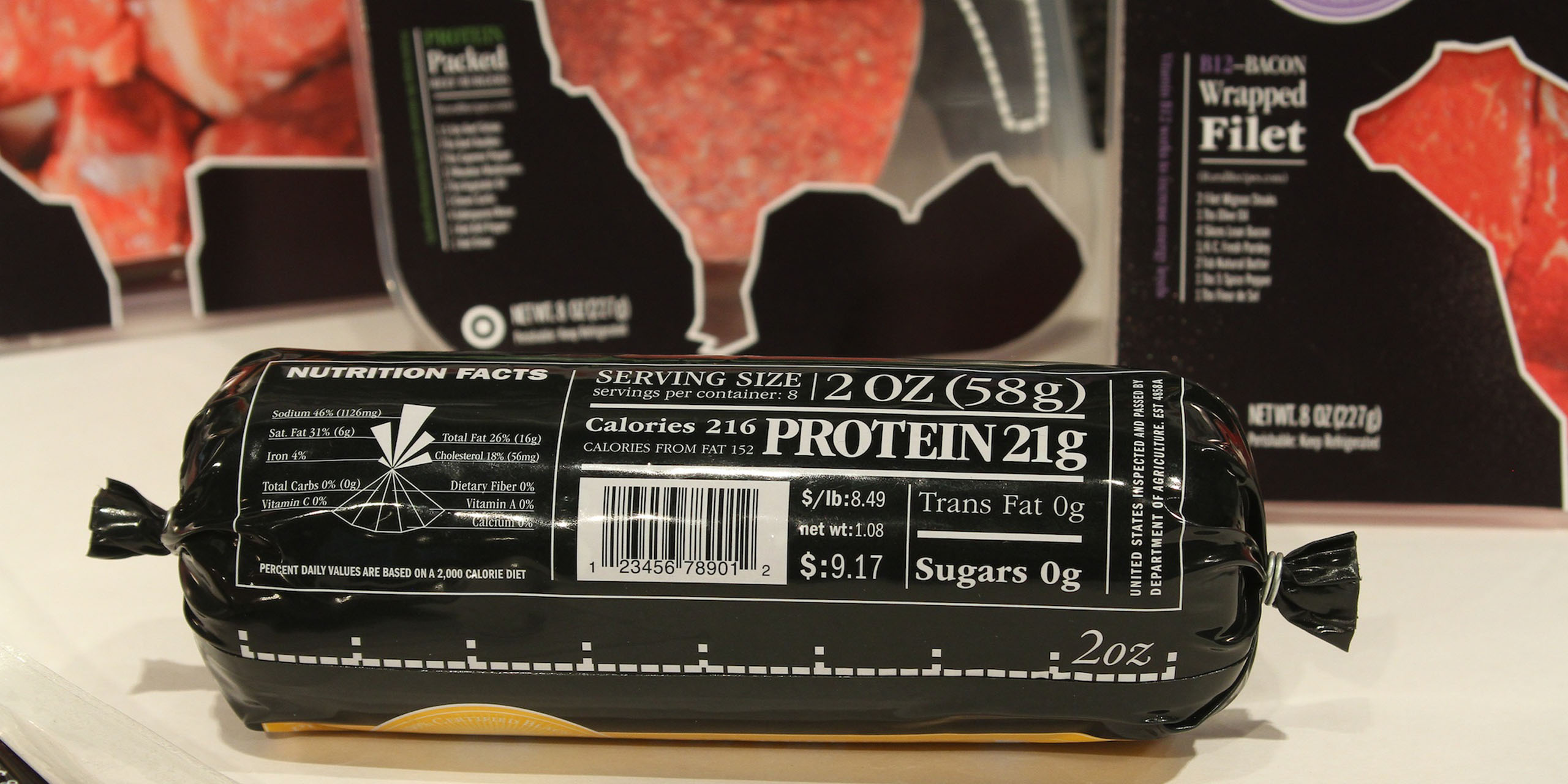
Jim Bogenrief created a private label brand for Target that focused on the highly scrutinized meat industry. In his youth, Bogenrief was a member of the 4-H organization and he grew up on a ranch. For this project, he wanted to educate the consumer about the health benefits of eating all-natural, hormone-free meat in lieu of processed foods. With “Rural Road,” he created a new graphic language and packaging forms that took advantage of the strategic use of nutritional information. One of the most striking aspects of his design appears on the front of the package, where there’s a transparent die cut in the shape of the animal against a black background, emphasizing to consumers that they are in fact eating an animal and putting some of the truth back into the consumption of meat. “There are no secrets here,” said Bogenrief. He also draws an outline around the section of the animal that represents the cut of meat. His design references a ribbon, harking back to his 4-H days. Each package prominently emphasizes a key nutritional fact about a particular cut of meat on the front of the package (e.g., the package containing top sirloin boasts 10 amino acids; a pork chop has 38 percent of the daily value of zinc). Other important nutritional information is organized into a fan-like graph on the front of the package. Knowing that part of the public health problem in this country is due to an unclear understanding of serving size, Bogenrief also created a silhouette or ruler-like measurement on the back of each package to show a particular serving size. Finally, realizing that a cut of meat is a “blank palette” for consumers, Bogenrief also included recipes on the front label to encourage consumers to think about the whole meal and its preparation.