Summary
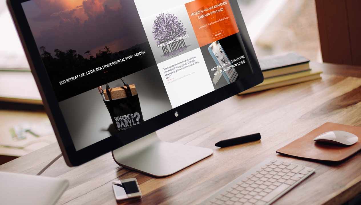
The team at Noformat is very proud to launch the new Designmatters website. Noformat and ArtCenter have a long history of collaboration; working together on Designmatters and other ArtCenter projects for over 7 years, and we were very pleased to be invited back to reimagine, redesign, and relaunch the new Designmatters at ArtCenter College of Design website. The previous website we created no longer served the communication and branding needs of the school and was in dire need of a refresh to work better on mobile platforms and integrate better with social media, not to mention the outdated design.
Through a rigorous discovery, design and development process, we were able to deliver a beautiful functional, responsive website we hope lasts as long as the previous version did.
Process
The first thing we did was to analyze the current site, including using user interviews to find everything that could be improved, from minor issues to major pain points. Mobile and Social were obvious areas but we also decided to revamp the site map to allow better access to content that had grown considerably since the original site was launched. Due to the growth in content and site sections, the navigation had become too busy and hard to use. And the search mechanism, originally built around projects proved insufficient to wade through the masses of content now living on the site. Design was also a big factor for users as the quality of the site content didn’t have a match in the site’s design both aesthetically and from a usability perspective.
Based on our findings, we opted to re-architect and redesign the site from the ground up, including an entirely new navigational structure, fresh and dynamic design aesthetic, and fully responsive design including a custom mobile-optimized theme. On the back-end, we created a fully customized Content Management System using wordpress as a framework, which enables the creation of an infinite variety of pages by combining a wide variety of drag and drop modules each with numerous settings to tune the appearance. During the buildout of the Content Management system we worked closely with the Designmatters team and specifically the Content team to create an interface the closely matched their current and future needs, making it very easy to intuitively update any section of the site.
From a design perspective it helped tremendously to have access to vast library of beautiful imagery that Designmatters has built up over the years with each new project. Making this imagery a centerpiece of the design was one of our main goals.
The Final Product
The culmination of this process was the launch of a new site that truly reflects the position of Designmatters as a dynamic force at the forefront of the design world. The site functions beautifully from the largest desktop monitors, down to smartphones. According to Google analytics, engagement has increased dramatically since the launch, as well. Unique sessions, visit duration, and mobile engagement have all increased 100-250% since the launch. Response from the school, students, staff and faculty has been overwhelmingly positive, as well.
Working with the Designmatters team on this ambitious redesign has been extremely gratifying for our entire team. By working closely together, we succeeded in overcoming every challenge that came our way and we can proudly say the result speaks for itself. We hope you agree!
