Arthritis Foundation Studio
- Global Health
In Summer 2014, this Designmatters studio hosted by the Graphic Design department positioned students and faculty to work with national and regional leadership of the Arthritis Foundation to contemporize the Foundation’s brand strategy for the long-term future, create a communication program spread across multiple platforms and produce a clear, memorable and user-friendly print, online and broadcast presence.
Our story changes with each breakthrough and new dreams develop. My dream is to galvanize our community to be passionate and bold, to articulate and clarify what we’re trying to accomplish, to become much more action oriented.
– Ann M. Palmer, President and CEO, Arthritis Foundation
Background
What is thought of as “Arthritis,” is actually over one hundred diseases. Though it means, “inflammation of the joint,” many forms of arthritis attack the entire body. Striking one in five adults and 300,000 children, arthritis is the leading cause of disability in the United States. Every day, people with arthritis are in pain for which there is no cure.
Despite impacting more than 50 million Americans, arthritis is a misunderstood disease, and myths surround it. Myth: Arthritis is an old person’s disease. Fact: Arthritis is a complex family of musculoskeletal and autoimmune disorders, diseases or conditions that affect people of all ages, races and genders. Two-thirds of the people with arthritis are under the age of 65, including 300,000 children. Myth: Arthritis is not a serious health problem. Fact: People with arthritis account for 44 million outpatient visits, and over 900,000 hospitalizations, yearly. The Arthritis Foundation’s demographic is diverse and vertical, familiar and far reaching. By 2030, arthritis is expected to impact 67 million Americans.
Film director, and Art Center alumnus, Zach Snyder, and his wife, movie producer Deborah Snyder, fostered the connection between the Arthritis Foundation and Designmatters. With trust established, the organization determined a broad project scope.
There needs to be an umbrella approach–one that lets the organization speak to the whole diverse arthritis population. It needs to be extremely broad, yet also be able to speak very specifically to one single person.
– Deborah Snyder, Arthritis patient and advocate
Design Brief
How does an established organization make itself relevant to its vastly diverse demographic: from the parents of a toddler crying when she walks, to a young adult incapacitated with pain, to aging baby boomers and the elderly? And how do you do it with one brand? Students addressed those questions in order to re-create the Arthritis Foundation’s brand into a strong multi-platform communication strategy that commands attention and action. The students worked to leverage the client’s trusted voice, using it as a source to larger things: a brand that represents all people with all forms of arthritis.
The class took large concepts and led them not just to their logical conclusions but to the right conclusions, which let the class learn the importance of creating ‘a different kind of right.
– Sean Adams, Faculty, Graphic Design
Research and Project Development
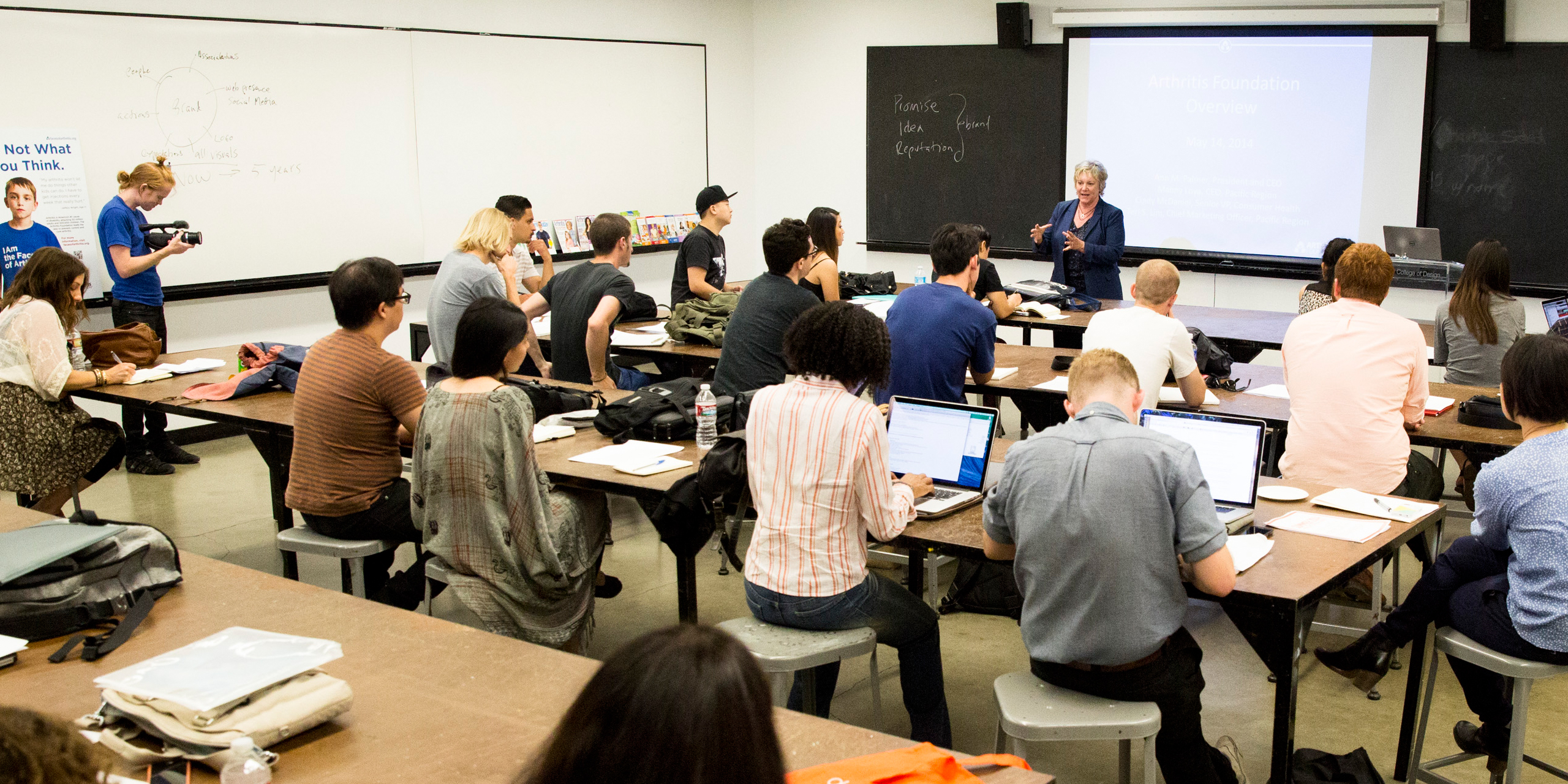
Week 1: Kick off: Presentations by the Arthritis Foundation’s leadership allowed the class to dialogue with the organization’s most senior members. The openness with which the organization shared their needs impelled the students to move forward to meet them. Strategies were developed to rebrand the organization, modernize its image, and shift it from an “old person’s” disease to one that affects anyone, communicating its story by promoting their many accomplishments through multiple platforms.
Week 2: Panel Presentation: Assembled by the Arthritis Foundation, and comprised of doctors, advocates, parents, a juvenile, an adult with adult onset arthritis, the panel provided students with a deeper, more compassionate understanding of the disease.
A broad range of topics was discussed, including: arthritis affecting anyone and everyone, changing the perception of arthritis, issues of awareness, diagnosis, public policy and advocacy. The panelists candidly expressed their hopes and frustrations.
Weeks 3-6: The teams moved steadily forward in developing ideas that were bold and visuals that were compelling. Addressing a disease, strongly associated with pain, yet, tasked to not create a campaign whose central construct was: this is about pain was key.
JD Buckley, guest faculty at Art Center, brought her expertise in communicating across broad target demographics, and workshopped with the students to research, synthesize and build user profiles. This allowed students to utilize the rich content they received from the panel and presentation, in addition to their own research, and distill, frame and synthesize it.
Viewing their work via the lens of the client’s questions: “Why the Arthritis Foundation?” “Why now?” and “How are we relevant to a broad demographic?” —the class engaged in research, data collection, and focused interviews. Storytelling was important, as the students searched for ways to tell a big story that was engaging, relevant and motivating.
The client encouraged us to believe nothing was out of bounds, and that our craziest idea could also be the greatest idea, and that was inspiring.
– Yorel Porcile, Student
Week 7 Midterm Presentation: The class, divided into four groups, presented four strikingly different campaigns, each addressing a different target audience.
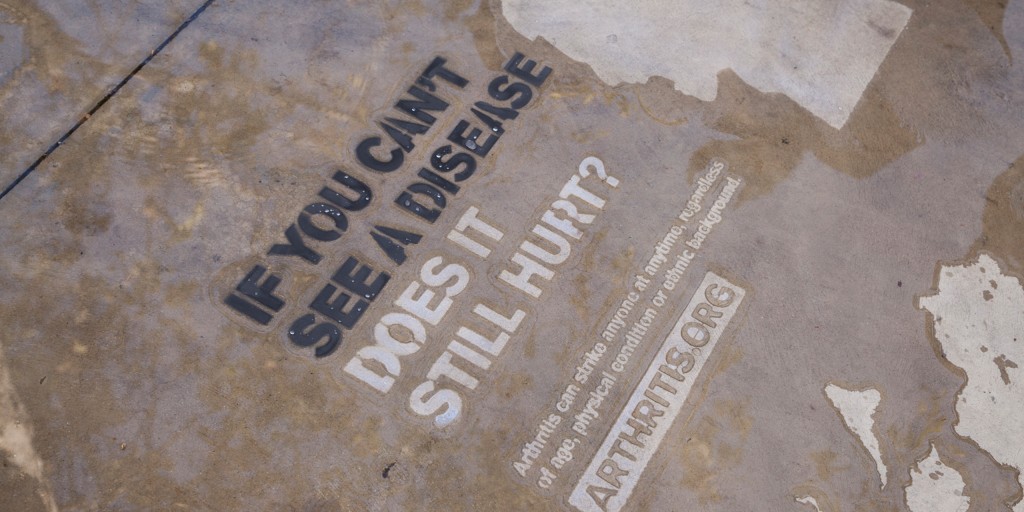
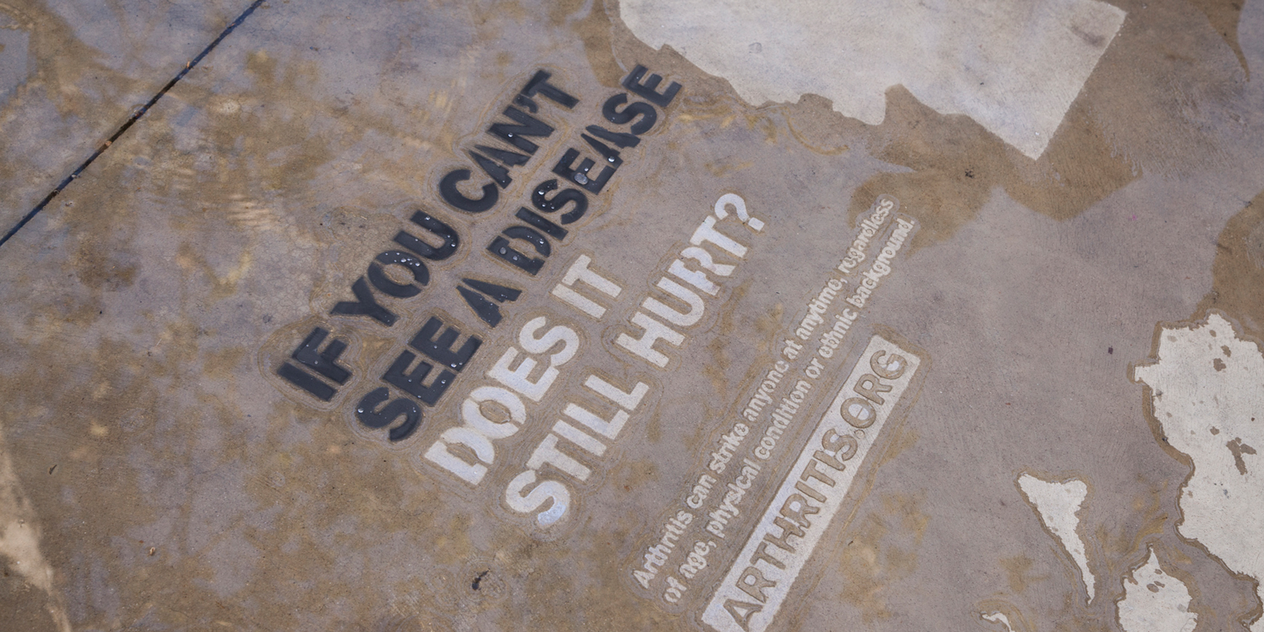
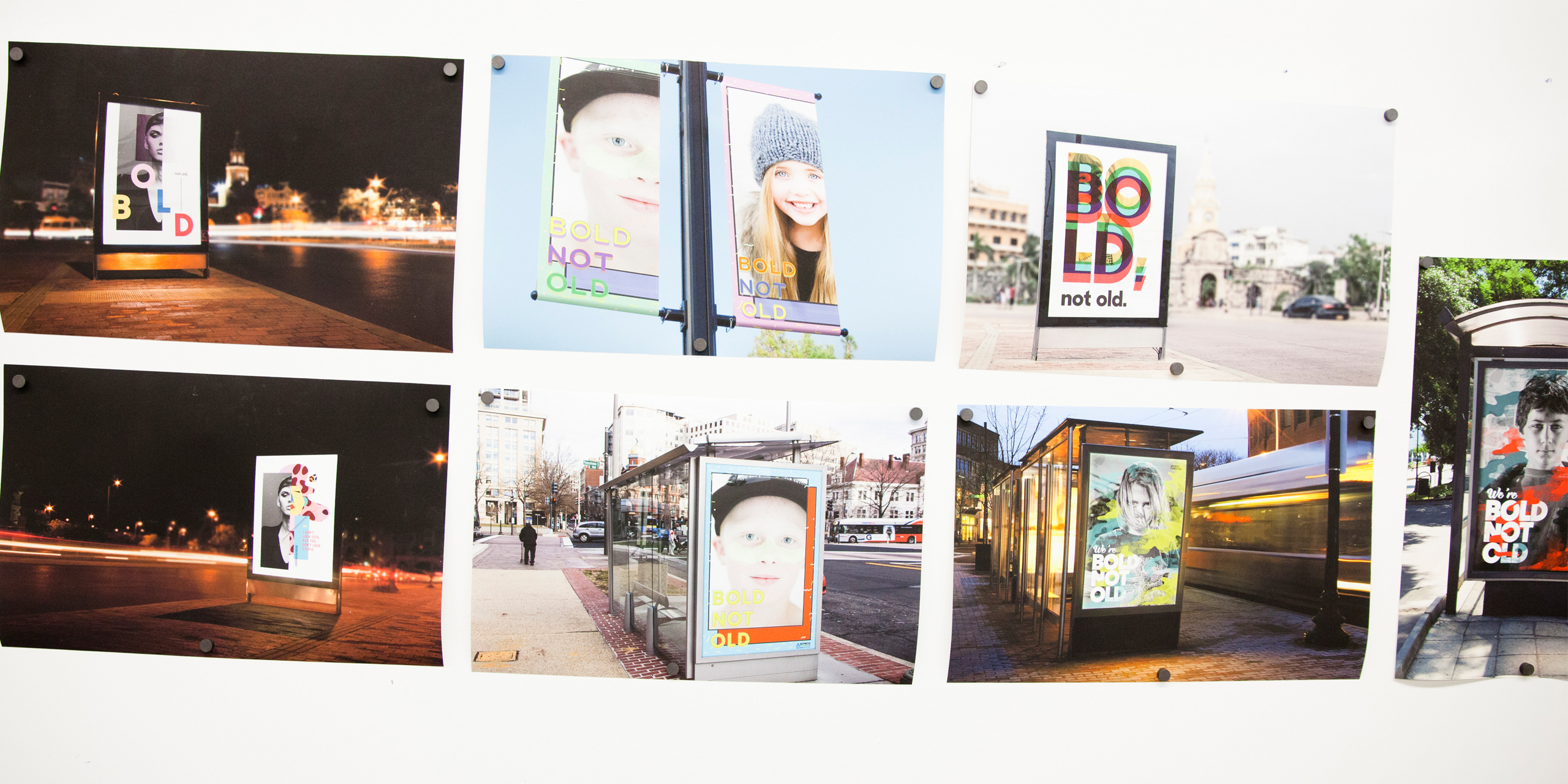
Group One: JA (Juvenile Arthritis). Reaching young adults from birth to sixteen meant opting for bold colors, and embracing social media. Research showed this target group was completely engaged in the things they love: social media and games; the students used them to spread their bold, and irreverent message. They took a strong stand, in a loud, vibrant voice. Three taglines were used: “We’re bold not old.” “If you can’t see the disease does it still hurt?” “I don’t look sick but you don’t look stupid.” To create awareness, the team produced posters; to create a “shock moment,” they created a GIF—animated on screen. With twitter feeds, environmental posters, magazines and material applications, Group One’s ideas would engage their audience in a process of discovery, knowing that when their target demographic was passionate about something, they would share it, ultimately allowing their well-targeted message to go viral.
Group Two: Trusted Advisors. Group Two’s research showed that trusted advisors wanted a dynamic website that revealed shared experiences. Their campaign focused on two approaches: movement and happiness, and celebrated the body. Showing an empowered individual in lively and bold colors, they created a feeling of support and strength. Their research revealed that happiness overcomes pain, leading Group Two to develop a brand campaign called: LAF (Laugh), which they envisioned as a haven in tough times. Its central idea was two people cooperating to achieve one goal. Laughter was the common ground on which patients, and their trusted advisors, could connect.
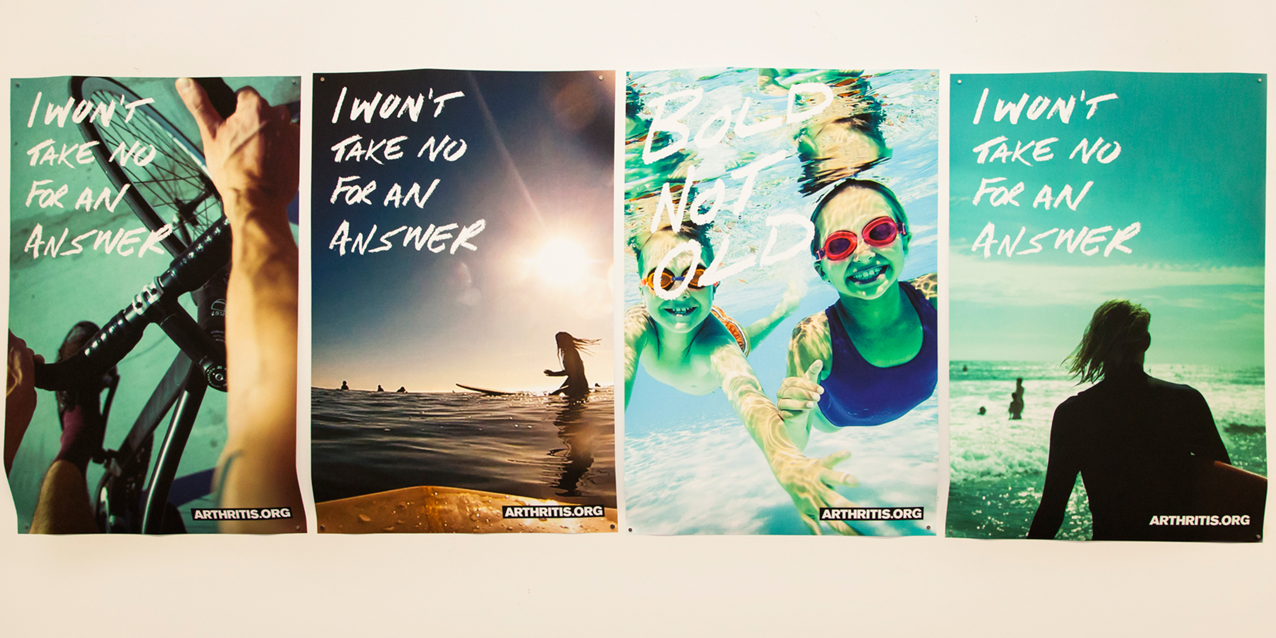
Group Three: Young Adult. Group Three used handwritten typography to reach its large and broad audience, which research showed inspires action, and reinforces honesty and directness. To empower the passion of standing on one’s own, they employed the first person voice: “I won’t put my life on hold.” “I won’t take no for an answer.” Color selections of green neon and blue-green captured the bright and youthful mood. Image choices addressed the desires arthritis patients have, but hold back from doing due to the disease. A metaphor brought this concept to life: a rusted bicycle that hadn’t been used for a long time. Concepts were developed for a quantified self-app. It focused on people optimizing their life and tracking their progress by logging their personal habits and health. Moving forward. Group Three would strive to create a deeper connection with their target audience by attaching the strong voice and handwritten typography to a person instead of an empty environment.
What brings us together is that we can all get this disease.
– Fatima Ghanavi, Student
Group Four: This campaign sought to create a movement around the idea of arthritis affecting everyone. Group Four’s crisis campaign focused on urgency: arthritis needs to be dealt with now, because people are in pain now. Using quick, aggressive statements that were assertive, personal and proactive, they impelled the public to join the fight.
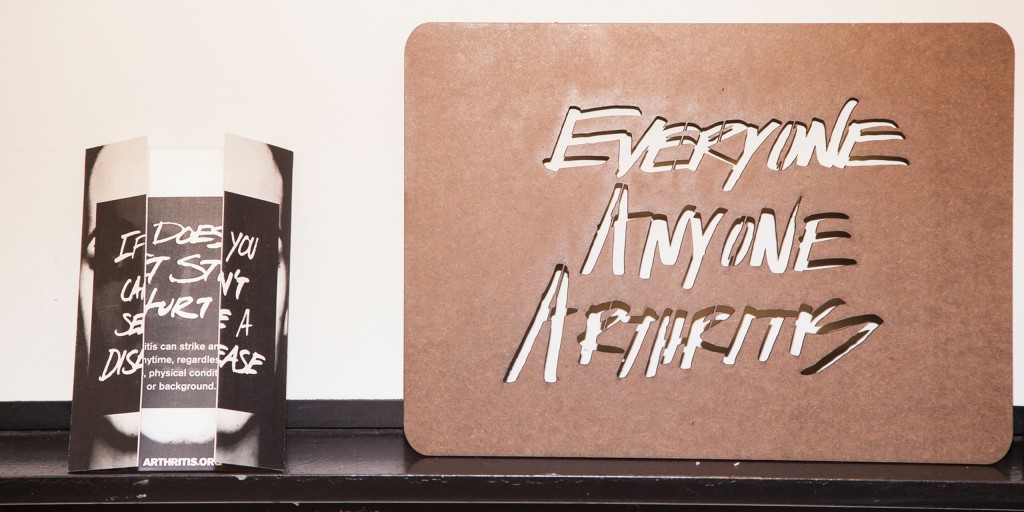
Group Four conceived of a video to be installed in crowded places and play in the background; it would be projected over everyone walking by, reinforcing the idea thatevery one can have arthritis. The visual campaign had three words: “Everyone. Anyone. Arthritis,” which captured broad attention and intrigued people to know more. Moving forward, the group would tie it to faces and images, and expand the aesthetic. Midterm Summation: The assets of the campaign had to encompass one strategy through a consistent voice and message. There was a need to inject more of the message of the Arthritis Foundation, and the students were encouraged to first define the message, and then execute it boldly and relevantly.
Weeks 8-12: The class built an overarching look and feel that expressed the primary elements of the brand and its broad target demographics, in one cohesive message.
The students produced an elaborate, modular branding system that will serve the Arthritis Foundation for decades to come.
– Dave Bullock, Faculty, Graphic Design, Interactive Design
Outcomes and Deliverables
TOOLKIT
To meet the twofold deliverable challenge of: stripping away as much as possible to get to the core of the issue, and creating a message that was bold, fresh and young, the class conceived of and produced a “toolbox” system of visual communications and design templates. The tools provided were: taglines, typography, color palette, and image treatment. All tools could be used independently, or in conjunction with each other on posters, website, social media, broadcast and more, affording the client a broad range of communication opportunities across the multiple platforms they had targeted.
Tool #1 Taglines:
Bold Not Old. The class created more iterations of the phrase, all were direct and attention grabbing, all were used the powerful voice of the person with arthritis. The handwritten font, which connected so strongly at the midterm, was maintained.
Everyone Anyone Arthritis. Seen as a call to action, this tagline with its palpable energy was designed to capture a younger, edgier demographic. Again, the handwritten font was used to connect with the viewer.
Tool #2 Typography:
The students chose an approachable and playful font to act as the best representation of “bold,” the key mood the students felt essential to express in their design of the campaign.
Tool #3 Color Palette:
Finding the right palette to express boldness was crucial; ultimately, teal was selected. It is the color of water, which expressed movement, a concept necessary to relate in counterbalancing perception around the “limitations” of arthritis. Movement was what arthritis patients say they lost, thus movement was the word that connected with all segments of the arthritis demographic groups. With teal established as the primary color, other colors were selected to complement it.
Tool #4 Image Treatment:
Dynamic images that connected directly to both patients and viewers were chosen. Portraits of people who have arthritis, looking out with bold and direct stares, enabled the class to create the honest and straightforward connection the client expressed as one of their desired outcomes.
This is a culture shift for us. We will now be recognizable as a national organization with one face for the whole country to relate to and connect with.
– Manny Loya, CEO, Pacific Region, Arthritis Foundation
CAMPAIGN PLATFORMS
Having presented the “tool kit,” to the organization, the students demonstrated how the client could apply it across multiple platforms.
Campaign Posters:
Designed to promote action, the posters accomplished this by delivering bold messages via the point of view of their target audience. “I Won’t Take No For Answer.” The powerful, forthright statement was matched by strong, compelling imagery. The students conceived of matching imagery to the organization’s diverse geographic regions. Through their use of bicycle and ocean imagery, they executed their concept for the organization’s West Coast demographic. “Bold Not Old.” The client’s campaign goal to raise awareness by making visuals fun was achieved in this poster. With imagery of children swimming, action was promoted, and having the children look directly at the viewer, an immediate connection was made.
Interchangeable imagery, targeted to the organization’s different regions, gave the client the ability to be relevant amongst their multiple target groups, a desired outcome expressed by the client early on.
Website:
Decisions led to optimal ways of distilling of information and establishing a clear hierarchy on the website. Thus allowing viewers to find, and then go directly, to what they needed. The website endeavored to create a strong call to action and a public resource repository for some of the organization’s key activities, including research, advocacy and patient education. Using moving backgrounds, and emotion-laden videos, the website features three tiers of information that is active, exciting and thoughtful.
Carefully designed info graphics help make the website more lively, and the rich and important content more accessible. Expanded engagement was reached through multiple channels, among them: stories, slide shows, and a chance to connect with others via comments. Viewers would be drawn in to the website immediately through bold, motion graphics, and the clear hierarchy would direct them easily through a functional, dynamic and engaging website.
Social Media Microsite:
The microsite provided the client with a place to communicate its most important and current information. After supplying vital information, the microsite would link viewers back to the main website.
Broadcast:
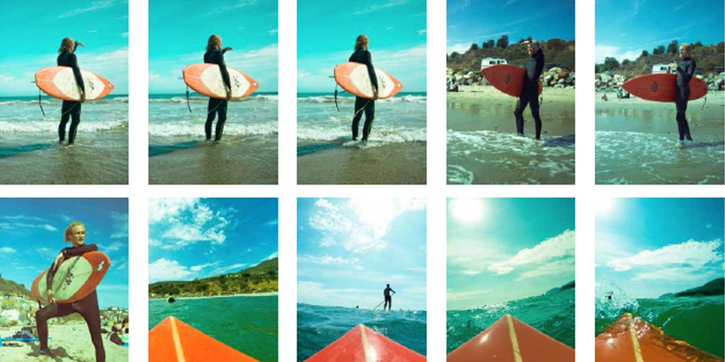
To capture the television viewer’s attention with an engrossing and compelling campaign, the class developed three scenarios of real people with real passions. The first, juveniles at a playground, lets the viewer see what it is like to be a child with arthritis, who is in the age of exploration. In the second, adults cooking, the viewer sees what it’s like to be a person with arthritis, with a passion for cooking. The final scenario depicts young adults surfing; the audience understands how the world looks to a person with arthritis who is passionate about surfing. The visuals are forceful, thus enabling the organization’s message to command attention and reach the viewer.
Magazine:
Looking at what is important to the patient and to the people impacted by arthritis, the class transformed the magazine by focusing on three elements:
1. Clarity of information. Conceived of as the best source for the latest information on research, breakthroughs, and lifestyle information, the class expanded the magazine’s reach and relevancy by gathering the patients’ and trusted advisors viewpoints. The decision lets the magazine represent and articulate the human aspect of the disease.
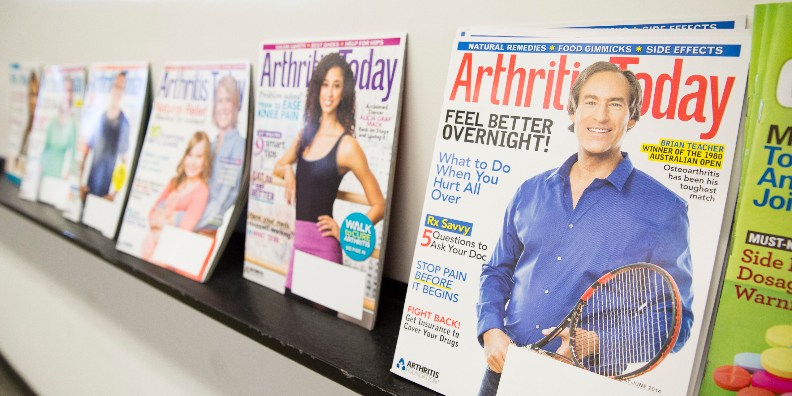
2. The Cover. The class visually manifested its concept of standing out by being quieterthrough its approach to the cover. Fundamental to achieving this was a transfixing cover portrait, featuring eyes looking directly at us. This portrait would create the strong, bold portrait that would shine through and connect with the reader.
3. Versatility. Through a simple grid, the students created a clear system in which information could be transferred across different planes, easily. The grid system promoted the organization’s facts through bold info graphics and a clear hierarchy.
App:
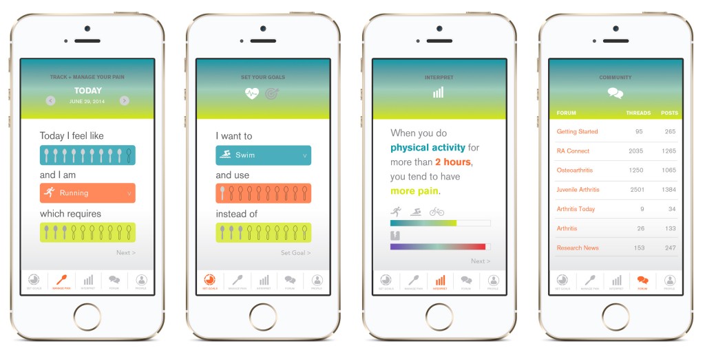
Giving users the capacity to draw correlations between how they are living, and their pain was the central idea behind the app, with features including: my information, my meds, my friends, my fitness goals, and more. The app provides a forum for users in the arthritis community to communicate, an issue of importance to the target audience
Guerilla Campaign:
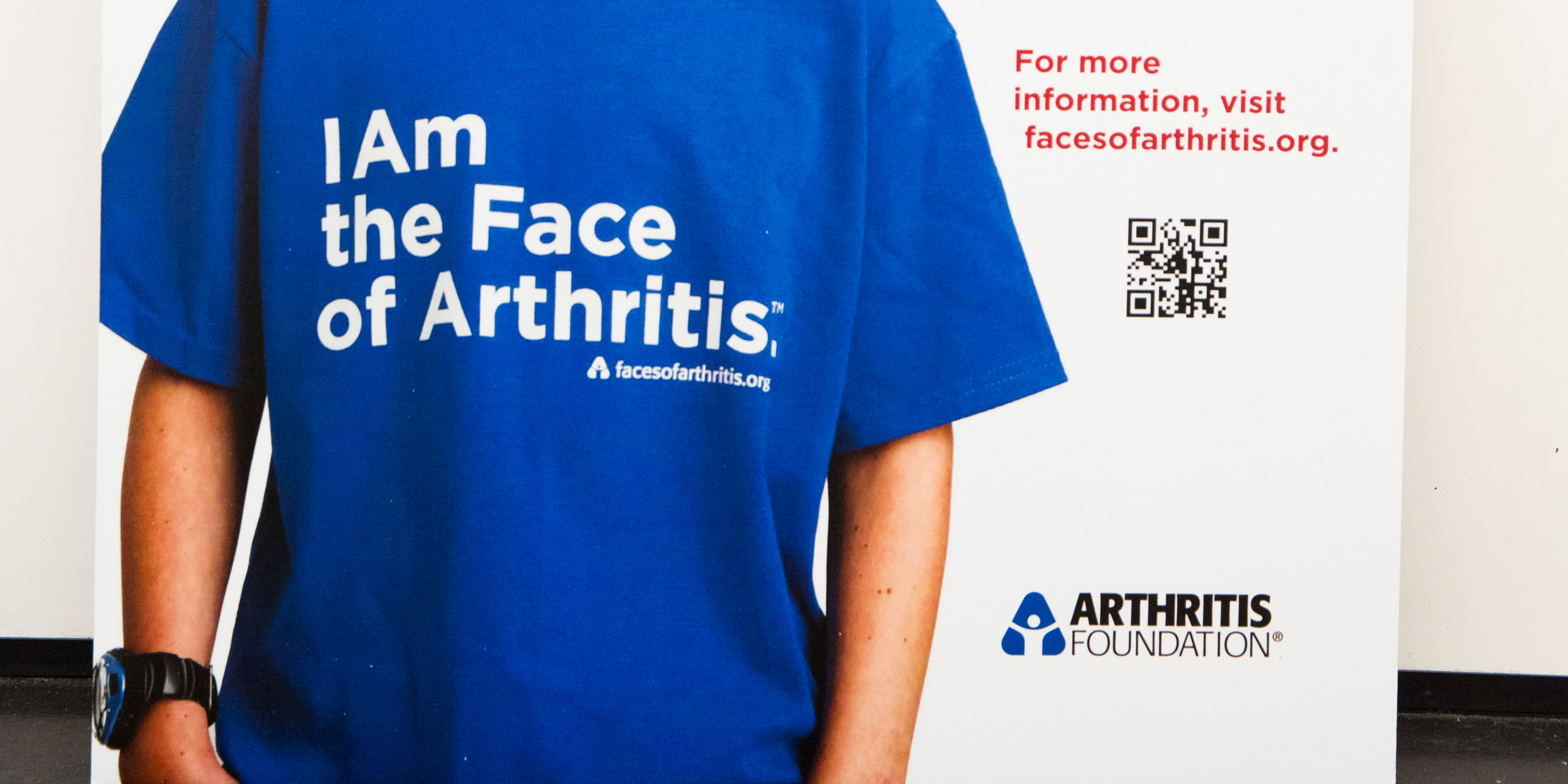
Developed as a call to action, the Everyone Anyone Arthritis campaign goal is to create a movement for its younger audience to join. The Guerilla Campaign’s Toolkit for the movement is comprised of: posters, tee shirts, tote bags, cling stickers for bus stops, magazine covers, store fronts, and lets the target audience share its message with others, thereby creating awareness and heightening visibility.
Surveillance Feed:
Video installations in subways, airports and other densely traveled spaces, feature live feeds of people walking. By projecting the video over each person walking, the point that everyone, anyone can have arthritis is clearly conveyed.
Brand Extension/Special Events:
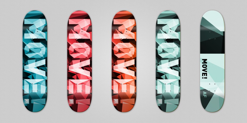
In a campaign called: MOVE, the class connected to its broad demographic base by asking, “What would you really love to do?” Their answers: cycling, running, swimming, all active words, would be shown on the microsite, expressed in exciting and inspiring imagery.
Rain Advertising:
On sidewalks in cities and high foot traffic areas, taglines appear: half as a 3-D stencil, the other half would be streaming.
Collateral:
A brand identity, created through what appeals to, and captures the attention of, the Arthritis Foundation’s different target groups contains tee shirts, caps, boards for skate events, all serving to increase and reinforce the organization’s visibility.
Impact
The organization came away with an entirely new set of visuals and dynamic ways to present themselves. The students produced a broad campaign that while highly customized, also speaks to the diverse members of the arthritis population. Summer 2014’s campaign will, hopefully, serve as the springboard to a nationwide campaign framing the Arthritis Foundation as one organization unified in its powerful, relevant and personal message.
This whole campaign is all about movement! The class has used an idea that is so challenging to people with arthritis, and turned it into something so strong and positive.
– Cynthia McDaniel, Senior VP, Consumer Health, Arthritis Foundation
Book
-
-
Connective Tissue: Arthritis Foundation Book
“Connective Tissue” documents a collaboration with the Arthritis Foundation to create a multimedia campaign and contemporized brand strategy.
Designed by Sean Adams
Published by Designmatters
Download PDF
