For the Future: Connecting Underserved Young Parents With Vital Resources
- Global Health
Based on a program developed by stakeholder Sentient Research, this Designmatters studio challenged ArtCenter students to create an appealing branding program and user interface for a mobile-based health program that will support and empower young parents ages 16-21 who often face social isolation, marginalization and stigma as they juggle competing priorities of school, work, employment, and family commitment. The program will provide engaging and easy-to-access information, parent and relationship-building resources, and peer-to-peer connections to help young parents navigate their journey.
About Sentient Research
A Los Angeles County-based consulting firm specializing in innovative research, program planning, evaluation and communications, Sentient Research offers services to non-profit organizations, government agencies and foundations around the world.
Since 2007, Sentient Research has employed a professional staff from diverse backgrounds – including public health, education, healthcare informatics and communications – to spearhead projects in health, education and public policy. By conducting rigorous research, building effective programs and embracing new technology, Sentient Research has an overriding goal to make the world a better place.
“The focus group interactions provided students with tremendous personal insights. It was a great opportunity for the students to meet these parents face-to-face and ask meaningful questions.”
– Jen Sorrell, Faculty, Graphic Design
Research and Project Development
At the kickoff, ArtCenter students engaged in an in-class project briefing by Sentient Research team members, who shared insights on their extensive research on the subject of young parents and the need for a program that specifically serves this audience. While there are many programs that aim to prevent teen pregnancies, there are few technology programs that provide support for young parents, especially young fathers. Students were introduced to key insights about the realities of being a young parent, including many that challenge negative perceptions regarding the attitudes, abilities, and challenges of young mothers and fathers.
To that end, ArtCenter students were encouraged to create with positivity and sensitivity, striking a tone that is upbeat and celebratory, inspiring young parents through difficult days as well cheering happy milestones.
Additionally, students were briefed about the User-Centered Design Process, a methodology that ensures that the user, the intended audience, is always at the forefront of conceptual thinking. Throughout the course of the studio, students would be reminded that they are designing for a specific audience, and the teams’ design concepts must focus on the end-users, the 16-21 year old parents.
Before they could start ideating possible designs, students needed to begin to understand the end-users and their triumphs and challenges. What are their motivations, what drives them? What are the goals of these young parents?
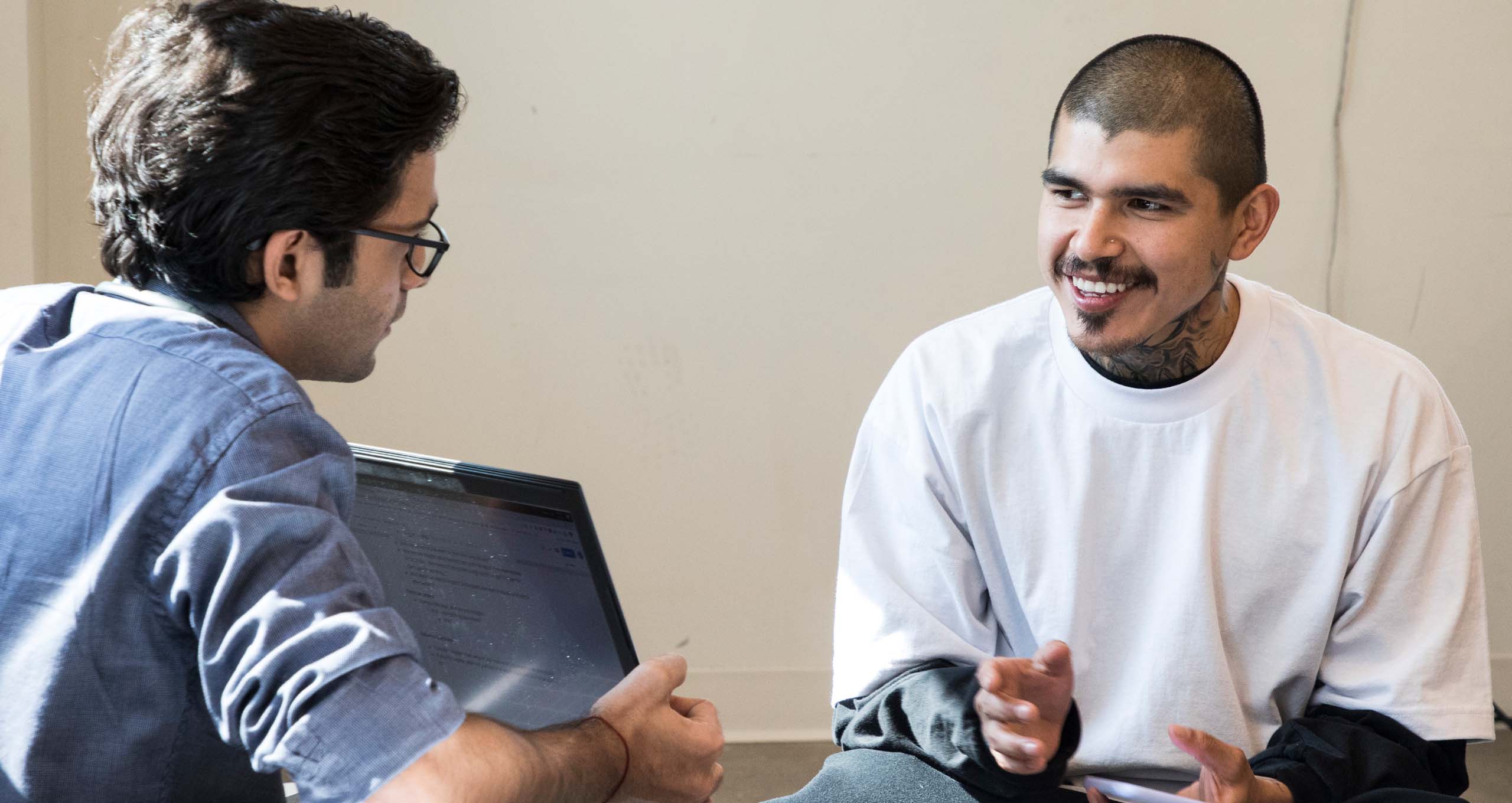
ArtCenter students engaged in a focus group experience where they met, interviewed and spent time with young parents. Prior to the focus group, students learned how to craft and ask effective and ethical questions in a respectful manner that would generate useful information. Focus group findings were shared with the entire class.
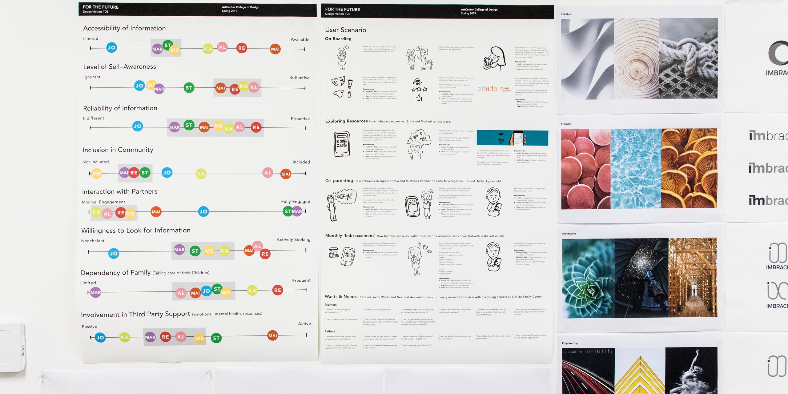
By addressing the user’s problems and pain points, teams’ design would arrive from a more authentic base which could successfully propel the project forward. For example, young parents explained that they did not feel welcomed on regular parenting websites or other typical social communities. By crafting user personas (which are models of data), student teams better understood the needs and emotions of their intended audience.
Combining the existing research with their focus group insights, student teams started to analyze information about how branding concepts and interfaces could address the common problem and issues.
Responding to Users’ Needs
Certain fundamental insights drove the student teams as they refined and prototyped their concepts, adding in typographical and visual expressions. They learned that simpler solutions were best, customization was critical and that tapping into users’ motivations presented workable conclusions. Overall, the branding and campaign design should connect with young parents in a safe community, offering an empowering and celebratory message.
At the studio midterm, student teams presented early concepts, showing how they employed the research and focus group insights to craft personas and scenarios, user models that would be their guide. Students described how young parents would use and interact through “A Day In The Life” scenarios.
After the midterm presentations, the students organized into three teams that would work on separate aspects of one holistic project: a branding team, an informational architecture team and a user-interface team.
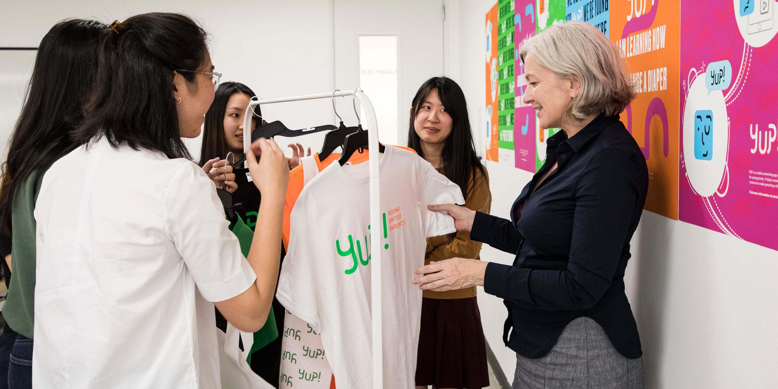
Teams began producing final deliverables: completed logo designs and taglines, determined typography and color palette in addition to producing image treatments. Campaign designs and collateral items were also created using inspiration from the overall branding design.
“I thought the students’ branding was very clever. They listened to the young parents and understood the importance of de-stigmatizing the topic. It feels very empowering.”
– Aaron Platt, Sentient Research
Project Outcomes
 close
close
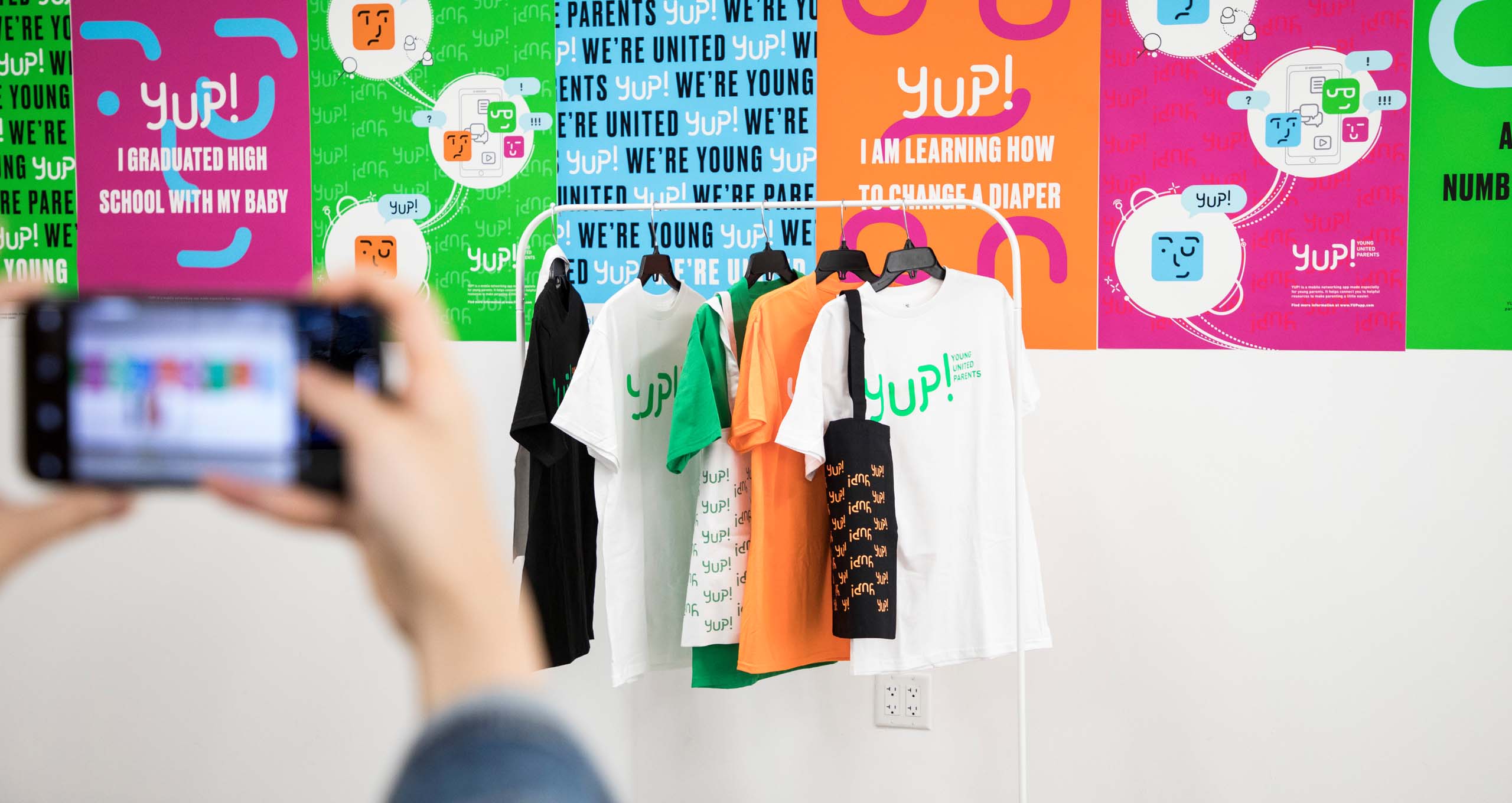
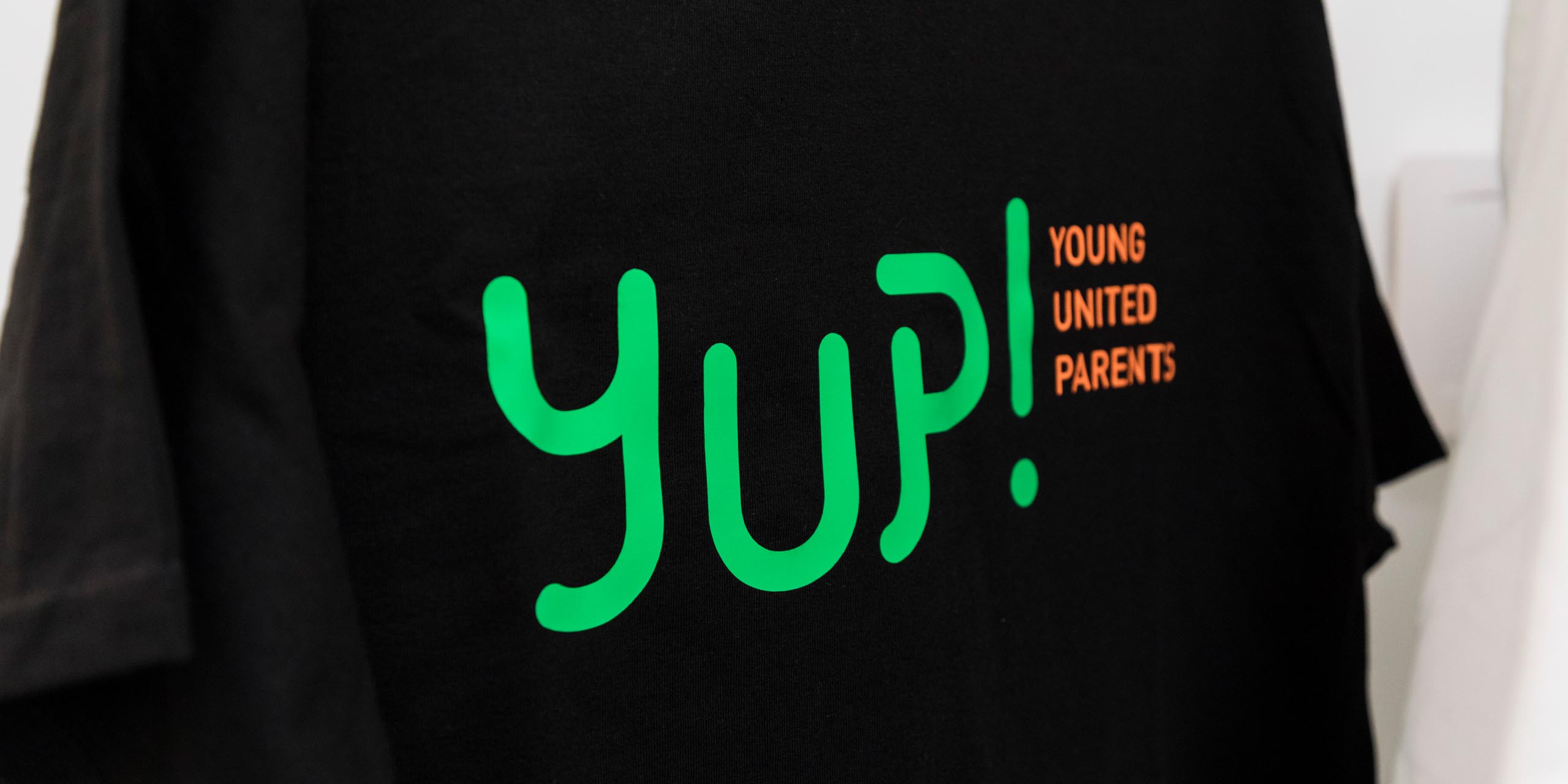
YUP Young United Parents!
Read more
Based on Sentient’s original concept, the design name is a positive colloquial term that incorporates the sensibility and overall playfulness of the design concept.
The YUP! logo, complete with exclamation point, is friendly and approachable.
Primary color designs were chosen for gender neutral associations. Secondary colors appropriately punctuate the main color palette while remaining playful and fun.
Primary typography design features soft edges and simple forms for titles and headers while secondary option is modern and easy-to-read.
Iconography is bold and simple images that instantly translate concepts. A profile avatar helps promote privacy and can be used to express a range of emotions and personalities.
Taglines are empowering and relatable with simple wording about the lifestyle – both struggles and successes – or being a young parent.
Campaign designs reflect the tone and color with illustrative language.
Collateral items could include: t-shirt, tote bags, pins
The YUP app information architecture and user interface concept provides two user pathways: unregistered users can access and content, while registered users can fully utilize the social aspects of the app. This addresses the young parents’ privacy concerns and wish for peer-to-peer connection while not putting barriers between the content and parents who are seeking information, but might not want to register.
“I am really proud of our branding system and the taglines we came up with. It’s more than just making something pretty; we were establishing a relationship with our users. We want them to feel welcome. I am also proud that we created a design language that speaks to young parents, instead of speaking against them.”
– Derling Chen, Student, Graphic Design