Project Play: Exploring the Concept of Play Through Pop-Up Experiences
- Social Entrepreneurship
- Sustainable Development
In partnership with Kidspace Children’s Museum in Pasadena, this Designmatters and Product Design studio challenged transdisciplinary ArtCenter students to conceptualize and create an engaging age-appropriate museum play experience and a companion Pop-Up exhibit that would serve as educational outreach at community locations.
Students connected with Kidspace staff and experts and, along with field observations and research, gained deep insights about creating self-directed interactive experiences as they explored child development, culture and the nature of play through the lens of the design process.
“At Kidspace, we talk a lot about how we want the kids to drive the experience, but it’s really their parents who are driving them to the museum. Whatever we offer at the museum, it has to appeal to both kids and the adults who bring them. These ArtCenter projects offered many comfortable engagement points for parents to get involved with their children, especially for parents who may feel intimidated in settings like these. The students provided a lot of easy entry points for them, where they can interact easily and play. The students really hit the note in all the right places.”
– Lauren Kaye, Chief Officer of Learning Environments, Kidspace
Project brief
ArtCenter students delved into the psychological, sociological and anthropological aspects of play as they partnered with Pasadena’s Kidspace Children’s Museum. Through extensive field research, onsite observations and connections with museum staff and experts, student teams designed a developmentally-appropriate exhibit and a companion Pop-Up experience that will serve as an interactive educational outreach at community locations.
“I never realized how much detail and design goes into something that is being created for a child. I never really thought about it before this studio. When you are designing for children of specific ages, you have to take into consideration safety, maintenance, etc. This was all new to me. The end product may look simple, but it’s really complex. This is a really good design cue that I’ll take with me for the rest of my career.”
– Rocky Lee, Student, Photography & Imaging
About Kidspace
Founded in 1979 by members of the Caltech community and Junior League of Pasadena, Kidspace has a long history of developing innovative interdisciplinary experiences for children that bridge the arts, humanities and sciences. Located for many years at Pasadena’s McKinley School, Kidspace moved to its current home in Brookside Park in 2004.
Kidspace’s mission is to serve the needs and interests of children ages 1-10 through self-directed experiences that will inspire them to become joyful, active learners. As a nonprofit educational and cultural institution, Kidspace presents exhibits and programs that stimulate curiosity and motivate learning as well as encourage a child’s growth and overall development.
Each year, more than 378,000 guests visits Kidspace’s 3.5 acre campus that features an extensive outdoor learning environment as well as more than 40 hands-on exhibits, programs and monthly events. Since its inception, Kidspace has welcomed more than 5 million visitors.
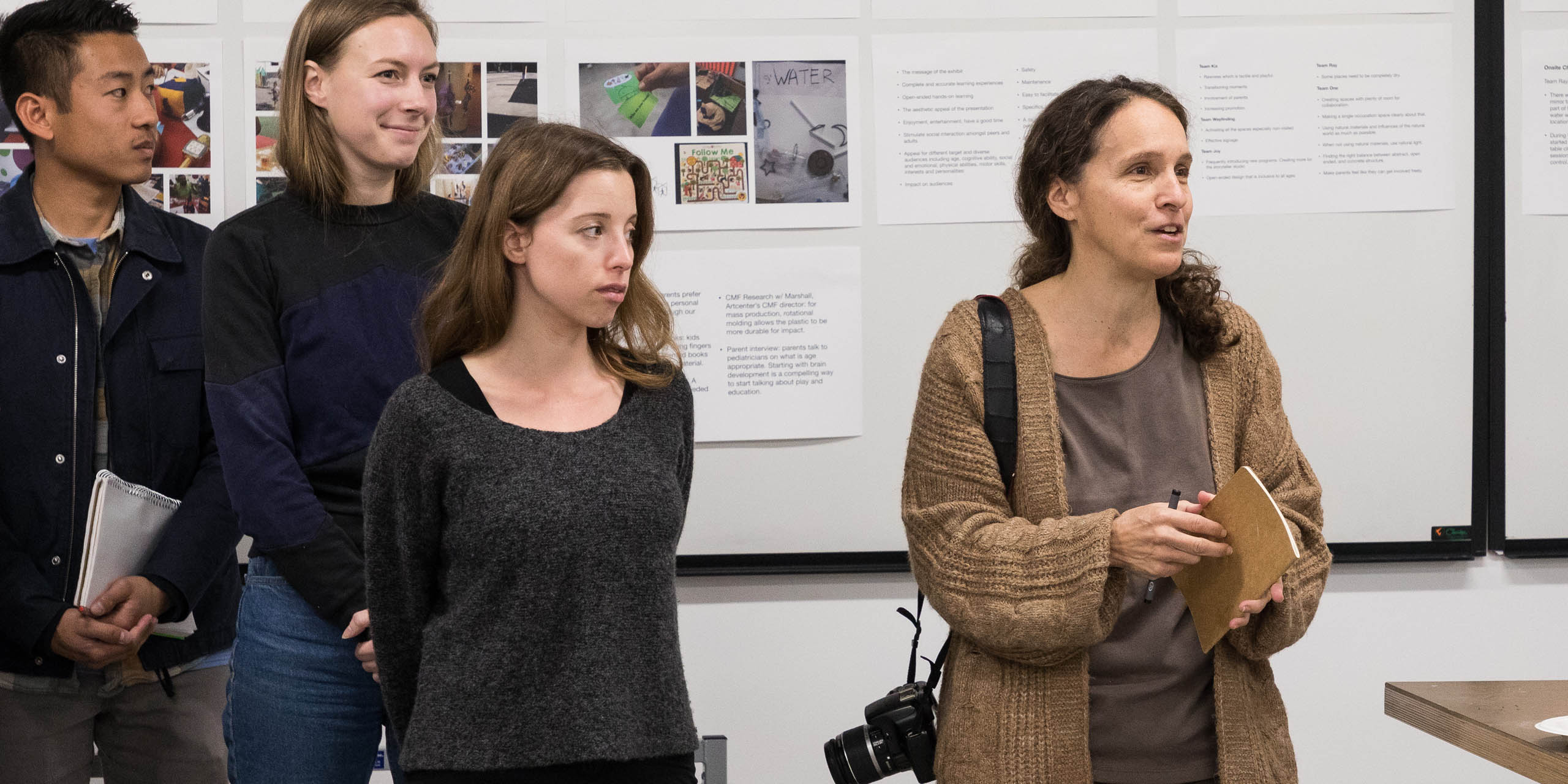
“Early on, the scenario became a tool for student teams to ask questions such as: ‘What do I need to have here? How do I create more interactions?’ Toward the end of the studio, that scenario became embedded with actual stories students got through testing and the real people they talked to; the scenario wasn’t an imaginary story of something that ‘might’ happen. It was based on reality and became a strong storytelling component for the students.”
– Krystina Castella, Professor, ArtCenter
Research and Project Development
To immerse themselves into the Kidspace environment, ArtCenter students spent the first three class sessions onsite, touring the space and connecting with staff and educational experts.
Incorporating the diversity of student’s majors, students were split into teams and focused their design attention on opportunities at specific museum experiences: Storyteller Studio, Nature Exchange, Imagination Workshop and the Outdoors.
Students were introduced to the social impact of different research methods, and how each method brings designers closer to influential insights that move their ideation toward more effective solutions. Research methods included: Observation, Interviewing Parents and Educators, Co-Design, and Secondary Sources.
During Observation, students paid close attention how parents and children interacted with museum exhibits and personnel. They noted what engaged the guests, how children played with each other onsite, what produced exciting interactions and how parents/educators could easily jump in with teachable moments.
For the next step, students interviewed parents to discover what aspects of the play experiences they think are most helpful and valuable. After asking parents why they bring their children to the museum, students also learned when parents typically interact with their children and when they step back and allow their children to discover (or play with others) on their own.
By Interviewing Educators, students examined the important role adults and facilitators have at Kidspace in addition to exploring specific nuanced discoveries such as: how certain motions and gestures can encourage children to manipulate the design, the benefits of open-ended play, and how expanding inclusivity opens access to all children.
For the Co-Design methodology segment, students conducted two sessions with two distinct groups: one group consisted of only younger children while the other encompassed kids of all ages. Students discovered favorite activities that crossed age limits, how parents seek multi-aged experiences since many families have more than one child, and how motor control abilities differ in various age groups. Teams also witnessed how ergonomically-designed exhibits are inviting to all guests.
Student teams also delved into the current research and theories of developmental psychology by reading relevant books, essays and articles. They investigated how the latest market trends could be incorporated into their designs.
Teams were concurrently ideating about a museum experience and how to distill that thinking into their Pop-Up exhibit. While presenting similar experiences targeting a kid audience, the Pop-Up also required supplemental resources for parents/educators. The companion exhibit needed to be flexible to move, easy to assemble and disassemble as well as lightweight. Sustainability also needed to be addressed with minimal waste and reusing resources whenever possible. Affordability was integral.
To inform this Pop-Up component, students interviewed other parents and children and observed behavior at local indoor and outdoor playgrounds, children’s book stores and other community locations.
Bringing their thinking into a workable reality, teams sketched out ideas and produced rough graphics. Storyboarding scenarios helped students visualize how their ideas would be used by parents and children. Mood boards provided students with a further design examination. Teams tested their initial design concepts onsite at the museum as well as in various community locations such as bus/train stops, schools and malls.
Students were encouraged to broaden their design thinking to incorporate inclusion. ArtCenter graduate and current MA Candidate, Josh Halstead, addressed the class about inclusion design and challenging the students to closely examine common assumptions about the disabled community.
In addition to uncovering common prejudices, students learned how the built environment often rejects individuals with disabilities, and how discrimination still exists in the context of “ableism.” Students were encouraged to consider design that welcomes and what design locks others out. Halstead reinforced the need for the students to critically question their decisions and outcomes.
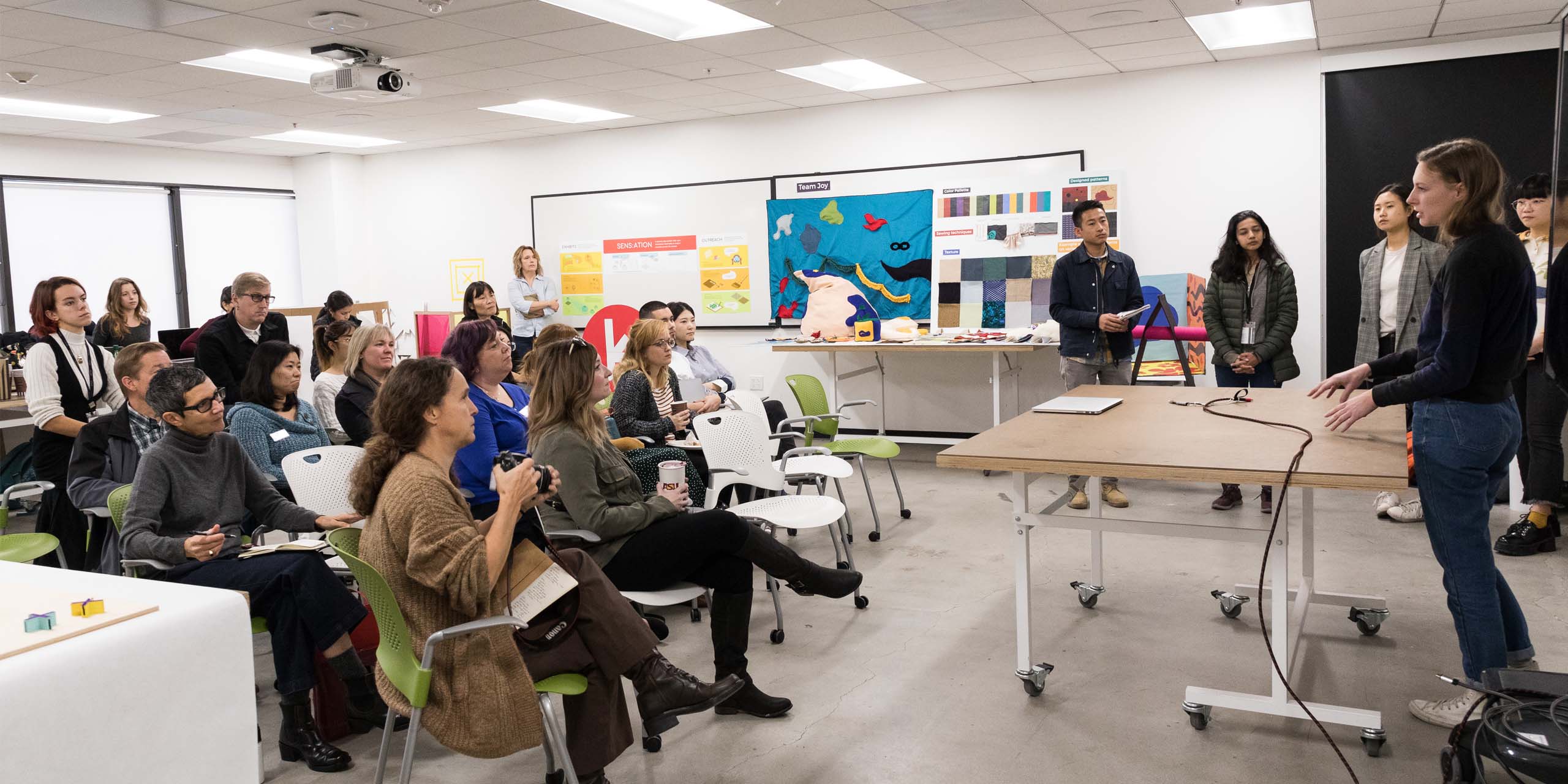
At the studio midterm, student teams revealed their initial concepts, outlining target learning opportunities and play-factor in addition to how their exhibits/experiences can be physically created. Comments and feedback from Kidspace staff gave teams motivation to refine their design thinking to move their projects forward.
Redefined Concepts, Full-Size Prototypes, Onsite Play Testing
Inspired by the midterm feedback, student teams further honed their concepts through co-design sessions with Kidspace staff and later crafted large-scale mockups for onsite field testing.
Additionally, student teams reexamined projected cost of their projects and, through research and reevaluations, discovered aspects that could be scaled down for affordability but still provide the same play value experience.
Teams presented their concepts to Kidspace staff and educators; this unique opportunity allowed students to draw upon their expertise and first-hand knowledge of how exhibits are typically used and experienced. Students showed how their concept would be actualized at Kidspace (costumes, cubes, small models and prototypes, etc.) and how it would translate to a Pop-Up version.
Students came prepared with a series of questions (“Is the play value high enough to catch and hold attention?” “What age group does this most appeal to?”) and often expert responses turned into lively discussions.
Staff was excited about the concepts and shared their enthusiasm with the students (“I have always through this would be an interesting topic to explore!” “You know what would be cool…”) as they honestly explained conceptual limitations and offered practical ways students could modify their concepts. (“I think this aspect would engage visitors more…”, “Here is why this would be hard to implement…” “You need to offer more direction. Kids need directions. You know what you can do…”).
Educators shared their insights on how certain exhibits have been received throughout the years at Kidspace. They encouraged teams to consider alterations and adaptations to their design-thinking, often simplifying elements into one streamlined presentation.
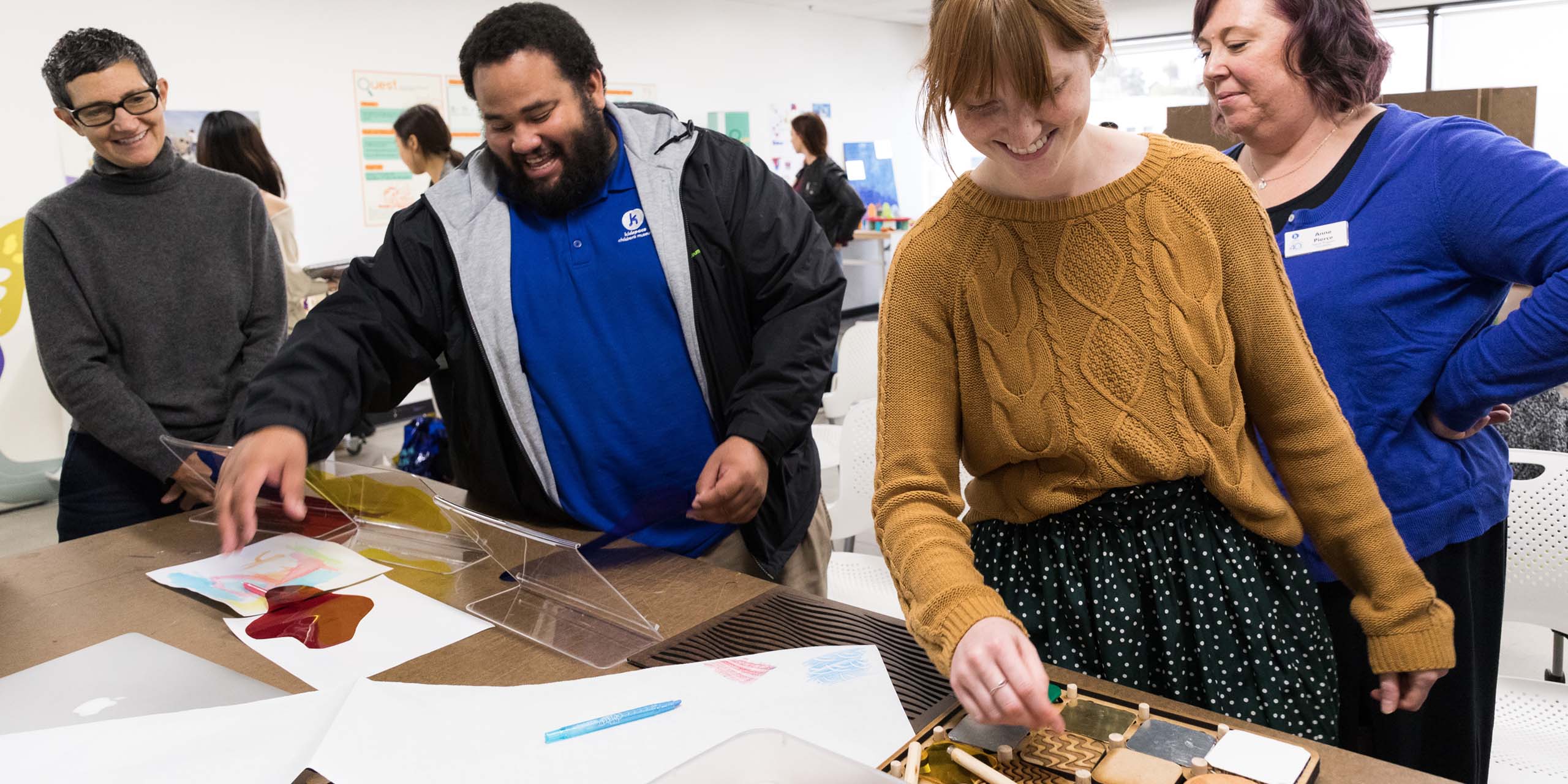
Armed with that information, teams refined their concepts, built full-size prototypes and returned to Kidspace for playtesting with actual museum guests. Teams were spread around the museum. Some teams quickly realized a need, and made on-the-spot modifications (elevating a table, adjusting colored gels for better reflections, etc.) to accommodate youngsters. These simple fixes made some elements more obvious and helped clarify and define the features of the play experience.
Student observations confirmed and challenged their concepts (“They are not playing the way I envisioned,” “They are not using the items how we designed them”) and overall, the field testing was an eye-opening valuable experience.
Students continued to refine their Pop-Up traveling version by researching and visiting targeted community hubs, social institutions, non-profit organizations, schools, etc. Teams created Pop-Up prototypes – including some full scaled models – that would bring a similar play experiences to a more intimate gathering. The Pop-Up became an integral part of their storytelling scenario as a method to engage parent/adults and their children and encourage a visit to Kidspace to continue play exploration. Additional at-home digital resources for grownups were also typically folded into the design thinking.
Teams crafted an overall mission statement along their concept development with outlined value proposition and projected social impacts. Personas dovetail into storytelling scenarios and – because of their extensive testing – reflected real life interactions that teams observed.
Bringing their concepts closer to actuality, teams researched manufacturing options, material possibilities, safety testing and production planning. They considered how their exhibit could be marketed and distributed along with other issues including legal standards, intellectual property issues and advertising concerns when designing for children.
Finally, teams diagrammed manufacturing schematics and called out materials for their exhibition pieces with a focus on sustainable and recyclable options. They also provided a timeline for production and next steps that included a MVP phase – Minimum Viable Product – along with additional testing and a roll-out framework.
“Simplicity can be so hard to achieve in design — it’s a challenge. Simplicity is key because you ultimately want the children and their families to be empowered to drive their own learning themselves. By creating something simple, you create opportunities. It’s a flexibility to be open-ended which presents unique exciting opportunities. The students created a central framework that is simplistic in form and function but offers scaffolding for more extended experiences.”
– J.J. Leissing, Chief Programs Officer, Kidspace
Project Outcomes
 close
close
Whimsical Storycrafters
Read moreJessie Lee, Devanshi Mehra, Jose Ramirez
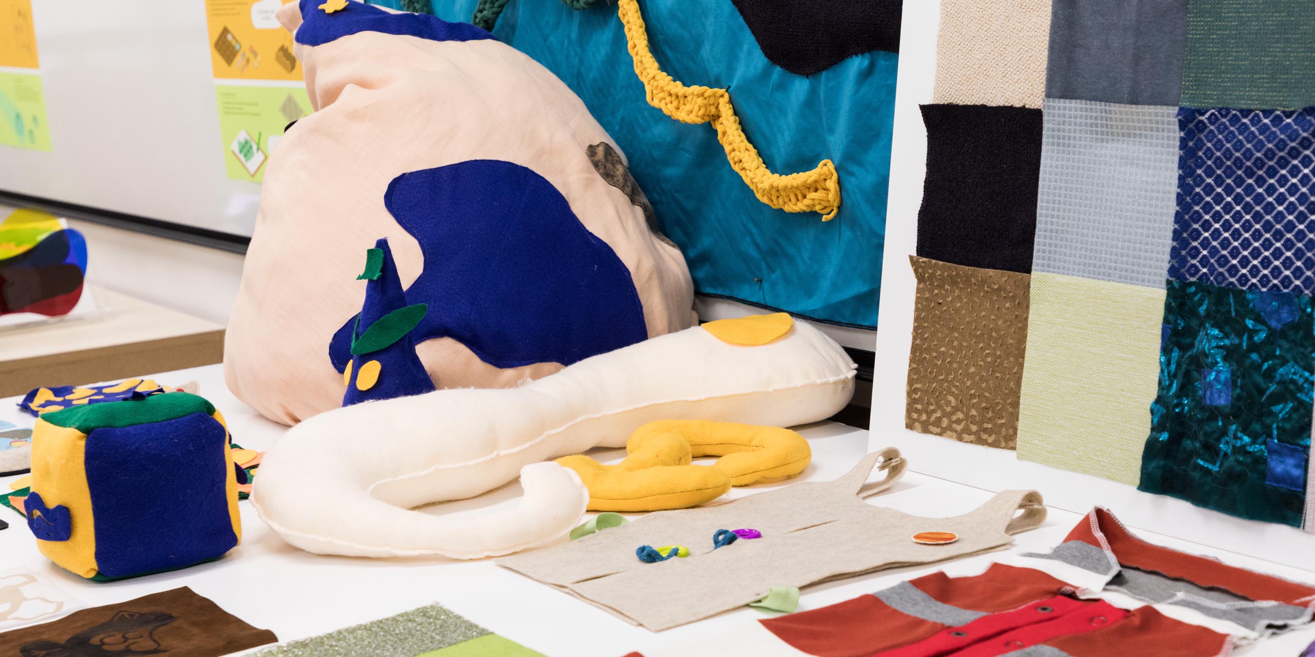
To help develop the inner world of imagination, Whimsical Storycrafters presents opportunities for pretend play that can empower children 4-10 years old to tell their own stories in self-directed, open-ended play.
A fabric wall sets the stage at Kidspace’s current Storytelling Studio where soft abstract props, large cubes and a sound piece are available for kid actors to employ in their storytelling. (The public will be invited to donate recycled materials that can be incorporated later into props.) Kids can also choose from simple costumes that are hung from rods on a rolling display closet.
Guided programming is available through prompt cue cards and a six-sided cube – products that can also be sold at the museum gift shop. Prompt cubes/cards are available online in addition to sewing patterns and printable backgrounds so families can recreate and continue their storycrafting experience apart from Kidspace.
The Whimsical Storycrafters Pop-Up exhibit will be contained in a collapsible storage cart that houses abstract props, costumes and other artifacts and features a mirror. Educators use prompts (roll the cube and become that character, etc.) to kickstart the storytelling experience.
 close
close
Sens:ation
Read moreCatalina Johnson, Michelle Romero, Marianne Wellman
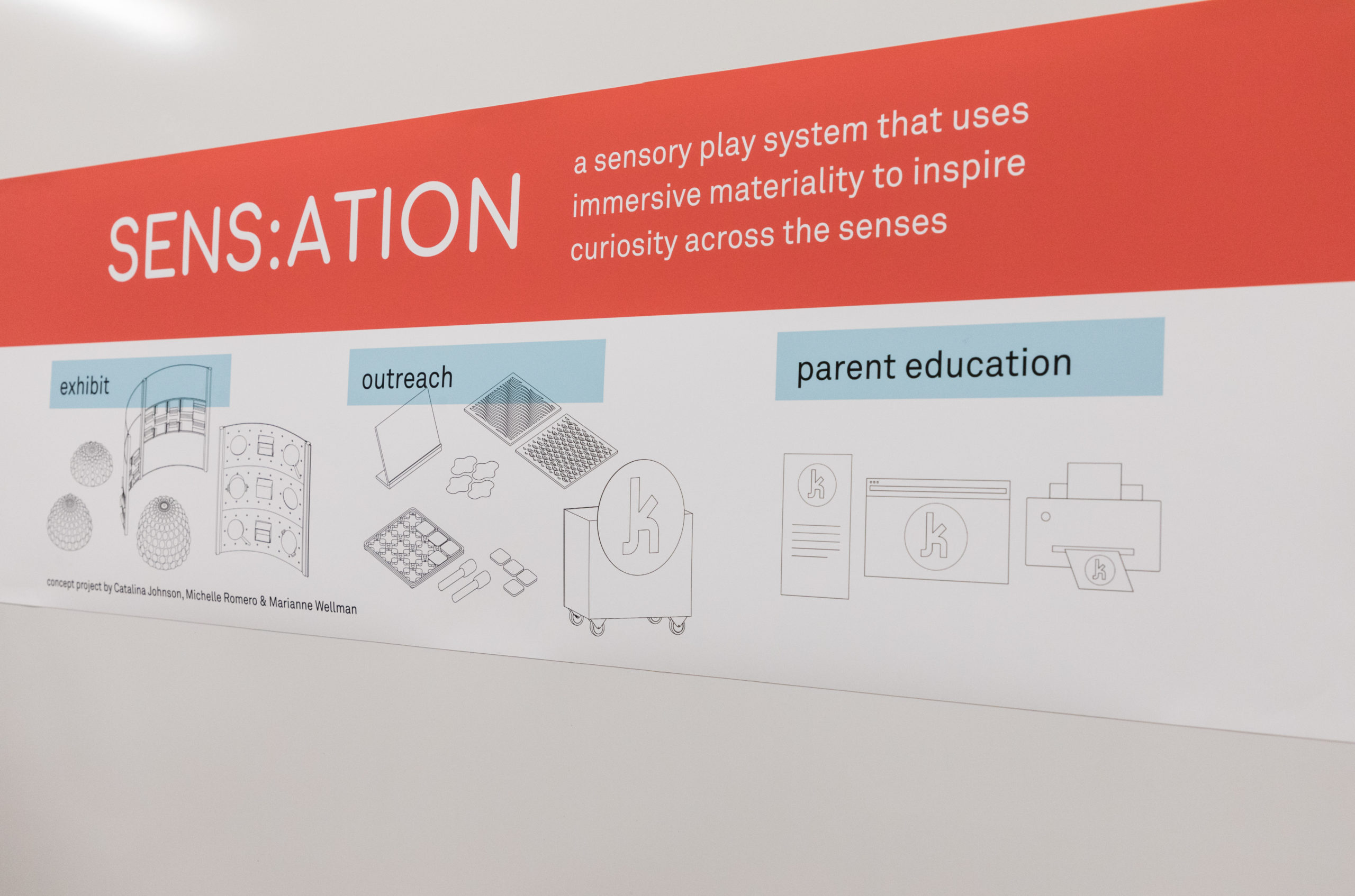
A sensory exploration system that encourages young children ages 0-3 to experience the wonders of scientific discovery.
Located outdoors in Kirby’s Corner at the museum, the exhibit features standing pegboards incorporating sight and sound panels. Sunlight through colored gels cast shadows on the ground and can be viewed from both sides. Sound panels employ household objects along with spinning elements that children can strike with wooden mallets. Panels are easily interchangeable so the exhibit can have new items at select times. The standing pegboards have three horizontal sections and are large enough for multiple kids to engage at one time; they also accommodate those children with accessibility needs such as wheelchairs.
Nearby, poured-concrete dome fountains offer tactile experiences with flowing water and textured engagements. Ramps will provide those in wheelchairs accessibility to easily touch the water and explore the concrete shape.
Located on the Kidspace website are additional parent/caregiver resources and downloadable at-home activities.
Housed in a cart with the Kidspace logo, the Pop-Up experience is a tabletop with more compact sensorial activities such as colored filtered gels and sound tiles created with various materials. Kids can feel the tactile grooves of rubber stamps as they create designs. A version of the portable Pop-Up tabletop can be sold as a packaged boxed set in the gift store.
Printed handouts about sensory play are available to adults and teachers who want to expand the experience with home activities.
 close
close
Kix
Read moreDemi Lan, Hammin Ko
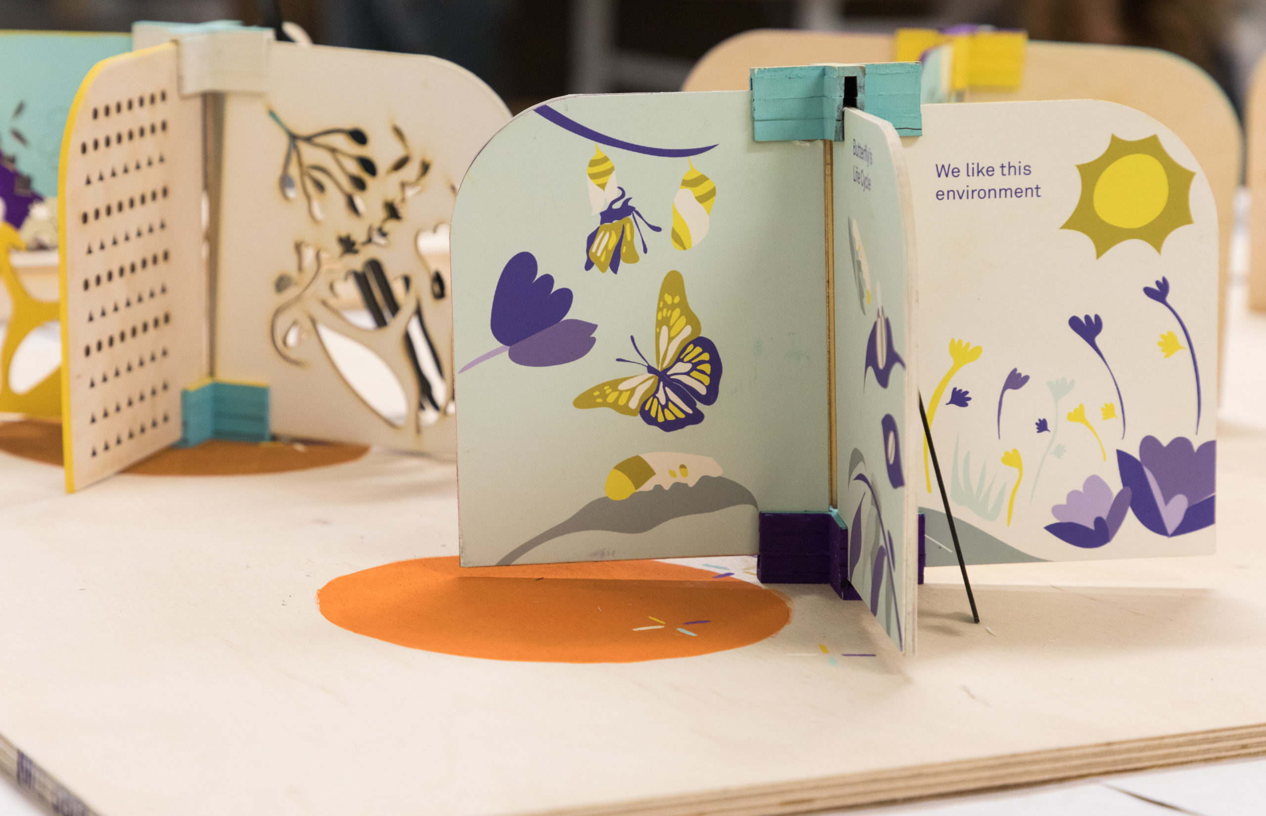
This interchangeable panel system provides spatial graphics with play-friendly interest. Located in the museum’s transition spaces, the four-panel system offers kids from 0-6 years old social interactions, learning and surprise discoveries.
The swappable panels slide into grooves and can feature a variety of mix and match engagements: sensory experiences (herbal scents and visuals), a chance for “hide and seek” with geometrical cutouts, moving through large cut-outs, seeing on an animal’s level, and other kid-driven play. These weatherproof panels can also be created with seasonal themes.
Panels can feature a complete story such as a butterfly life cycle told in simple visuals on all sides and with a mirror at the end where a child can see their face as a butterfly.
Offering a moment of rest, benches/stools can be incorporated near the panels without blocking the playability.
In the community, Kix panels can be installed in area parks and open spaces; and a tree can be planted in the center of the panel structure.
 close
close
Quest Wayfinding System
Read moreSunny Den, Mingyuan Li, Taekyung Yoo
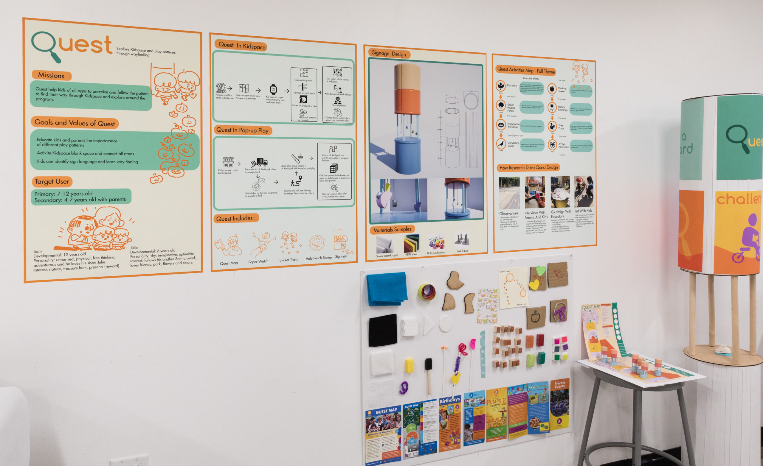
To help visitors navigate their Kidspace experience, the Quest Wayfinding System encourages children to engage in different play patterns and fully explore new areas of the museum. Younger children (ages 4-7) will rely on grownups to help navigate, while older children (ages 7-12) will be independent enough to engage on their own.
At the entrance, maps are handed to visitors that also include a paper bracelet to be worn by children who, as they explore the museum, collect stamps at kiosks which are spread around the campus. Children follow pattern trails on the ground (vinyl acorns, leaves, etc.) that leads to a kiosk station. Here, they are instructed to perform a nearby challenge activity (ride the bike, etc.) and then collect a hole-punched stamp. Kiosks also feature interchangeable posters in clear acrylic panels; seasonal themes can be easily updated to provide ‘new’ experiences for repeat visitors.
Out in the community, a Pop-Up version of the Quest system can be implemented at local parks. Posters announce an upcoming Kidspace scavenger hunt; on the day of the hunt, stickers will be hidden on trees or on the ground for kids to find in addition to maybe searching for natural items like leaves and sticks.
 close
close
Aquoa
Read moreRocky Lee, Yujia Li, Aziza Tanjung
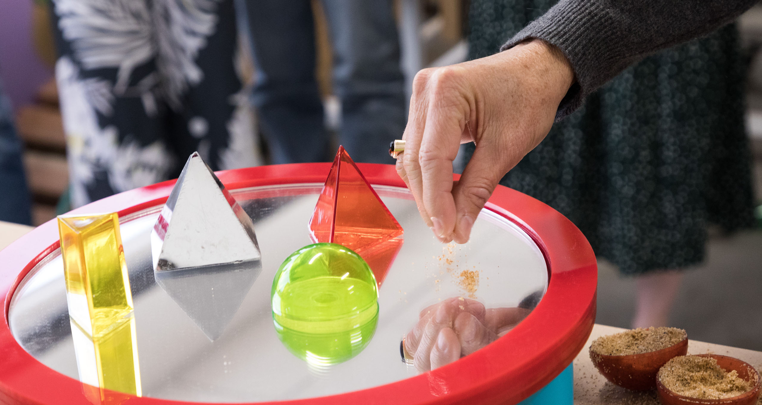
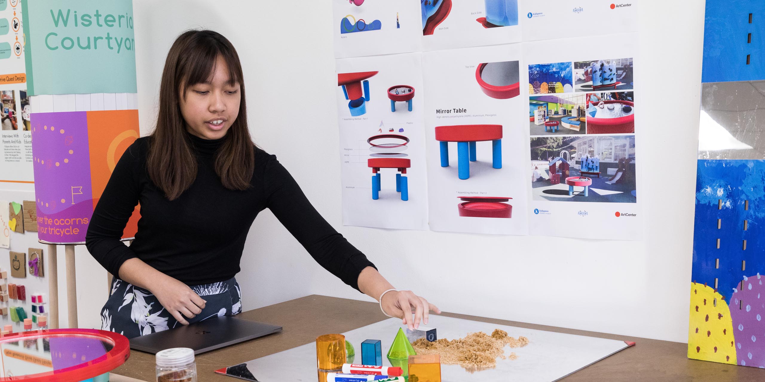
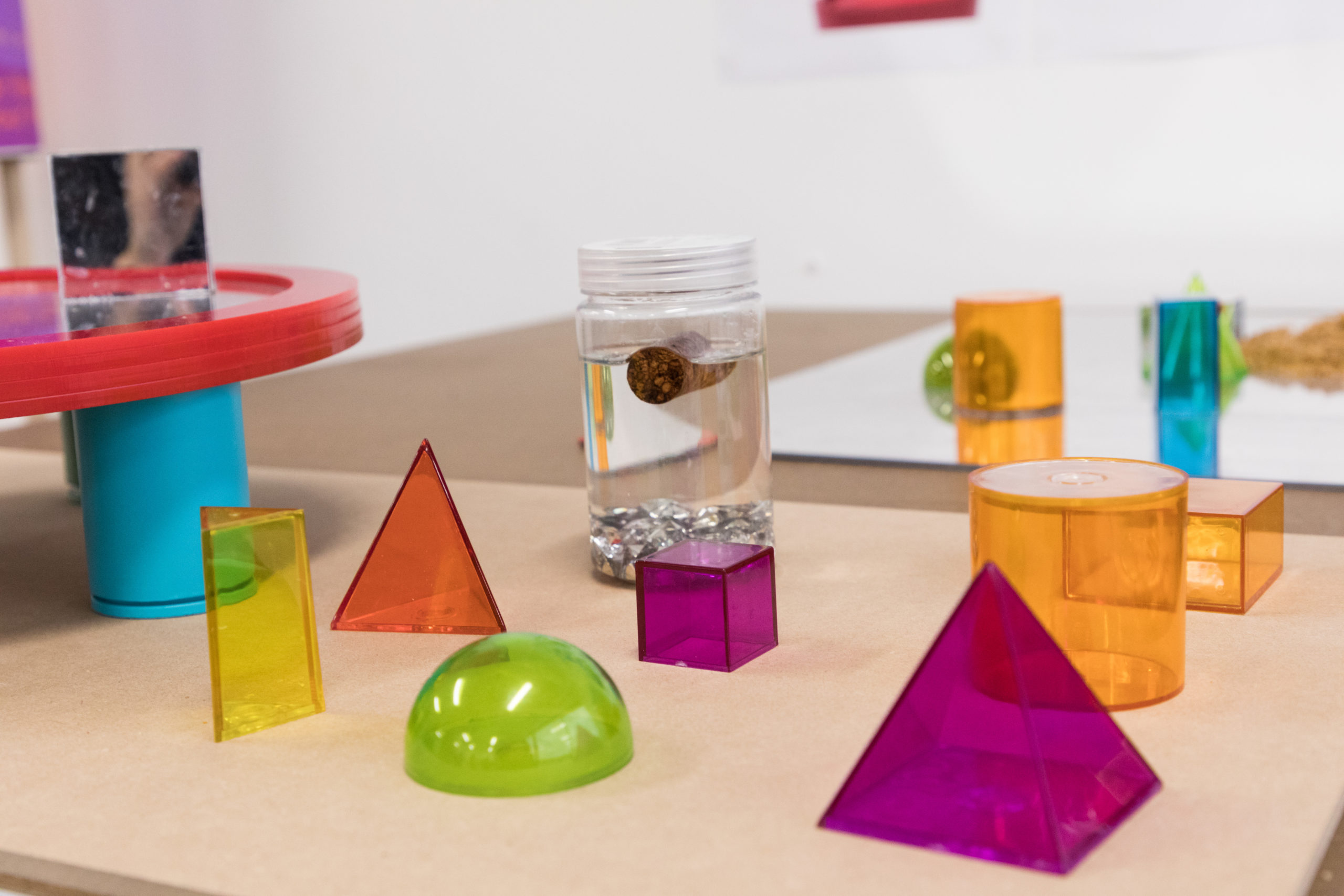
Two components – a Water Wall and a Mirror Table located in Kirby’s Corner at the museum – employ water, mirrors, sand and interactive shapes. Self-directed play experiences allows children to discover movement, fluidity and reflective properties.
The free standing Water Wall features gears, tracks, wheels and channels that divert water which is collected in a small pool at the bottom and recirculated. Water not only flows down the wall but also shoots up. Fixed and removable parts offer kids creative opportunities for creating new water flowing patterns. The Water Wall’s background represents Pasadena’s famed locales such as the Rose Bowl, the nearby San Gabriel Mountains and the Colorado Street Bridge.
Composed of durable materials and a no-scratch surface, the nearby Mirror Table invites children to manipulate sand and 3-D color shapes to create patterns, observe reflections and explore tactilely.
Because of its compact and easy to assemble/disassemble size, the Mirror Table can be used in various outreach locations. Additionally, the simple design could be mass produced and sold through retail outlets.
Brochures and signage will inform caregivers about the benefits of “messy” play as a necessary for a child’s development.
“Kidspace was always very positive in giving feedback, encouraging the students to look at their projects in different ways. Students were able to take those learnings immediately and apply to their projects. By testing of different audiences – parents, kids, educators – the students were able to streamline and evolve their concepts. They saw what people are receptive to and fine tune what their design was all about.”
– Krystina Castella, Professor, ArtCenter
