Seeing the Unseen: Visualizing Flow Patterns of Mesopelagic Ocean Eddies
- Sustainable Development
Spring 2018
With a grant from the National Academies Keck Futures Initiative of the National Academies of Sciences, Engineering and Medicine, this Designmatters Studio brings together the Woods Hole Oceanographic Institute with the Interaction Design Department at ArtCenter to facilitate interdisciplinary ArtCenter students in designing interactive data visualization projects based on elusive underwater movement patterns by ocean eddies. Working with complex scientific data and employing human-centered design methodology and design-thinking along with current technological methods, students developed innovative interactive concepts that would assist oceanographers to gain new factual insights as well as communicate the science to a broader, non-scientific audience.
This project was made possible by a grant from the National Academies Keck Futures Initiative.
RECENT PROJECT DEVELOPMENTS:
- SUMMER 2018: The project will conclude this Fall with an independent study directed by Santiago Lombeyda in which students will further develop the Augmented Reality project toward a working prototype.
- SPRING 2019: Maggie Hendrie & Jennifer May will present the project at the 2019 Interaction Design Education Summit in Seattle!
Project brief
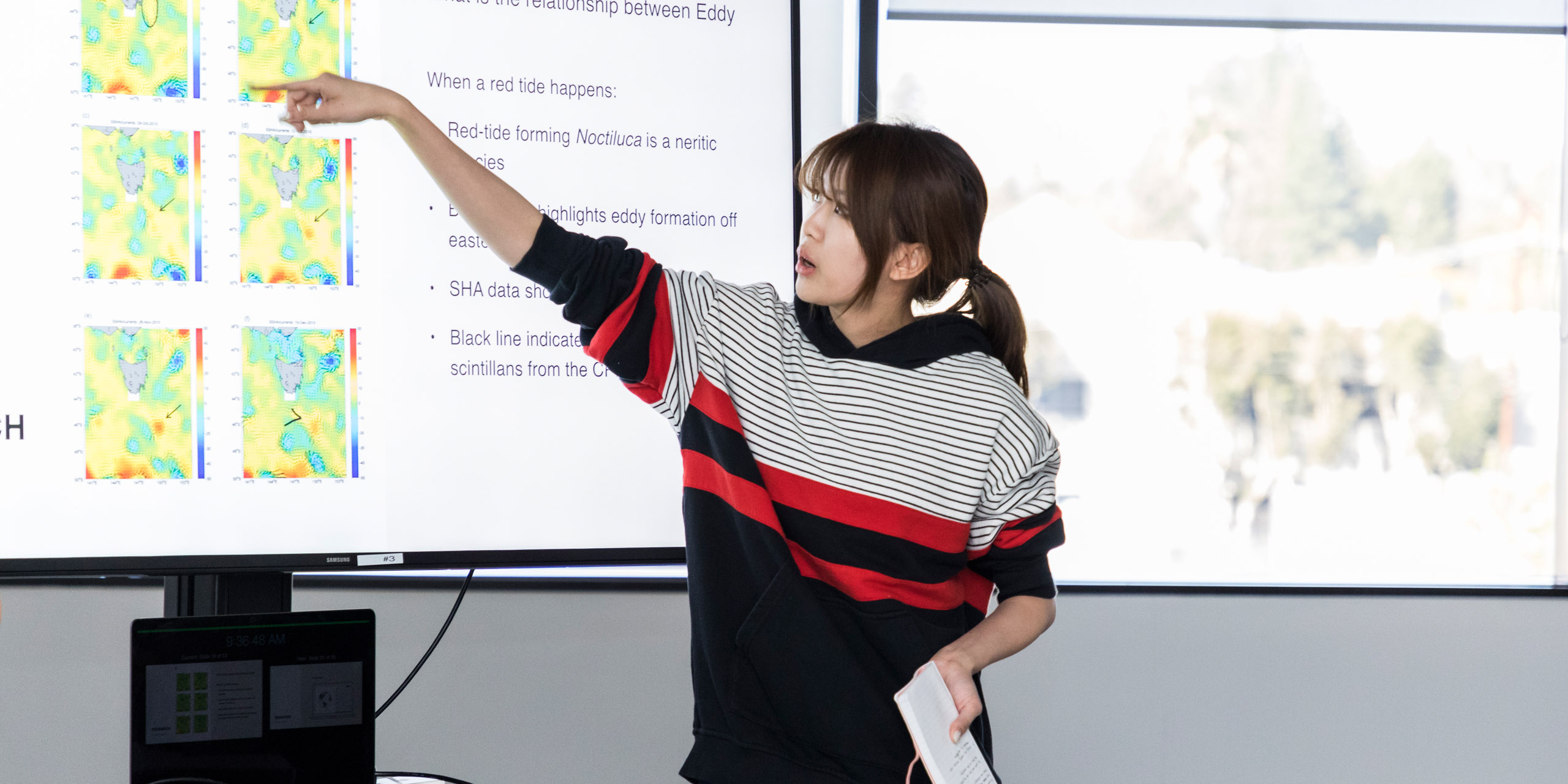
Dr. Larry Pratt from the Woods Hole Oceanographic Institute joined Maggie Hendrie, Chair of ArtCenter’s Interaction Design Department and Santiago Lombeyda, Research Scientist and Lecturer from CalTech, for this Designmatters studio, which challenged students to develop interactive data visualization opportunities about flow patterns of underwater movement caused by ocean eddies. These eddies fill the ocean and are vital to the ocean’s health and its role in the Earth’s climate.
Employing complex scientific data, students developed concepts featuring visual and interactive characteristics which could help integrate, communicate and ultimately gain new insight into the current data for oceanographers and the general public. The class was structured by faculty Lombeyda and Hendrie to develop new interdisciplinary approaches that combine design-thinking and the latest technological methods from computer-user design, interaction design, 3D graphics and physical 3D printing.
“Mathematics can be very visual; there is interplay in how elements can be expressed in terms of equations. Making visualization easier offers new opportunities and understandings. Sometimes, visualization inspires new mathematics or physics and vice versa – and that is exciting.”
– Dr. Larry Pratt, Woods Hole Oceanographic Institute/MIT
About Ocean Eddies
In addition to major current systems such as the Gulf Stream, the ocean contains complex swirling motions that range is diameter from hundreds of kilometers down to five kilometers or less. These features are known as ocean eddies and are evident in satellite images of the sea surface. Some of the more prominent eddies, such as Gulf Stream rings, extend down as far as 1000 meters below the sea surface and create complex, three-dimensional circulation patterns that are felt throughout the mesopelagic zone.
Ocean eddies also transport properties (nutrients, oxygen, biological populations, heat, momentum, etc.) from one location to another, both vertically and horizontally. Nutrients brought to the surface stimulate biological productivity, including the growth of phytoplankton, which in turn produces about half of the oxygen that living creatures need to breathe. Eddies are essential to life on Earth – yet their evolving, 3D nature makes them extremely difficult to view and understand.
Advanced methods for data visualization help oceanographers study these complex objects and the currents that they induce. As water circulates around an eddy in a spiral manner, many water parcels form complex surfaces, often twisted and folded in unrecognizable ways.
These twisted and folded surfaces are objects that oceanographers, especially Dr. Larry Pratt from the Woods Hole Oceanographic Institution, who has spent years studying these patterns and is part of this Designmatters team, would like to better visualize and understand. Ocean eddies have the potential to help scientists learn how important properties such as oxygen and nutrients are distributed.
These surfaces could also provide a template to better understand ocean circulation. Such a template will be inherently multifaceted with many interleaved surfaces and surface-free zones of chaotic mixing. Current relevant data can conceivably create such a template with appropriate design skills.
With new technologies evolving at a rapid pace, scientists have been generating model data on mesopelagic eddies, knowing that data visualization will provide the interactive and dynamic display needed to better understand this extremely essential ocean phenomena.
“We spent time in this studio analyzing effective and ineffective data visualizations which made us very aware and critical of how often there is a bias attached to visualizations. Even if they are using good data, often these visualizations offer no sense of scale or context. They are presenting data the way they want you to see it”
– Sam Giambalvo, Student, Interaction Design
Research and Project Development
Building on their work in the ArtCenter/CalTech/JPL Data Visualization program, Lombeyda and Hendrie developed lectures, hands-on activities, in-class assignments, homework and prototyping. Students were presented with the challenge: understand, extract and communicate insights from the current eddy data into narrative, scientific and educational contexts, all while maintaining the integrity of the original data.
Lombeyda, who has partnered on visualizations with CalTech scientists for almost 20 years, outlined the role of visualization and how it pertains to the scientific world; students examined how data is ingested, the intuitive nature of presentations and analyzed best practices for effective interpretations that could include the latest methods from computing, user-centered design, interactive design and 3D graphics and printing.
Additionally, students evaluated data through an artistic lens, discovering how to effectively transform the veracity of the data into graphically effective designs and interpretations that would resonate emotionally with both a scientific community and public audiences.
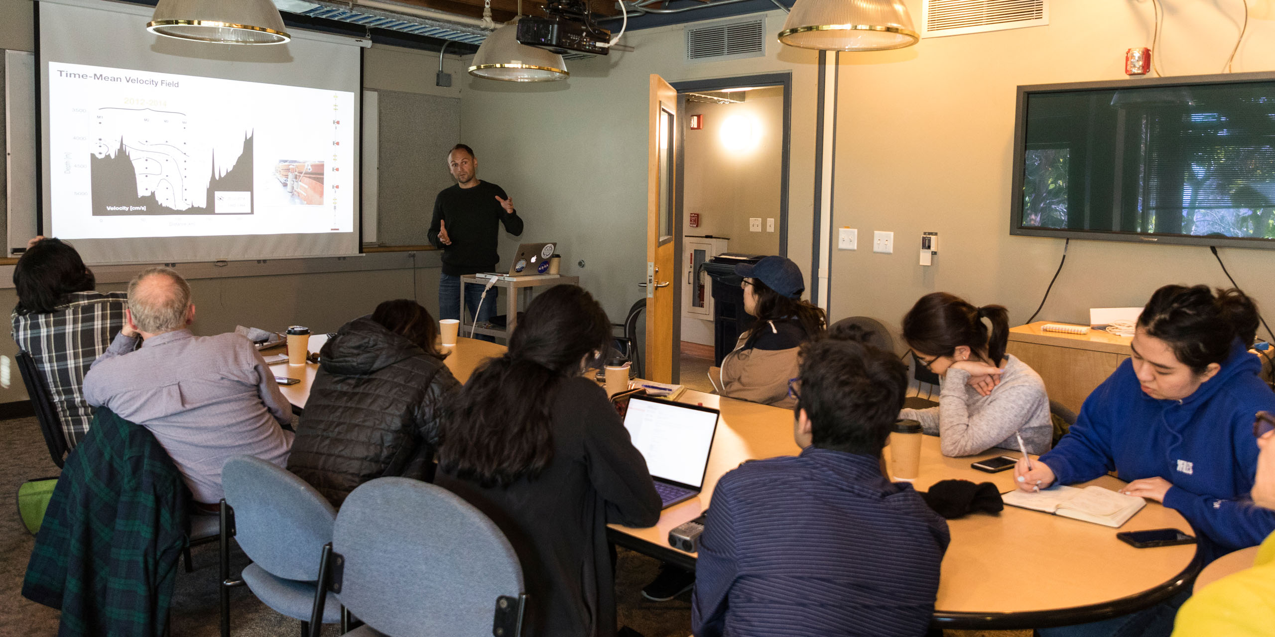
Students also delved into the science of ocean eddies from one of the prominent researchers in the field, Dr. Larry Pratt of the Woods Hole Oceanographic Institute, who has spent years researching these patterns. Throughout the course of the studio, Dr. Pratt engaged through Skype lectures, in-person visits, e-mail correspondence and one-on-one discussion meetings with the students. While Dr. Pratt was a partner in the studio, his presence was also that of a client for the students to consider.
Faculty led students through the Discovery process and structured participatory design research methods to facilitate student-expert sessions. Overall, students were challenged to design interactive and dynamic displays of complex information that would provide “insights into the invisible,” which is at the heart of effective data visualization.
Students analyzed how data has been traditionally represented through charts, graphs and design elements. They examined the thinking behind abstract data (which can include numerical sequencing) as well as 2D and 3D data (which can involve geometric shapes). Current models and hands-on assignments enabled the students to comprehend how a specifically detailed presentational visualization helps viewers understand, compare and make informed inferences from the data.
Students were exposed to informational layout of data (e.g. charts and graphs), paying attention to the correlation of the scale and size. They observed how data points can reveal specific data attributes depending on their position, orientation, shapes, color and texture as well as describing motion by vibration or deformation. They studied how to sort and format for the most effective ways to show trends, information and compilations in order to present a clear understandable snapshot of scientific findings.
Students also learned that humans process visual information more effectively and, often, more emotionally than text. Human brains are wired to make connections when introduced with a series of facts and information; this subconscious understanding is manifested in the layout of a smart phone scroll, the design of a billboard or how a newspaper is formatted.
Data visualization is often used for a purpose: to present a question and/or to prove a point. Insights used in a visual format must be well-constructed for meaning; students learned to avoid “chart junk” which are items that either don’t support the data or that are confusing/misleading.
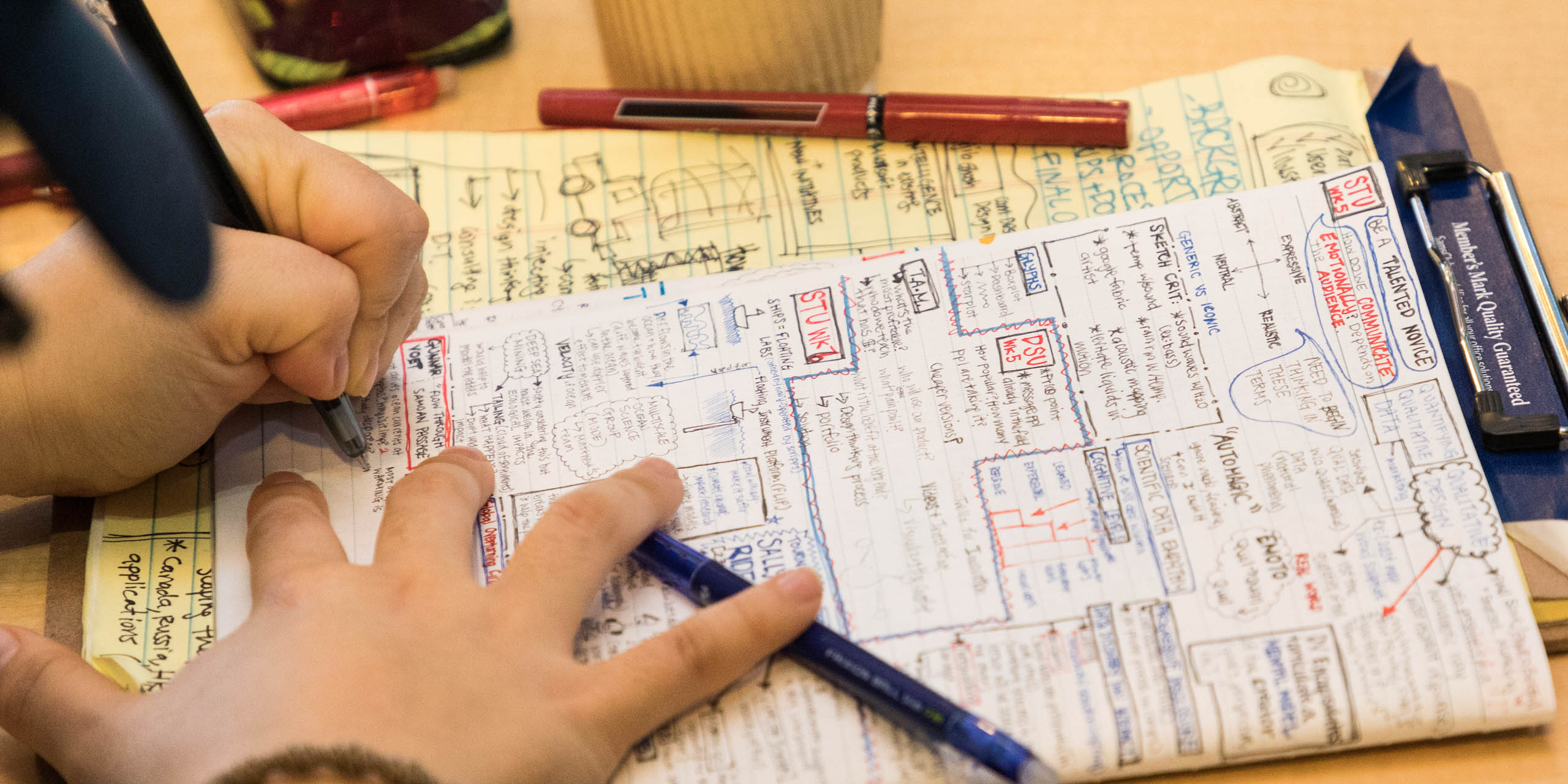
Students were encouraged to sketch out ideas before using a computer to better understand the creative process. They also examined the different platforms and canvases to communicate data with varying degrees of interaction, multiple audiences and interactive techniques, including data journalism/advocacy and emerging technologies ART (Augmented Reality above the Tabletop) and CAR (Computer-Assisted Reporting).
Lombeyda curated an online Trello board where students posted weekly examples of both effective and confusing visualizations along with homework, in-class assignments, research items and project iterations.
Concurrently, students were introduced to the physics of ocean circulation; videos from space and NASA animation depicting eddies in motion provided a 2D experience. Students learned the various representative visualizations that describe the flow and movement of water; they analyzed the components of the vorticity of a curl along with other physical fluid concepts, especially noting how data can be presented as moving and directional.
Students examined how scientists visually label information about fluid movements via critical points when flows interact and/or intersect with one another, learning how these critical points are represented in 2D and 3D.
Lectures, in-class exercises and assignments reflected students’ grasp of the material and the scientific principles. Instructors encouraged the students to question their choices, always circling back to basic foundational questions: “Are the details necessary?” “What is working?” “What needs help?”
Class assignments included crafting/sculpting a 3D visual representation of a fluid flow, designing quick sketches and conceptual poster-sized images, data mapping for a specific story/takeaway, and more.
Engaging Working Scientists
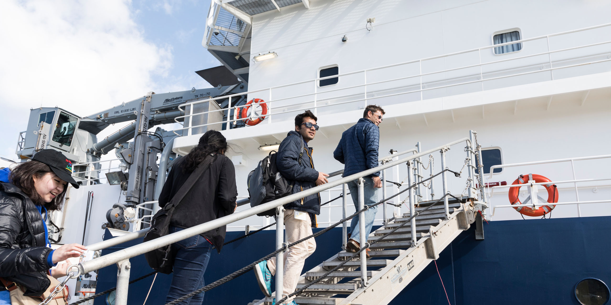
A field trip to visit the Scripps Center for Oceanography’s R/V Sally Ride in San Diego Harbor led by Professor Matthew Alford of the Marine Physical Laboratory gave students an opportunity to engage with working research scientists who collect and analyze data. Students heard presentations from scientists at Scripps on their research and the roles that data and data visualization plays in their work. Dr. Gunnar Voet spoke about his observational work on Samoan Passage data and Professor Sutanu Sarkar described his work with high-resolution modeling in Fluid Dynamics.
Prior to the mid-term, faculty split students into four groups, who each created 15 idea sketches that would become the first steps toward their final projects. Students considered exploration of the actual scientific data or a more personal understanding of the chaotic nature of eddies.
As a team and through studio critique, they honed these initial thoughts down to three creative concepts which they presented at the mid-term. Ideation needed to showcase specific facts and truths, representing them with clear intention and gauging their impact on intended user types. One direction needed to focus on an analytical tool while another was to be more data-empathetic.
In addition to feedback from class instructors, student teams met with Dr. Pratt in person to discuss initial thoughts and concepts; Dr. Pratt advised each team on how to possibly refine or redirect their concepts using the scientific data collection and to consider the end user’s point of view.
At mid-term presentations, student teams introduced three rough concepts on multiple platforms. Guests from JPL, Caltech and ArtCenter staff provided feedback that spurred discussions. These comments helped direct teams on which concept to focus their attention and efforts for their final project.
Teams then worked to refine their projects by creating personas and “A Day in the Life” scenarios which helped direct their design thinking and ideation with the end user in mind. They created prototypes, often multiple iterations, and field tested their ideas as they reshaped their concepts. Students often examined existing tools currently used by researchers (SPIN Lab, MATLAB, ParaView, etc.), comparing the technology to their project goals.
All through the prototyping phase, student teams realized that staying true to the integrity of the data should be the through line in all their conceptual ideas coupled with keeping the needs of their intended users as a guiding principle.
“I was a borderline computer science major before I came into interaction design; I’m really interested in physics and chemistry. This class was a way to throw design back into science and mathematics and help a community that is helping to give back to us.”
– Akshay Agrawal, Student, Interaction Design
Projects Outcomes
 close
close
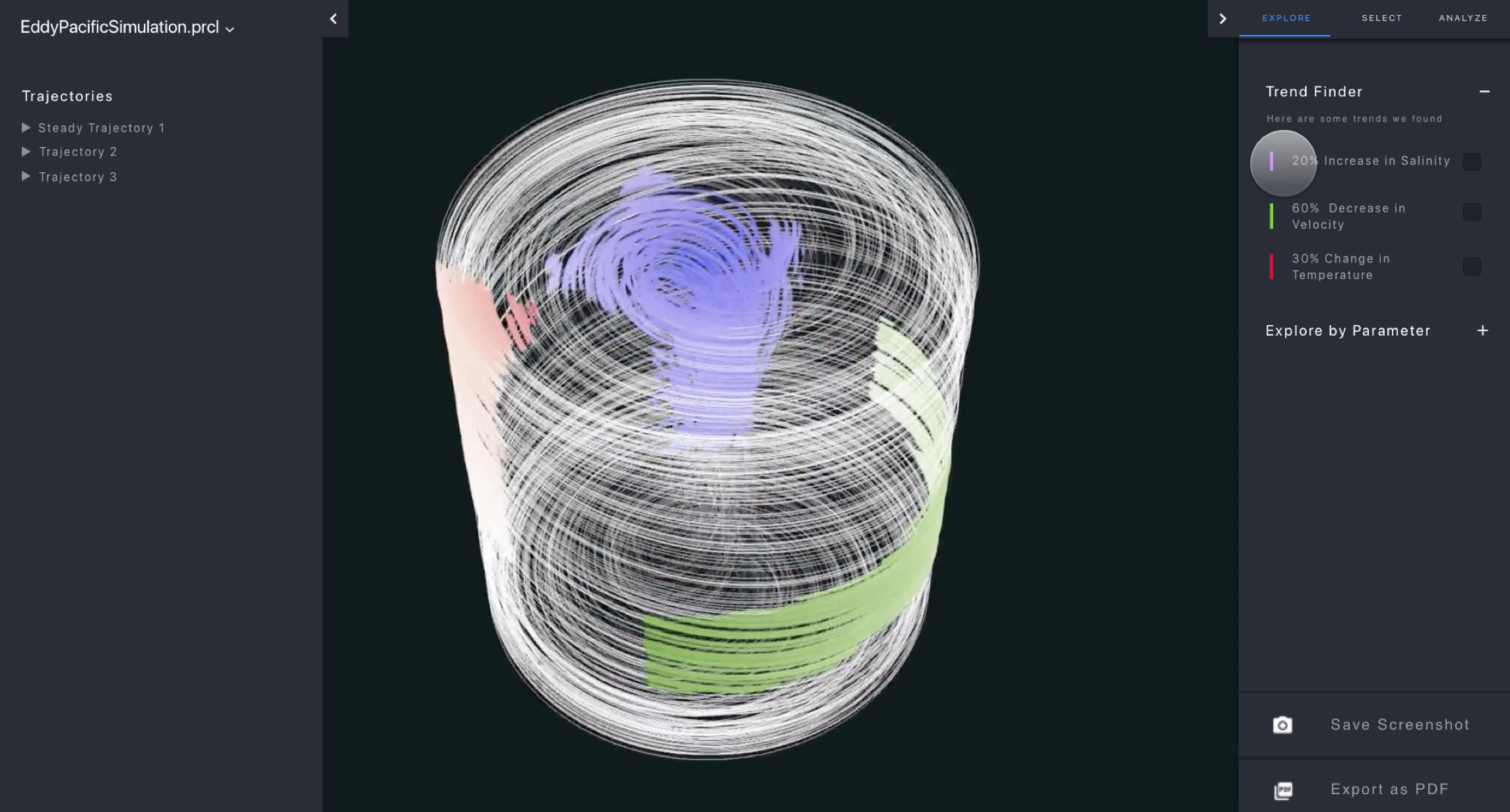
Parcel
Read moreAkshay Agrawal, Michelle Kim, Pooja Nair
A software tool, Parcel provides oceanographers with a more detailed understanding of data generated in eddy simulations by allowing the user to select, explore and analyze the complex phenomena in numerous ways through 3D screen visualizations.
Using a prototype created from data algorithms, researchers can select individual and/or bundled eddy trajectories and, using a series of predetermined constraints, can highlight movements, filter the focus and discover eddy behavioral trends. Researchers can separate out eddy properties for temperature, salinity, density, pressure and velocity, which can provide a more in-depth understanding of the eddy mechanics and physics at work.
Additionally, researchers can easily share their explorations with peers. The software has a clean, simple-to-understand design and is flexible to be modified for other scientific fields of research.
 close
close
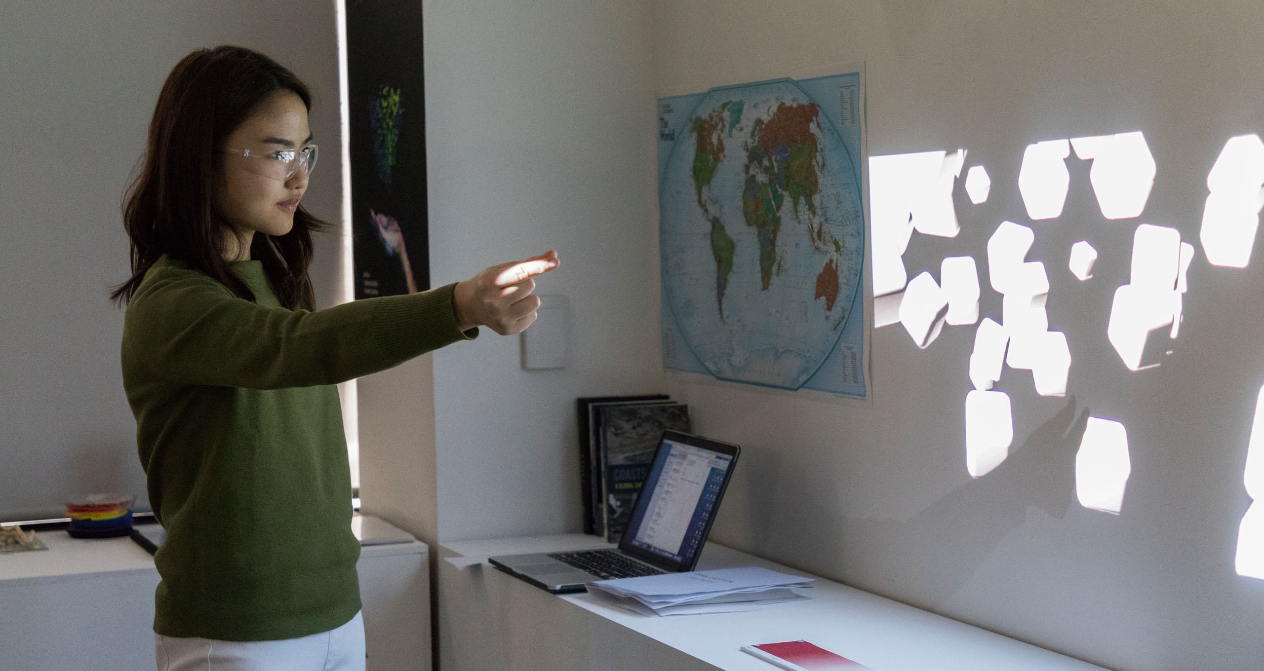
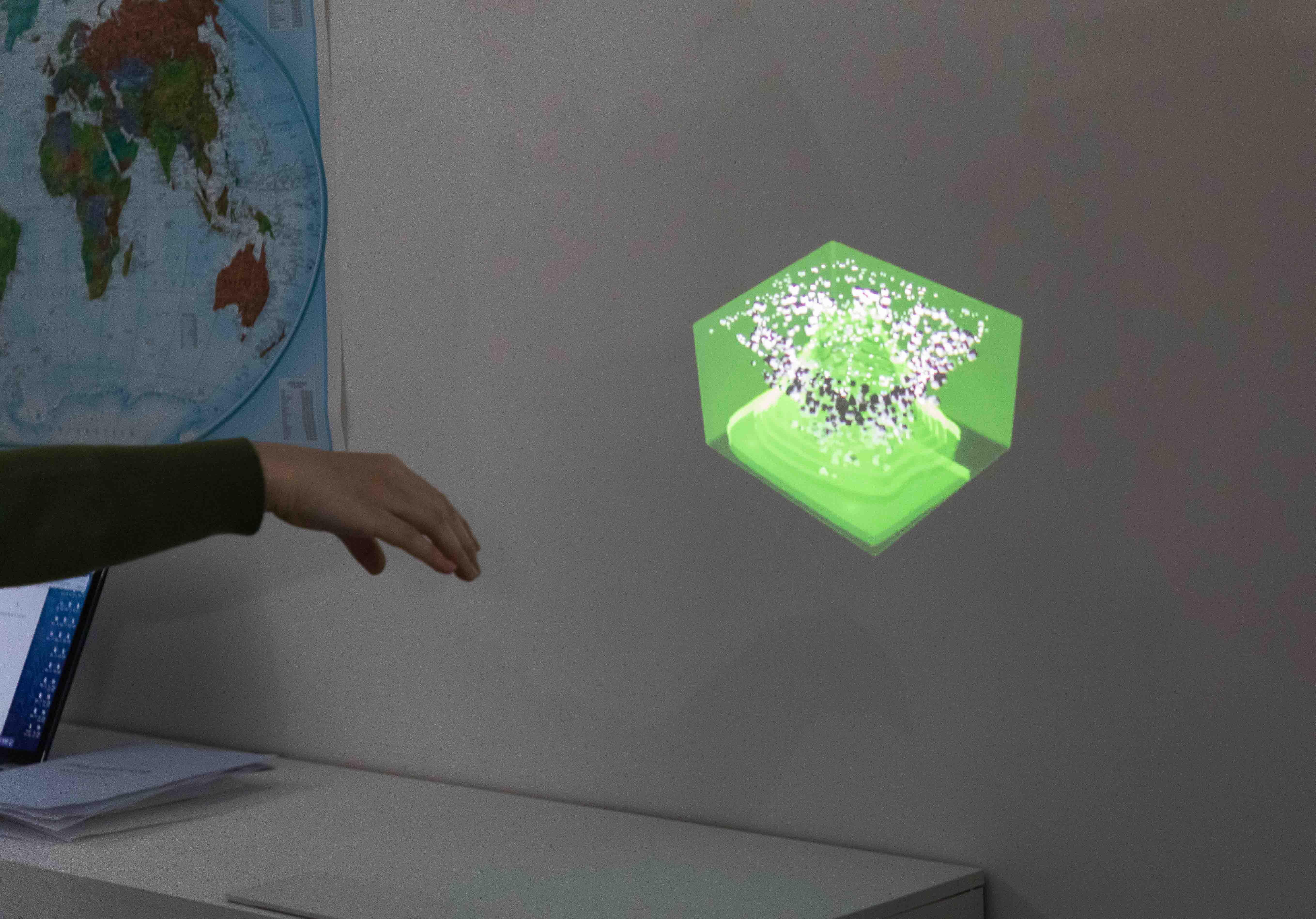
EAV (Eddy Augmented Visualization)
Read moreChristin Carolina, Jie Gu, Gabriela Sudirja
This scientific discovery tool puts eddy data in Augmented Visualization (AV) software to provide an interactive, non-intrusive experience of eddies that is more realistic than traditional 2D presentations and can assist researchers in discovering new insights. The system can be implemented in a researcher’s office or laboratory and could be used at sea.
Using a logbook and AR projection in tandem, researchers can understand a specific eddy through its external and internal factors such as relative position, size and spatial relationships as well as the time and location originally observed.
When researchers put on the AR glasses, they can visualize the eddy from different viewpoints and filter out specific factors. Using large gestures (grab, swipe, pinch, rotate, etc.), they can separate layers, zoom and track, push away and push to save the results. Since vision of the laboratory surroundings are not impeded by the glasses (as would be the case for VR) they researcher has access to all his or her laboratory equipment. Finally, researchers can annotate and share their findings with colleagues.
 close
close
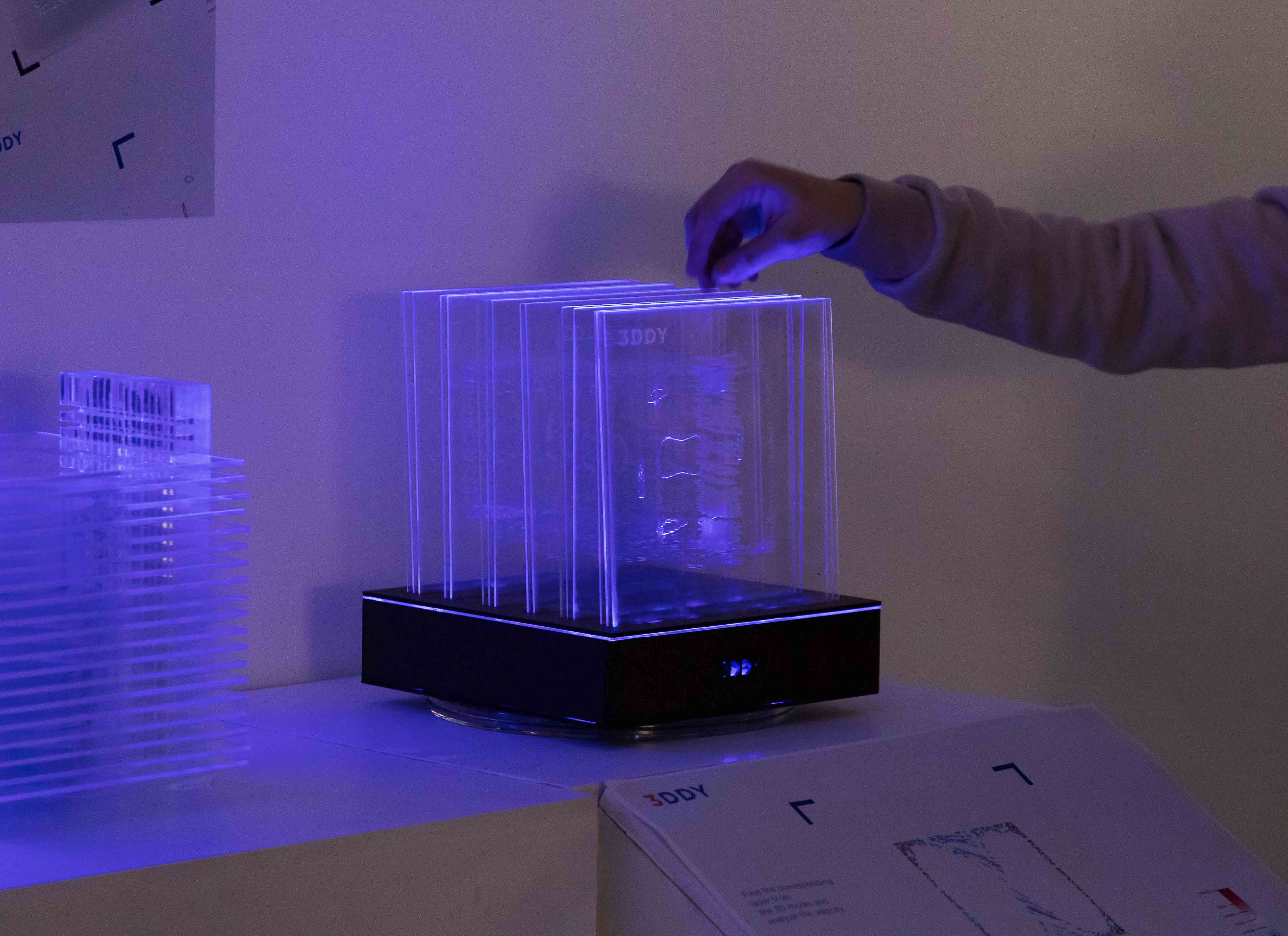
3DDY
Read moreJing Qiao and Wenyuan Xu
Beginner oceanographic students can learn about the physical properties of eddies through a lab learning process that employs 3D acrylic models which can be separated by layers and analyzed in-depth.
Inspired by Russian nesting dolls, kaleidoscopes, and science display drawers, this educational tool presents colorful slices of eddies in layers which can help students visualize eddies in a more realistic context from inside and outside.
In a learning lab setting, students can remove vertical and horizontal slices and place them on an accompanying interactive table to match what activity is happening at that specific layer (velocity, salinity, etc.). The transparent slides also give the viewer a 3D picture of eddy properties without removing slides.
The acrylic 3D models can also be created with engraved slices and lit to further add detail to the complex structure of an eddy.
 close
close
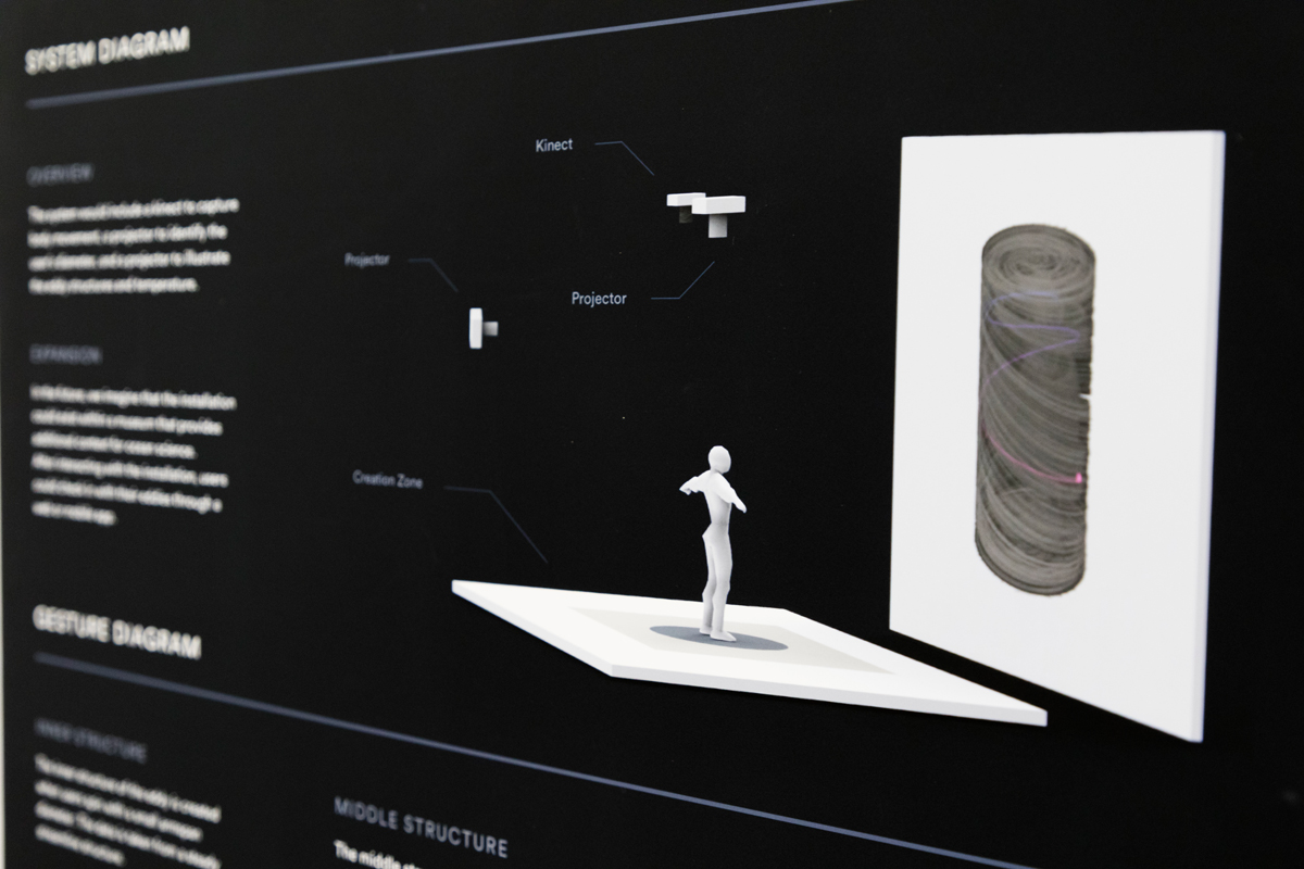
Flow
Read moreJoyce Chiu, Sam Giambalvo, Christine Ye
Students and the general public can learn about the internal structure of ocean eddies through play at an interactive installation that employs a Kinect to capture body movement and multiple projectors that simulate how eddies move and interact.
When participants enter the creation zone, a sensor is activated. By spinning and raising their arms, participants will “create” a swirling vortex eddy which will be displayed on a nearby wall. Varying the height of the extended arms, participants will see different internal images of an eddy. Coloration reveals how the eddy’s temperature depends on its depth.
Possible eddy visualization display prototypes include an abstracted version (simplified animation), low-fidelity (incorporating body movement and light), and high fidelity (precise scientific models with overlayed parcel).
Next Steps
In June, student projects will be presented at the 2018 National Academies Keck Futures Initiative (NAKFI) mid-term grantee meeting in Huntington Beach, CA.
“Previous experience has taught us that there is small window at the beginning of a science-heavy studio like this where the students will be overwhelmed and start to freak out. Some of them tried to get a PhD in the first few weeks. Our job was to rein them in and tell them to put on their user experience hat and understand the basics of what that researcher really needs – and how your design can help them achieve that. That’s a neat part; seeing the beginning stages that we have come to expect and then watching the students come out on the other side. Now they are grabbing for the important things, now they are shedding the unimportant parts, and in the end, they do end up with a vision.”
– Santiago Lombeyda, Caltech and ArtCenter faculty
“What is really impressive is that students are learning multiple domains at the same time. They are learning about marine science and learning about data: acquisition, visualizations and a spectrum of tools. On top of that, they are working with an outside partner, a subject matter expert, a real live professional scientist. And then on top of that, is the emerging technology they could choose to prototype. Put that all together and these students are learning the methodology that allows them to tackle those domains with a clear method.”
– Maggie Hendrie, Instructor and Department Chair, Interaction Design
The content is solely the responsibility of the authors and does not necessarily represent the official views of the National Academies Keck Futures Initiative or the National Academy of Sciences.