The Aesthetics of Power: What Makes Good Design
In the Spring of 2023, this Designmatters studio challenged ArtCenter students to explore the intricacies of design and what it means for something to be considered “beautiful” or “good”—and how those concepts can be incorporated into design for social change. Students examined how the study of aesthetics has expanded today beyond style and beauty to include various forms of sensory experience in relation to values, taste, and power.
Through readings and project executions, students analyzed the social forces that shape design knowledge and practice, uncovering how knowledge and resources can produce cultural, social, and ecological imbalances. Coursework, discussions, and lectures also equipped students to apply refined design and research methods to their design practices that can offer critiques with richer technical and theoretical know-how.
Project Brief
This Designmatters studio introduced ArtCenter students to the social forces that shape design knowledge and practice while examining what it means for design to be considered “beautiful” or “good”—and how that benchmark has evolved culturally and over the years.
Aesthetics are often associated with style or beauty, but students discovered how today’s thinking encompasses many forms of sensory experience relating to values, taste, and power. Through coursework, readings, and classroom discussions, students also examined how knowledge and resources produce cultural, social and ecological imbalances. Turning the lens on their own design practice, students were also challenged to apply what they have learned to create more sophisticated design thinking and research methods while also nurturing a deeper sensibility of discerning and critiquing.
“Because this was the first time this class ran, our students defined it. We just created the framework for them to plan and build a body of work. We wanted the students to create their own possibilities.”
– Arden Stern, Humanities and Sciences Faculty
Research and Project Development
At the kickoff, students were introduced to the work ahead of them—and how profoundly understanding modern design discourse can strengthen their own design practices, especially regarding social justice and sustainable issues.
Faculty Team, Joshua Halstead and Arden Stern, described how the studio would have a seminar-like format: the first half was devoted to assigned readings of historical essays, philosophical treatises, and critiques on the nature of design and the power and meaning of beauty and aesthetics. Readings and assignments would examine such questions as: Who defines beauty and/or good design? How do ideals of beauty and power change over time and by culture? How does aesthetics fit into design for social change?
Arden and Joshua described how students would engage in modules during the course of the studio, culminating in a critical making presentation. These projects would be assessed as part of a larger body of work that each student developed through the course of the studio.
Modules included:
- Power and Visuality
- The Politics of Aesthetics
- Rethinking Aesthetics
- Appropriate/Translation/Access
- Final Synthesis
Each week students had a reading assignment which led to energetic in-class discussions that often were illustrated with current events. At the end of each module, students had a creative project assignment to apply concepts to their own ideas and explorations.
Reading assignments gave students a historical and philosophical precedent and a foundation to discern how they could shape their design practice. This led to a more critical eye on design’s role in social change. Weekly readings spanned various viewpoints, theories, and philosophies from multiple global intellectual traditions, including works from Pierre Bourdieu, Immanuel Kant, Jullien François, Susan Sontag, Sylvia Wynter, and others.
Authors and essayists introduced students to concepts that could help them scrutinize the aesthetics of a particular object, system, or way of thinking. Examples; Bourdieu’s term “habitus” (social habitats), along with Wynter’s “Altruism Inducing Symbolic Kin-Relatedness” (designing social cohesions), and Rancière’s “dissensus” (unsettling uncritical links between perception and meaning).
Throughout the studio, students would informally write down thoughts, ideas, and notes along with documenting projects in their Process Book. This personal tool would chronicle the development of their critical thinking skills into their body of work.
In-class assignments provided students with additional attention to concepts presented in the readings; these hands-on activities offered new ways to observe and understand the role and nature of design—noting the ideological underpinnings of dominant design paradigms and how disruption can change that.
“Aesthetics of Power is a class foundationed on what Karen Barad calls “sensing into the abyss.” That is, as faculty and students, we occupied the spaces between “good” and “bad” design, to apprehend the contexts from which these categories of thought emerged. It’s only by sensing into these spaces of uncertainty that design aesthetics and meaning, equity and authority, in my view, can be reopened and retooled for the better.”
– Joshua Halstead, Designmatters Faculty
While the studio did not have traditional midterm presentations, they shared their assignments, explaining what inspired them from the readings and how they searched to apply those concepts to areas they felt strongly about. After midterm presentations, students continued to explore, question, and reflect on how particular readings resonated with their lived experience and expectation of being a designer. They honed-in on one possible application that could serve as their Final Synthesis, which they continued to think about and work on until the end of the studio.
Additionally, students cooperated to create a rubric to grade their final Synthesis projects. They also continued adding to their Process Book and composed a written statement summarizing their thinking as it relates to their final synthesis.
Accompanying their final synthesis would be an annotated bibliography showing which readings/concepts guided their design thinking.
Outcomes
 close
close
The Tree Test
Read moreKerry Lee
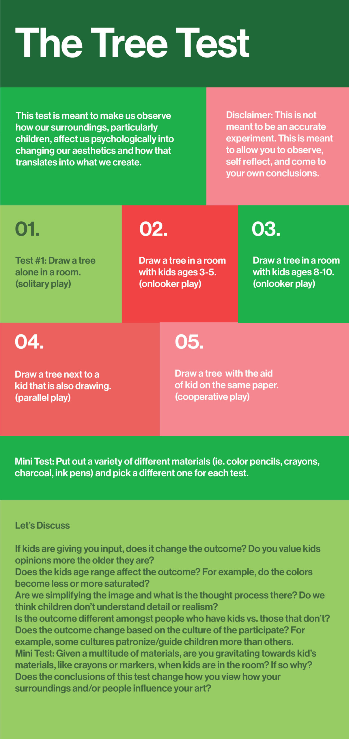
“I took this idea of the 'norm' and how we decipher aesthetics and developed it into my synthesis project analyzing how we are affected by those around us into shifting our aesthetics.” This project is designed for adults to observe and think about how creating art is affected by interactions with children. An infographic describes the Tree Test but purposefully does not include any illustrations. Five scenarios depict how an adult could draw a tree in various settings involving children: solitary play, onlooker play with younger children, onlooker play with older children, parallel play, and cooperative play. An additional, mini-test affects adults choosing different mediums to create art (crayons, markers, charcoal, etc.) which could correspond to how children are present. Discussion questions relate to observational recognition of choices made in creating art.
 close
close
Los Angeles Architectural Design
Read moreBridget Fischer-Linkogle
“This project imagines that if, instead of the current streamlined globalist architectural style that strips away cultural roots often reflecting colonial histories, urban areas embrace different styles of its immigrant populations, indigenous peoples, and native flora and fauna.” With the help of Artificial Intelligence (A.I.) Generative Imaging software, Bridget presented initial concepts on how the Los Angeles architectural style of bungalows, Spanish and Mission revival homes, and glass high-rise office buildings could echo the natural individuality of the area.
 close
close
Maps are Errors to Arrive at Truth
Read moreNastassia Meija
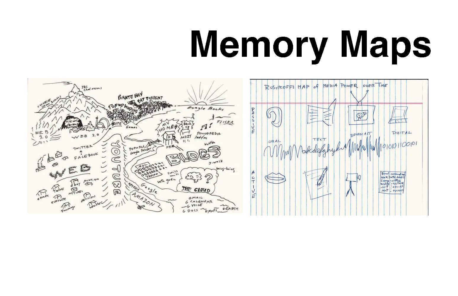
“By creating opportunities for community engagement and communication, we can use aesthetics to promote social cohesion and inclusivity.” To guide people to special locations in Miami, the tour guide and a series of interactive maps—including a series of text messages—will help visitors witness the local beauty. This interactivity highlights historical aspects vs. personal stories; some walks feature locations of colorful lifeguard stations along the beach, suggested shopping/eating in a four-block radius, and mango trees in lower-income locations.
 close
close
Space/Thought/Aesthetic Sculpture
Read moreCyrus Froning
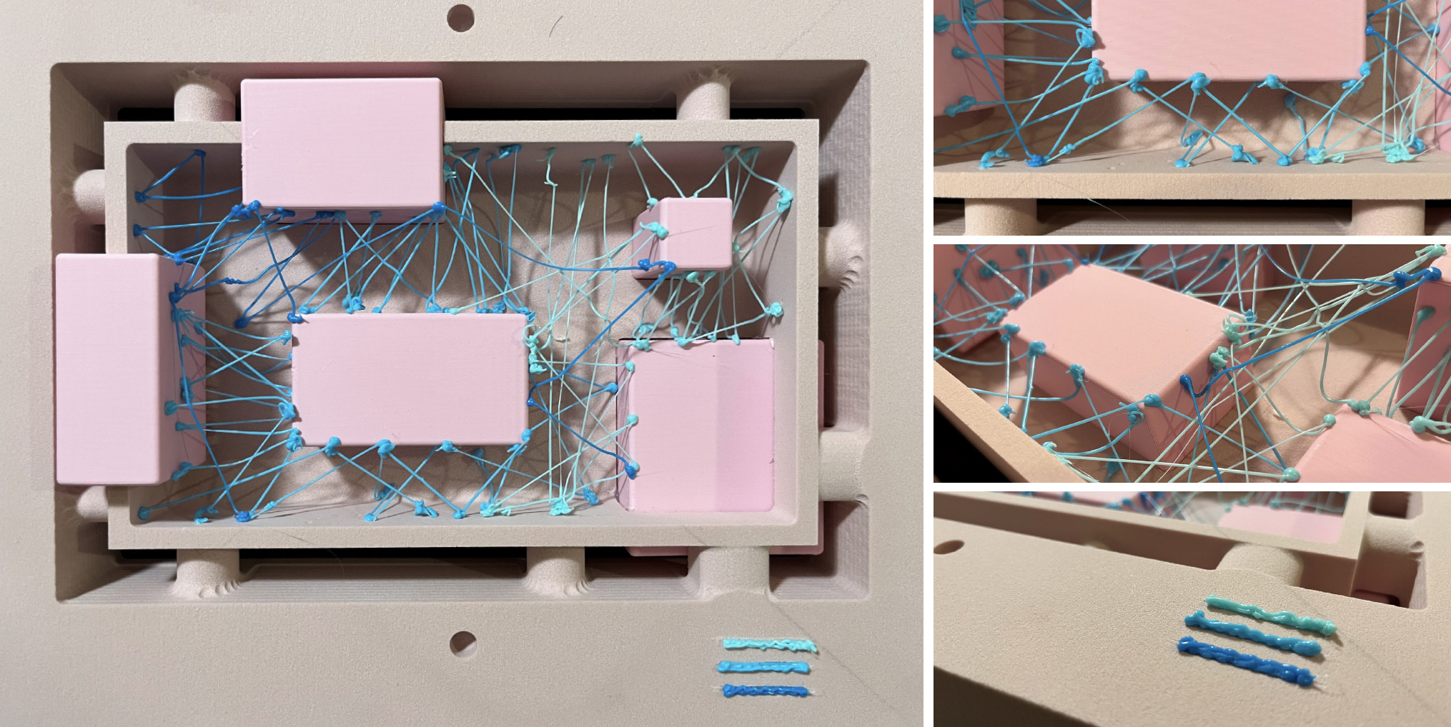
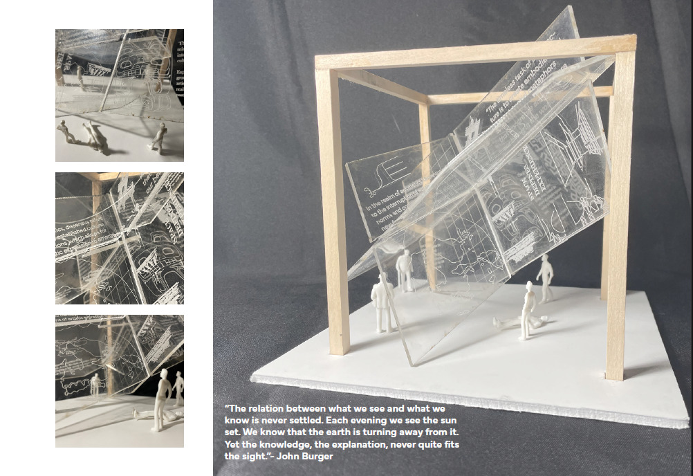
“This exploration in form and analysis was the synthesis of my attempt to realize a space that explores the complex relationship of aesthetic and culture while minimizing my own biased desires for form and function.” Distilling the intersections of space, thought, and aesthetics, this project imagines a physical form that can be interactive as the concepts it's trying to present. The resulting transparent, 3-D sculpture incorporates overlapping and interplay of elements, symbols, and text to create the three representational planes.
 close
close
Plato’s Cave
Read moreRebecca Brown
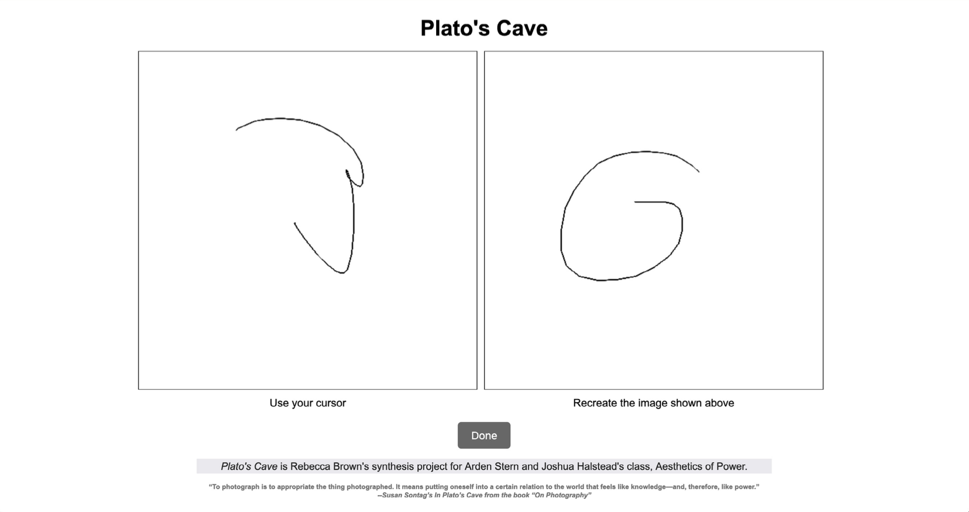
“The retelling and reiterative nature of this project shows how recreation and memory are not reliable in an objective way but consider that it is reliable in a subjective manner.” This project explores how stories, concepts, and ideas are changed as they are handed down over generations. Generating interpretation and responses, a website provides an image that the first user picks from a previous answer. The next user must create a reply based on the first user's re-creation of that image. The underlying question is how long can users keep the original image “alive”? How does imagery change?
 close
close
Syntheses Project
Read moreJingyi Ge
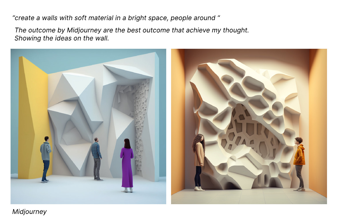
“I want to use Ranciere's view that the aesthetic revolution will liberate art from rules and destroy and innovate traditional norms, while Julien's view is that Chinese art and literature must conform to specific types and conventions. I want to integrate their views. Can I use ‘innovation’ to destroy the regulations of tradition?” This project explores how by disrupting a form, you can change its meaning. Using walls as the conventional form, a new construction design was inspired by how acoustic walls can change the sensory identity of the environment. Pushing the concept further, walls can be created out of soft material and placed in a light space to alter the environment and mood, which, in a library, will invite visitors to fall into the wall with a book. AI sketches show texturally pleasing possibilities.
 close
close
Life Pattern
Read moreShupeng Jiang
“By acknowledging the irregularities, imperfections and pressures of young people's lives, we can create designs that celebrate and empower them, rather than trying to impose narrow cultural norms of value.” Inspired by the pressure-filled lifestyles of young people, this project began with exploring how concepts and items that are considered ugly or unconventional can be treated as beautiful or valuable. The workspaces of young people often are filled with empty soda cans, cups, and glasses, which leave damaging water stains on work surfaces, but when examined closer, these stains can be abstractly beautiful. The stain design can be transformed into a 3-D eyeglasses lens, a response to young people’s dependency today on viewing screens.
 close
close
Grandparent’s Photos
Read moreLuke Sacapano
“With her camera, Diane Arbus asked which aspects of these more traditional families could survive. What bonds of affection could remain intact? What forms of community could be gleaned from them? Or, conversely, what final vestiges of an earlier family life needed farewell?” This project explores how photography captures what Walter Benjamin describes as an “aura,” a strange tissue of space and time." Taking old photos from his grandparents’ collection, the student restored the images, adding his own manipulations for a projection show. By examining the subjects and their relationship to the photographer, the student found images of community and affection which gave him insights into his journey and provided inspiration to tell his own stories more authentically. Having a visual record of his family history connected the student to how his Filipino American grandparents valued and interpreted the “American Dream.”
 close
close
Experimental Art Piece: Surveillance
Read moreSybil Ye
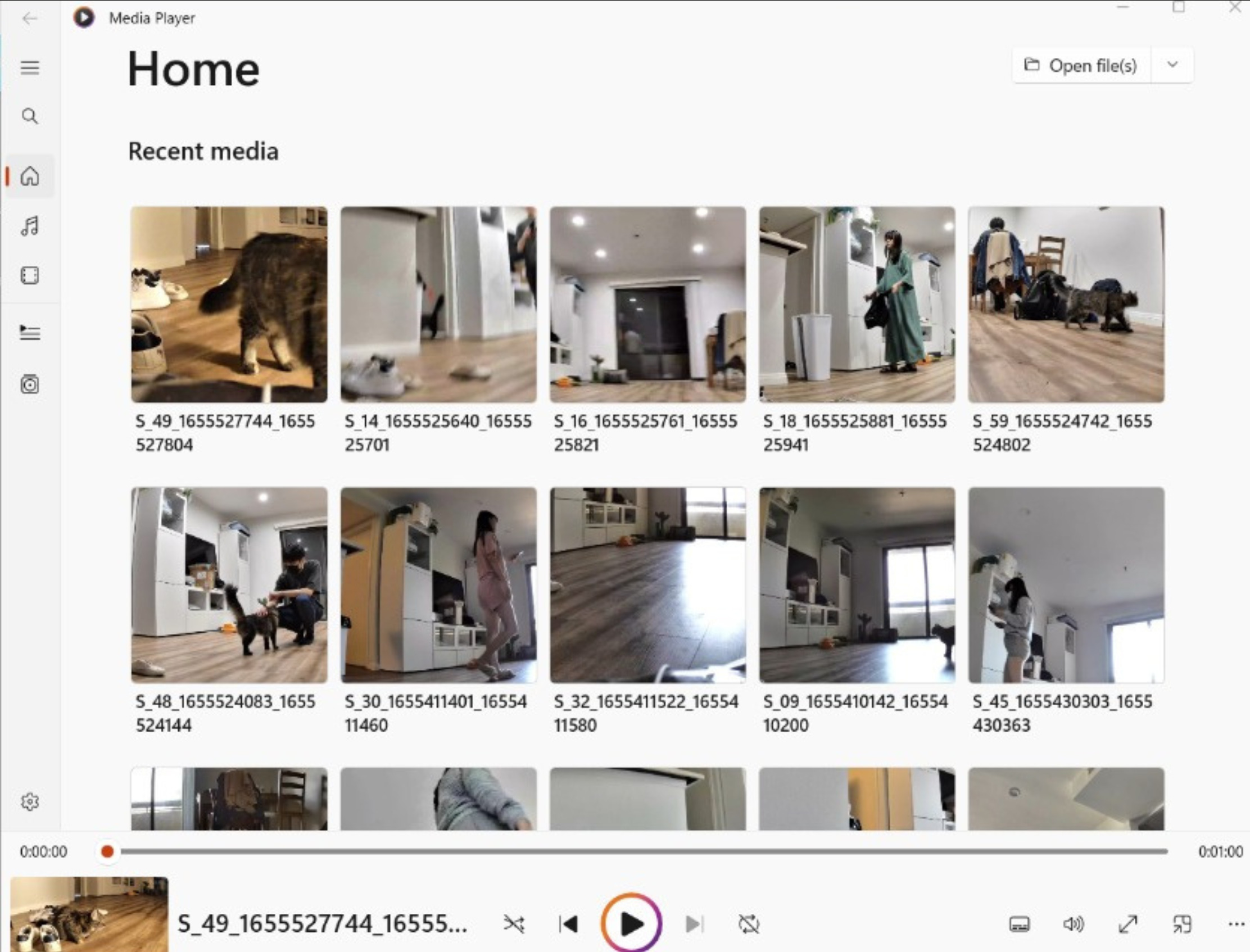
“This experimental art piece explores the nature of surveillance and self-perception through setting a camera in my room… to capture a candid and unguarded depiction of my daily life.” This project explores the relationship between self and the social norm—and how self-perceptions are shaped by the presence of the camera. To embrace the unexpected, this work challenges assumptions about the nature of surveillance of the self. Using a bedroom as a mirror of our true selves, this compilation of moving images shows the student among piles of clothes as she organizes, declutters, and moves through daily activities. Insights include how the student felt more self-conscious when the camera was on, and even though she frequently noticed the camera, she came to the conclusion that it was easier to “get used to surveillance than I expected.”
 close
close
Looking at “Barrio” Aesthetics in Los Angeles
Read moreEnea Sernesi
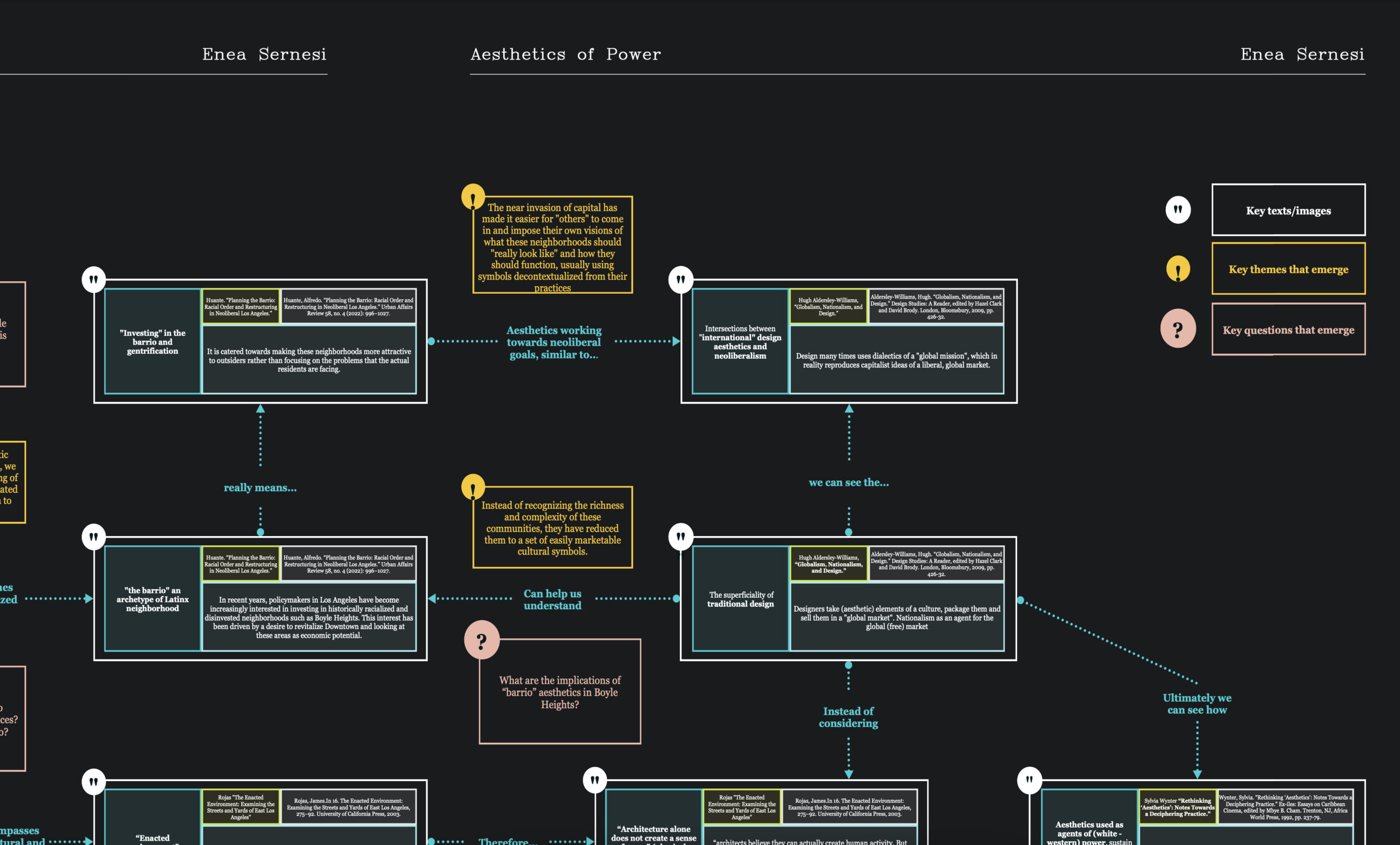
“How can design be a decolonizing tool? I want to map the texts that we have been engaging in class and reflect on the ways they can help me rethink my design process.” To explore the ways that Latino Urbanisms are manipulated by forms of power, this exploration asks: What are the implications of “barrio” aesthetics? What is being manipulated? Who benefits from altering cultural aesthetics? Found in areas of East LA and Boyle Heights, Latino Urbanisms are “ethnic enclaves,” sources of social connections, spaces that adapt to community needs, dynamics, and rituals. City leaders and developers want to invest in these historically radicalized and disinvested neighborhoods for economic reasons. The aestheticization of Latino Urbanisms as "The Barrio" often leads to gentrification and a colonization of meaning. Planners and policymakers have effectively agitated against and ignored the lived experiences of the people who call these neighborhoods home. Instead of recognizing the richness and complexity of these communities, they have reduced them to a set of readily marketable symbols. Some examples include: how cashless businesses are discriminatory to those lacking digital assets and visual elements (e.g., murals) that recycle in-group aesthetic tropes toward out-group, commercial gain.
 close
close
Algospeak
Read moreJanine Hernandez
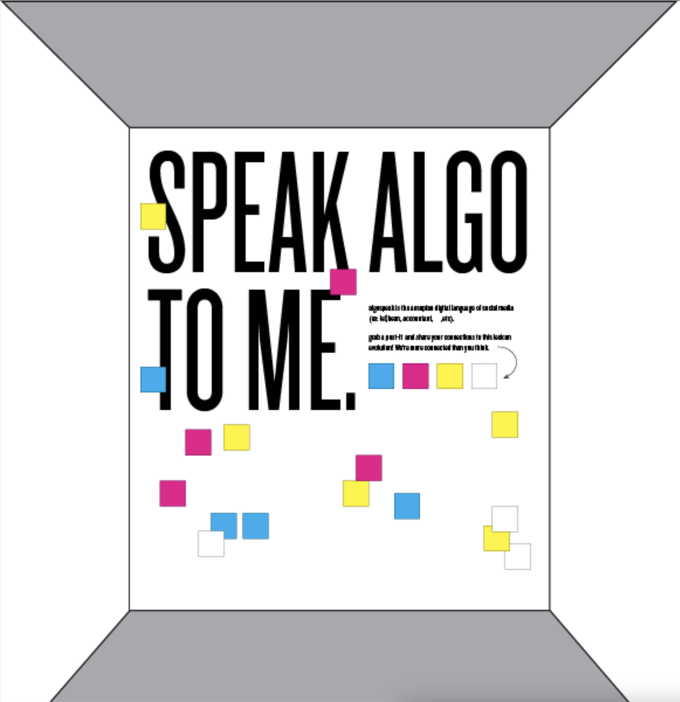
“How do you make something about the internet, for internet users, without actually using the platforms they heavily rely on?” To avoid getting posts removed or down-ranked by content moderation systems on the internet, social media users have embraced Algospeak, which embodies code words, emojis, and turns of phrases to create a brand-safe lexicon. To create a compendium of Algospeak without affecting algorithmic learning patterns, this project imagines a physical (yet, interactive) installation space that encourages participants to write on post-its and share emojis, stories, or other contributions related to Algospeak and its politics of use.
 close
close
The Role of the Designer
Read moreGrace Johnson
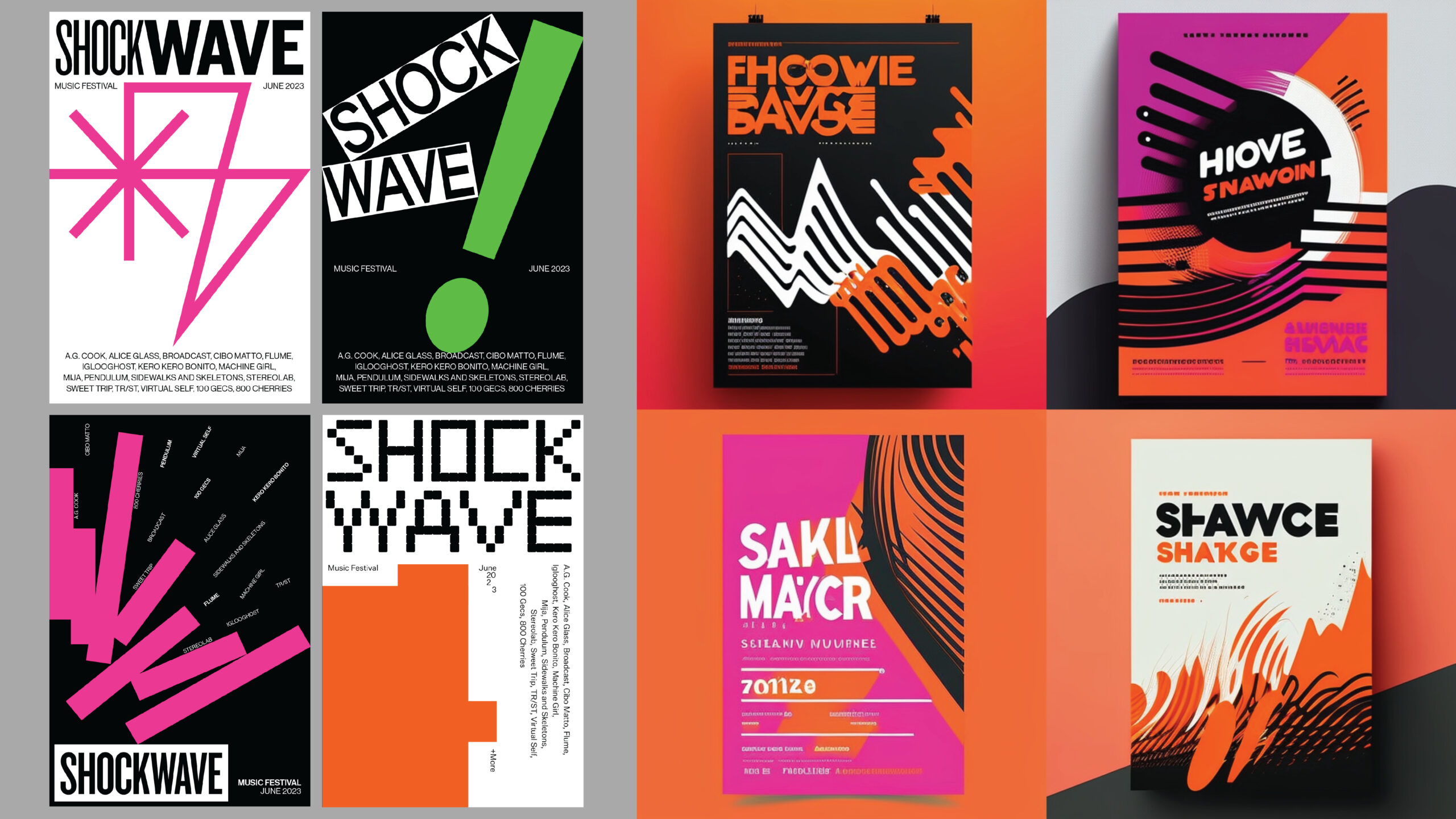
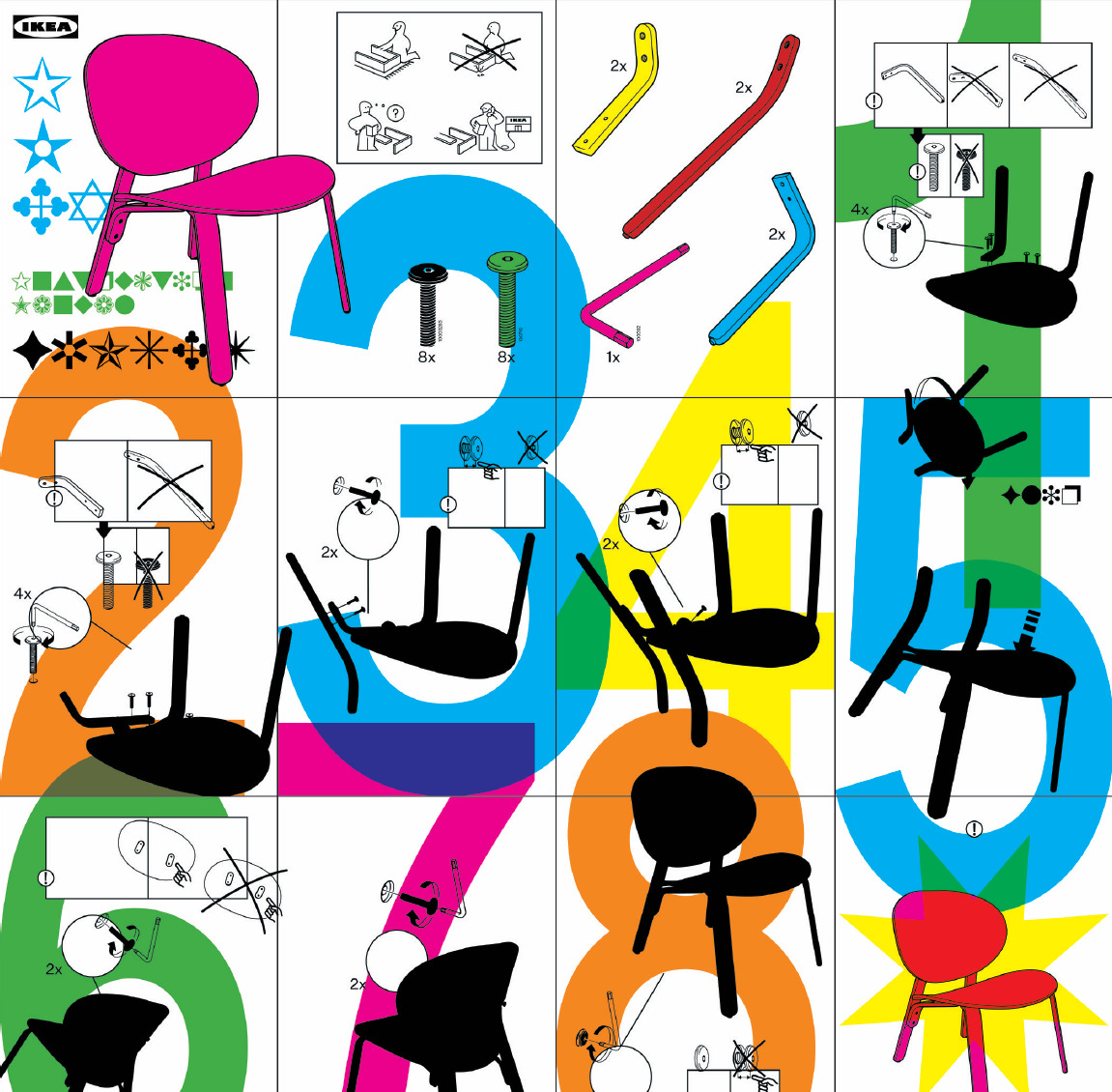
“With these projects, I critically examine the evolving role of the designer and how I can use my skills to challenge existing norms and subvert dominant paradigms… All of these pieces come together to demonstrate the potential for design to raise awareness about systemic biases and inequalities. I have found new meaning in being a designer and envision a future of inclusive, empowering design.” Questioning current design standards’ authority, these graphics series present concepts and themes in explorative designs. The first is to discover if AI can design a music festival poster; the resulting imagery features bold graphics, energy, and excitement. Today’s marketing practice of appropriating aesthetics languages from specific communities, such as Indigenous, Black, and/or Queer aesthetics, interrupts the self-determination of narratives, images, perceptions, and, consequently, power of the groups in which insider cues have been exploited. To counter that practice, window dressing designs and posters call attention to how Pride’s rainbow aesthetics are being commercialized. Finally, ornamentation has often been conceived as either frivolous or shallow. Exploring the tension between decoration and minimalism, this student critically retooled a user’s manual for an IKEA chair, leveraging ornamentation to enhance reader comprehension and the assembly process. Of course, decoration was not totally reduced to an instrument of utility but, instead, was deployed to highlight modernism and how, over time, it has institutionalized and habituated boundaries for dominant design norms, cultures, and rituals.