Words in Exile
- Social Entrepreneurship
Summer 2016
In partnership with ArtCenter’s Hoffmitz Milken Center for Typography and with a grant from the Autodesk Foundation Fund, the “Words in Exile” studio challenged students to effectively communicate the plight of worldwide refugees by creating social issue text and imagery designs using the hand-crafted art form of type-setting and letterpress printing.
This project was made possible in part by support from the Designmatters Educational Program Grant from the Autodesk Foundation.
Project brief
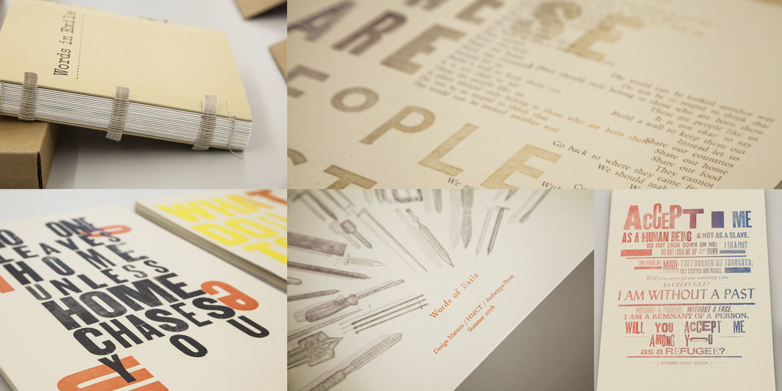
“Words in Exile” provided students opportunities to learn the process of traditional letterpress printing by hand-setting metal foundry and wood types on vintage printing presses. Embedded with a social topic, the studio further challenged students to visually interpret the words of refugee writers and poets to create thoughtful and humane portraits of the refugee experience that often included a call to action.
Guest experts shared insights and experiences with the students on the harsh realities of life as a refugee; students also explored the topic via news articles, podcasts, governmental reports, literary writings and other artistic expressions.
“What becomes of the individual voices of the displaced as they lose not only their homes but often their cultural identities? Words in Exile is an acknowledgement of these voices. It represents the visual interpretations of the prose and poetry of the displaced, which have been meticulously hand-set in foundry metal and wood type, and then letterpress printed. It is a small, yet permanent and tangible testament to their continuing struggle.” – Gloria Kondrup, Professor and Executive Director, Hoffmitz Milken Center for Typography
“We hear that millions of people are being displaced and we don’t have any context for what that truly means. When you wrestle with numbers that big, you have a tendency to glaze over and it goes right pass you. We take data and actually make it something that a human being can relate to – that’s the power of art and design.” – Margaret Jensen, Instructor, Archetype Press
Background
The Refugee Crisis
The volume of people displaced by war, conflict, religious and political persecution and natural disasters today has hit a record high: 65.3 million people globally are currently displaced from their homes, according to the United Nations Human Rights Council. Since the beginning of the recent Syrian conflict, the pace of the refugee crisis has intensified and millions of men, women and children around the world face an uncertain future.
On the average, a refugee lives outside of his/her home country for 17 years, according to another United Nations study. Some countries and residents welcome displaced individuals and families; others are leery of opening their doors and sharing resources to outsiders.
Archetype Press
Acquired in 1989 as a letterpress printing facility at ArtCenter, Archetype Press is a unique creative resource for the college and community as students learn and practice the almost-forgotten meticulous skill of setting type and printing by hand.
Featuring rare American and European metal foundry type, wood type and ornaments kept in 2,500 wooden drawers, Archetype’s collection is the largest in California and one of largest of any design school in the country. Students learn to set and print type on a variety of historic printing presses, discovery the heritage and cultural history of typography, print culture and book arts.
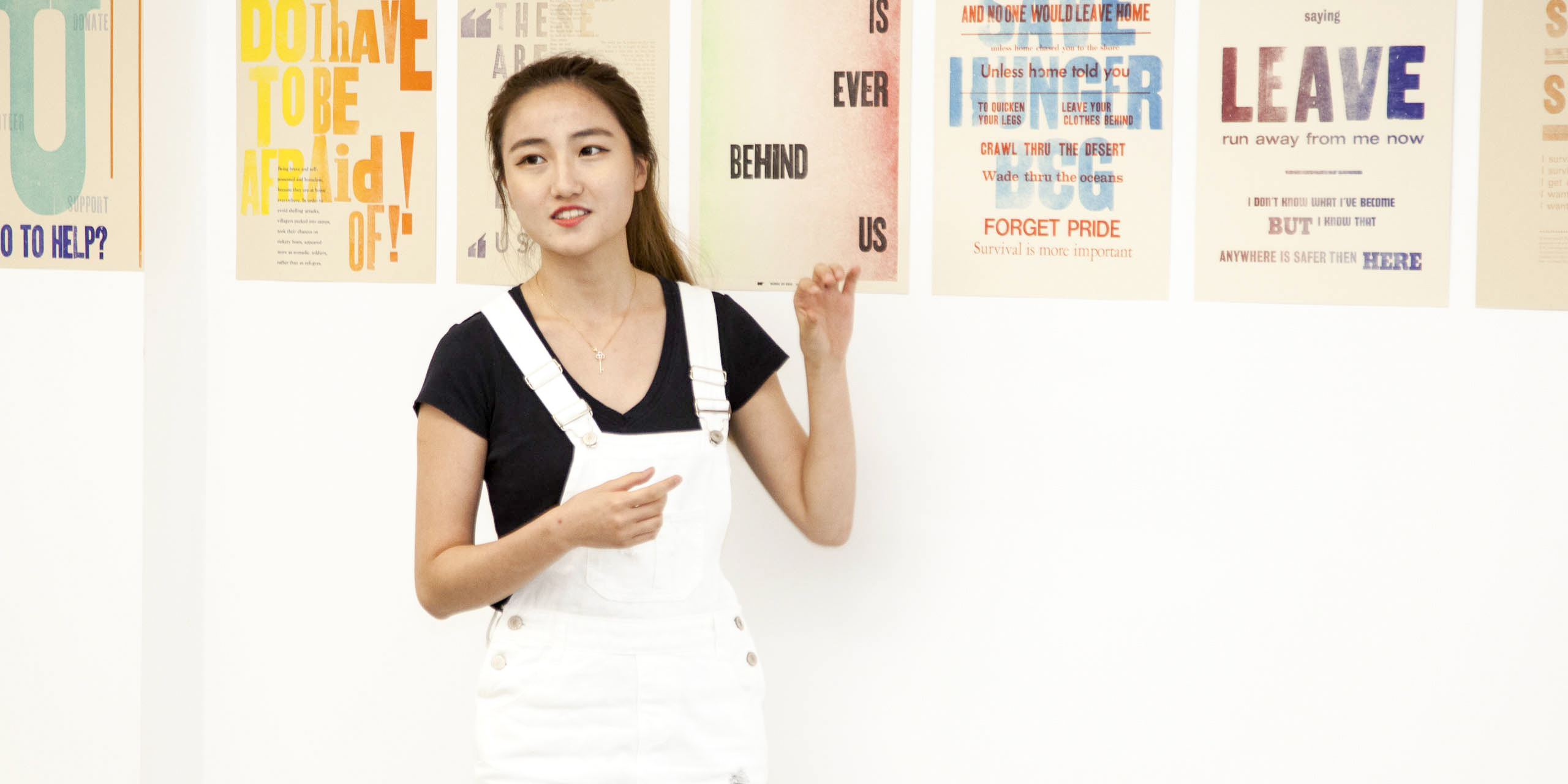
“All refugees have such different stories. My project involved a woman who thought she didn’t feel beautiful here…and that corresponds to my own background because I am an immigrant and I know how she felt. You try to fit in, but you are in between cultures and you have to learn to see if you can balance the two worlds.” – Lulubi Garcia, Student, Graphic Design
Research and Project Development
For the first four weeks of the studio, students were introduced to the painstakingly detailed process of setting type and hand printing on the center’s vintage presses. For students familiar only with the ease of digital composition – where changes can be made with a single mouse click – the letter-by-letter placement challenged them with patience, persistence and a steady hand. Many students observed that the intensely slow practice became meditative in nature, allowing them to reflect deeper and more intimately on their subjects.
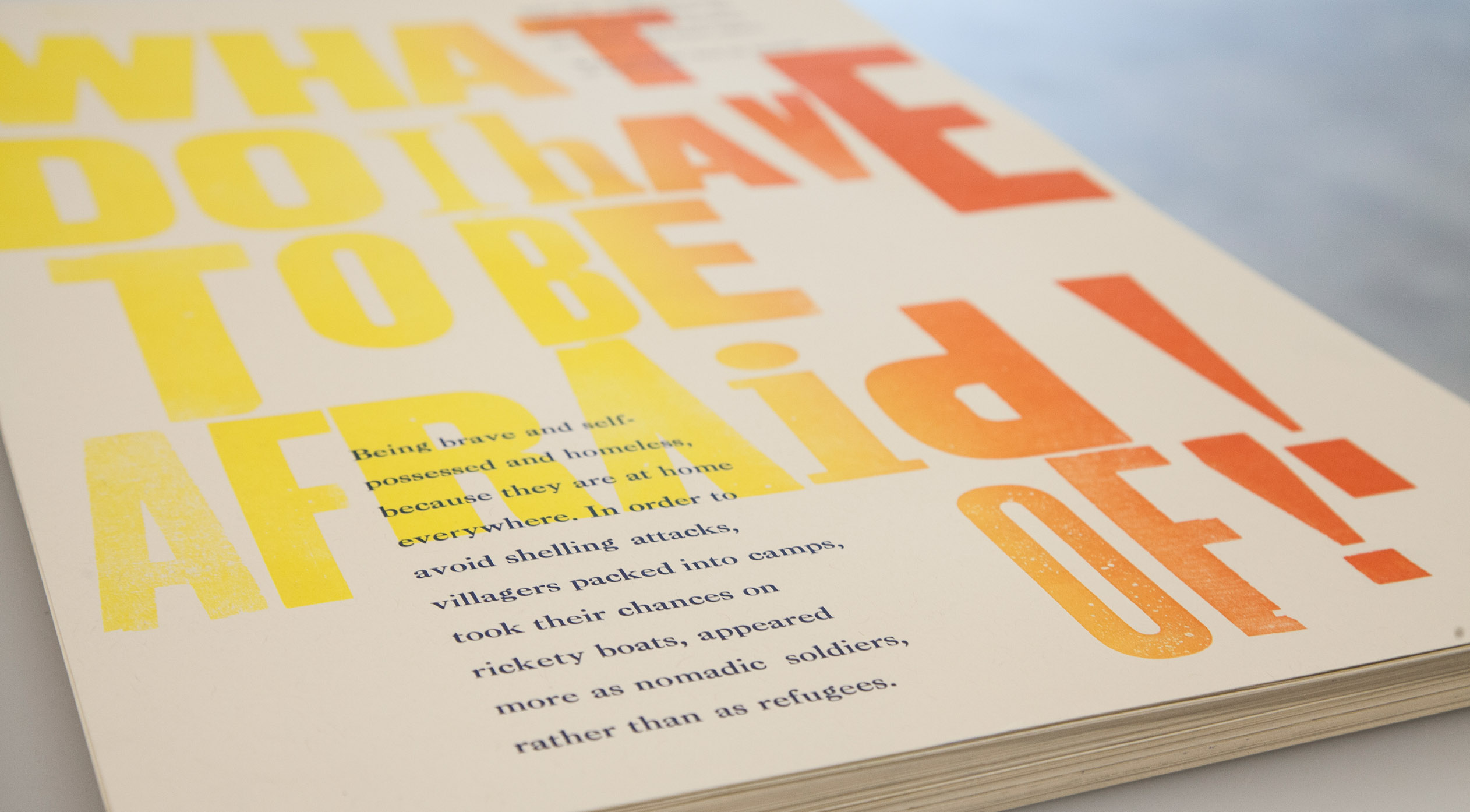
One of the first exercises for the students was to set type using a word often associated with the word “refugee” (such as outlaw, exile and ostracism) along with a definition. Through these and other hands-on experiences, the students learned the mechanics of spatial use, coloring and the relatability of type and words on a page.
Students also discovered the various historical forms of letterpress, including the stylized broadside. The large, poster-like broadside was used regularly in the early days of American printing and was extremely popular in communicating ideas and provoking responses.
Knowing that the role of the artist is often to communicate social issues, the instructors directed students to delve into the dense topic of refugees through research, reading and a trip to the view the exhibit REFUGEE at the Annenberg Space for Photography in Santa Monica.
Students conducted copious hours reading articles, digesting complicated refugee statistics and watching video interviews with refugees who told, in their own words, personal stories of loneliness, sadness and the risks that they and their families have taken.
A panel of guest lecturers visited the classroom: Martin Zogg, Executive Director of the International Rescue Committee; Kerry Khan, Casework Supervisor with the American Red Cross Restoring Family Links initiative; and Elena Dorfman, artist/photographer from UNHCR (United National High Commissioner for Refugees) who documented the recent refugee crisis in Syria. Through their personal experiences and testimonies, these experts helped inform the students about the plight of modern day refugees.
Classroom discussions involved refugees throughout history, including the current Syrian crisis, the concept of nationalism and the meaning of freedom. In addition, students examined the emotional message of how artists and writers have presented the subject. Students selected for their two class projects a particularly moving excerpt from a poet or author who discussed the refugee situation.
The overarching lesson in the studio was that typography is a tool to shape content and that the artist manipulates various elements of the craft – hierarchy, emphasis density, the use of positive and negative space – all to serve a compelling communication vision.
“We all do this work mostly in anonymity. Only recently have refugees been on the front pages. To see young people and an institution make a commitment to my life’s work, and see it reflected so beautifully and succinctly and to have them put their finger on the emotion that’s associated with this work, is extraordinary. I didn’t expect how powerful and overwhelming to see those words presented that way. We focus so much on the nuts and bolts of our job that we don’t allow ourselves to experience the emotion of it, even when it’s presented to us. You can’t do it every day. You would get burned out. These students were able to learn and reflect in such a powerful way.” – Martin Zogg, Executive Director of the International Rescue Committee
Project Outcomes
 close
close
Words of Exile: Book & Poster
Read more
Students employed their new skills of typesetting and hand-printing to create two final projects for the studio: a large broadside poster and smaller pages to be compiled into a book. Students visually interpreted select phrases and literary excerpts to create thoughtful, challenging and humane portraits of refugees as real people and not just faceless statistics. Students were encouraged to have their two projects complement each other using the same design voice, color, tone, style and typography. The resulting “Words of Exile” book features a short class description and student work. Hand-crafted with an exposed spine and French stitching which gives the volume a raw, unfinished feel, the small-sized book was designed to be portable as if a fleeing refugee would grab and carry in a moment’s notice.
Next Steps
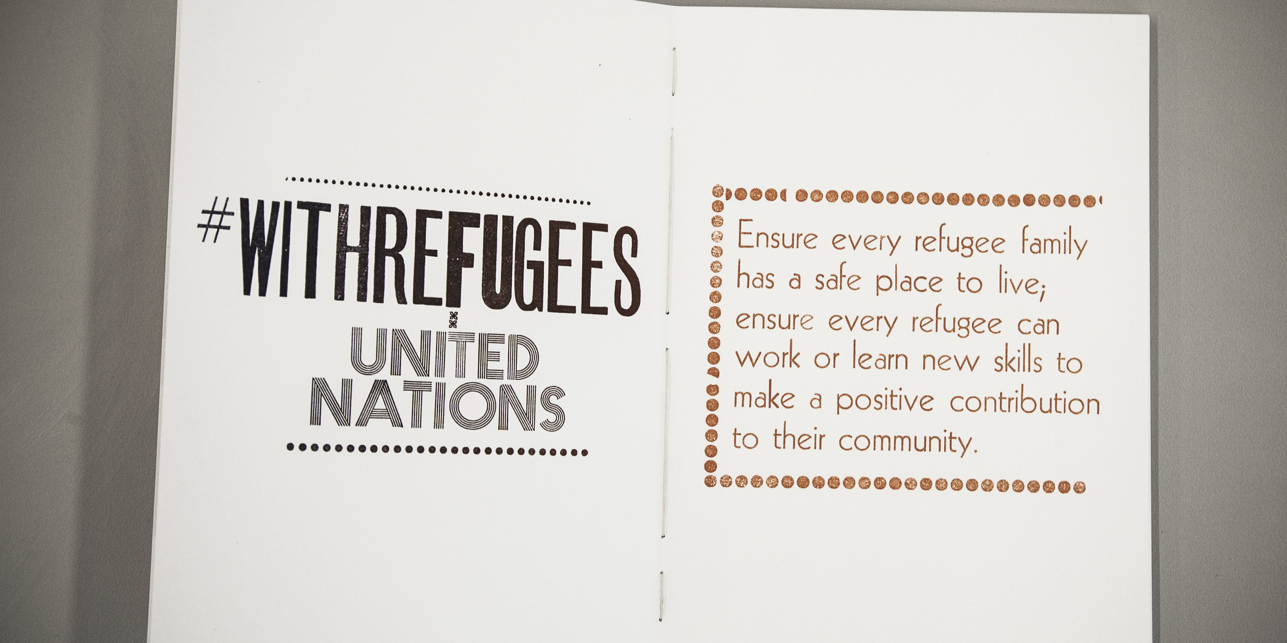
A limited number of the hand-crafted “Words of Exile” books will be sold with proceeds donated to the International Rescue Committee.