Branded: How Brands Shape Ideas, Identities and Society
- Social Entrepreneurship
This Designmatters studio in Fall 2022 invited students to decode ideological aspects of brand messaging and values to learn how brands shape personal and collective identities.
Lectures, readings and stimulating presentations from experts, scholars and practitioners provided students with a deeper understanding on how factors such as psychology, politics, race and gender reveal how brands contribute to the production of subjectivities as much as market value—redirecting analysis toward branding as a binding agent of identity.
Throughout the studio, students worked on group projects involving dismantling and reconfiguring strategies for popular brands; they also produced a campaign-style agonistic brand with the goal of provoking justice at multiple scales.
“My background is branding and marketing is very formal, but I’ve always been a skeptic… What I’m taking away from this studio is yet a more critical lens when it comes to social, cultural and political viewpoints. But what was the most interesting—and unexpected—takeaway was I ended up being more hopeful and feeling more proactive.”
Leigh Hoffman, Faculty
Project Brief
Transdisciplinary ArtCenter students delved into how brands shape personal and collective identities by decoding ideological aspects of brands, understanding their anthropological impacts and learning strategies for (de)branding to highlight sociopolitical inequities. Originally coined in Brand Psycho: The Hidden Psychology of Brands by Max Jakob Lusensky, (de)branding is a methodological approach to deconstructing the psychosocial games advertising plays in service of garnering attention and brand loyalty. In practice, students took (de)branding a tick further by using their newly honed sensitivity to subvert popular brand systems such that commonplace campaigns became canvases for experimentation.
Research and Project Development
For the first half of the studio, instructors discussed and provided readings as well as assignments that examined such questions as: who defines brands? Who gives brands power? Who is depicted in these images? Who do they exclude? What kind of lifestyle does this brand portray? As designers, students need to understand how their own identity and experience play into their practice and creations; how their own brand thinking contributes to a collective identity that can either open or close possibilities.
Today a brand is more than just the company that creates a commodity; it’s often presented as a symbolic or even spiritual choice for consumers—but many times, the sociopolitical factors that created that product or service are overlooked. Too often, the promises the brand offers—freedom, love, empowerment—are not extended to the (overseas) workers that created or delivered the product.
Among the topics discussed was the concept of lovemarks, a relatively new idea based on a brand image that is often the first choice of its target audience because of emotional bonds. Students began to understand the power that brand connection can be, especially when it came to their favorite or go-to brands.
As part of their midterm review, student teams were assigned to create a project for a (De)Brand Gallery, employing a branding method discussed in the article “Brand Neurosis” by Max Jakob Lusensky. This project would be completed in less than seven weeks
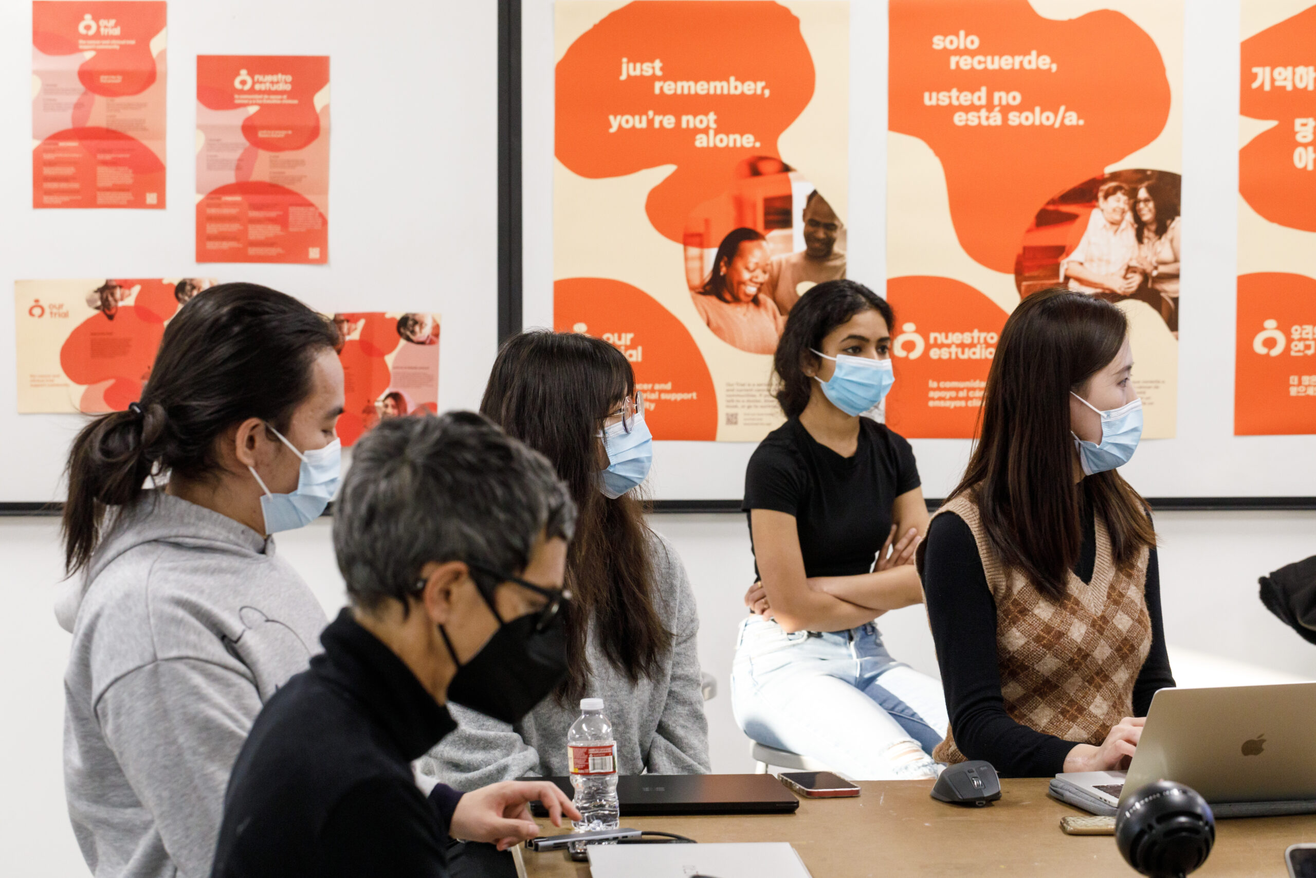
“To me, this project taught me to…see social movements or history in critical ways. We put methods and results side by side to… think deeply and reflect on our insights. The second thing this taught me is that negative and radical ways of doing things sometimes will provoke rebellious mentality. Therefore, positive ways can achieve the goal more effectively.”
Shirley Lyu (Product Design)
ArtCenter and Designmatters Minor alum Cosme Cruz-Ramirez conducted a workshop on inverse ideation which showed students that examining the opposite of a brand’s image, value and voice can be a helpful tool for designers. Likewise, an intensification of a brand takes an aspect of that brand and pushes it to the extreme—and also offers new possibilities.
Numerous speakers came to the studio to discuss their specific relationship to branding. Artist Lauren Williams discussed with students how to create a theoretical practice through design. Williams often investigates Blackness, identity, and social fictions to examine how racism is embedded into institutions.
Williams shared three important questions she asks when she reflects upon her own projects or assigned projects:
- What questions/methods/orientations did I bring to this work because of/through my identity?
- What does it look like for me to design through a critical lens?
- How did the texts I was working with inform/influence this work?
Williams detailed how to bridge identity, theory and practice, often honing-in on specific words that describe the topic of the proposed work. These pieces of text help William’s traffic from thought to thought, contemplating the many meanings they afford. From these descriptions, Williams can examine possible responses, absences, and more. Words and phrases often become instrumental elements in Williams’ final art.
In addition to in-class work and assignments, teams worked on their midterm presentations. Instructors reminded students as they thought about and examined brands, to pay attention to their own brand biases, how their identity might reflect their sociopolitical position(s) and how those elements could be manifested in their own theoretical practice made manifest in each unfolding week.
The (De)brand Gallery at Midterm
At midterm, student teams unveiled their (De)brand Gallery to peers, stakeholders and other interested audience members. Students shared the historical, social and cultural backdrop of their chosen brand through a descriptive (logo, color palette, imagery, etc.) lens and then with a critical lens, which analyzed the brand alongside social, cultural and political layers. Students showed how the brand has changed over time and how it has morphed to maintain relevance and consumer attention.
Then teams shared how they mixed up and/or intensified relevant elements to reinvent the brand, often with purposes completely different from the original brand’s intention. By reconfiguring elements—and presenting contradictory messaging, they presented new meanings and possibilities.
Some of the brands students presented included: REI, Disneyland, Lego, IKEA, Toyota, Shein and Coca-Cola.
After sharing their experience, students reflected on what this exercise taught them about their own lens/experience. How does breaking down a brand help my creative process move forward? How could this methodology be applied to issues of social movements and justice? How does my personal identity fit into my creative process/thinking? Students also reflected on aspects of their own identities that the brand omits, such as race, class, age, gender, and sexuality.
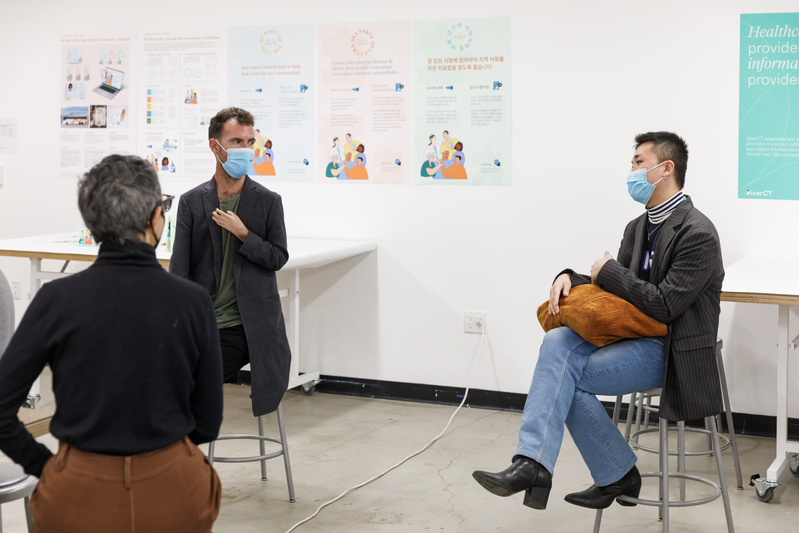
“Through (de)brand’s reverse thinking mode, we can analyze this brand from a more profound and thorough perspective. Compared with the usual boring analysis of branding research, this is almost a playful form to make the whole work more interesting and vivid… I got a lot of pleasure out of these designs and exercises.”
Weide Zhang (Interaction Design)
Presenting to an audience gave the students the opportunity to explain the process deeper and its meaning for their design-thinking, offering the students a richer sense of ownership of their project’s ideation and outcomes. Moving forward, students continued to investigate brands and their relationships with social justice issues and how brands influence popular thinking about social movements—topics that would be integral into their final projects.
Student teams chose a social justice issue and then decided to either create an extended (de)branded version or imagine a new campaign in support of a movement. Once they settled on a topic, students found possible interviewees who could elaborate on challenges and offer insights. Students crafted a list of questions for their interviewees that would open up opportunities to their ideation process.
In the classroom, active discussions on important readings expanded the students’ concepts of brands. In-class presenters also shared important insights about branding and its impact on modern society. Brand expert Debbie Millman offered an overview on “Branding for Social Change” and how today’s democratization of brands has the power to bring people together for the benefit of humanity.
George Aye, co-founder of Greater Good Studio, offered a talk about the ethics of the design workplace “Quiet Little Voice: When Design and Ethics Collide.” Aye used examples and challenged students to understand that currently there is no system of accountability when it comes to working on potentially unethical projects. Designers need to rely on their conscience. “Does design serve mankind? No, it often serves businesses,” relates Aye who shared an email when he “broke up” with a client that his company didn’t share similar values with.
“I came to the realization that when I develop a brand—from the logo and brand name to the target audience and the identification of the brand’s fundamental values—I am, in essence, creating a relationship between the brand and its audience and the value that the brand can offer.”
Harper Chen (Graphic Design)
Finally, Hillary Haley discussed social psychology using examples from her current advertising work with big-name brands in a talk, “Branding and Identity, Applying a Psychological Lens.” Haley shared how human brains process messages and the overall goal of marketing. With so many stimuli surrounding us daily, marketers must appeal to audiences who are often on autopilot. In fact, Haley shared that 95 percent of human perception is on a subconscious level. To get past those filters, marketers find messages that are novel, emotional, relevant and even threatening. Among the other information Haley shared is that knowing your target audience, and maybe creating a new identity for them, is one way of attracting brand ambassadors.
Taking in all they have heard, read, experienced, student teams kept modifying their projects and incorporating feedback from instructors to make sure their concepts were in line with the team’s overall objectives.
As before with the mid-term projects, students had less than seven weeks to create this campaign, but their enthusiasm for flexing their design-thinking muscles in new and interesting ways kept their motivation high.
Outcomes
 close
close
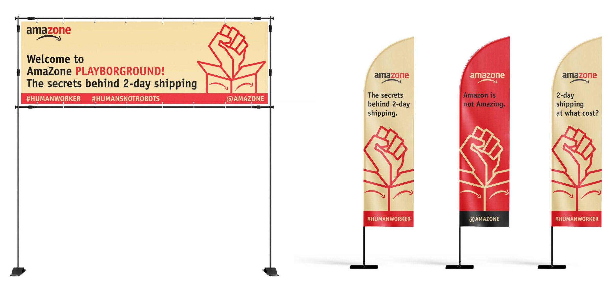
Labor Ethics: The Amazon Playbroground
Read moreKalex Shen, Lauren Lee Johnston, Ansel Warerly Lisaka
Responding to the ongoing history of unethical working conditions, this project imagines an interactive pop-up experience where visitors can “recreate” working at an Amazon warehouse to experience the harsh realities that face employees daily.
This light-hearted parody seeks to raise awareness about a serious subject and calls for action in unionizing workers (for employees) and boycotting the service (for the general public).
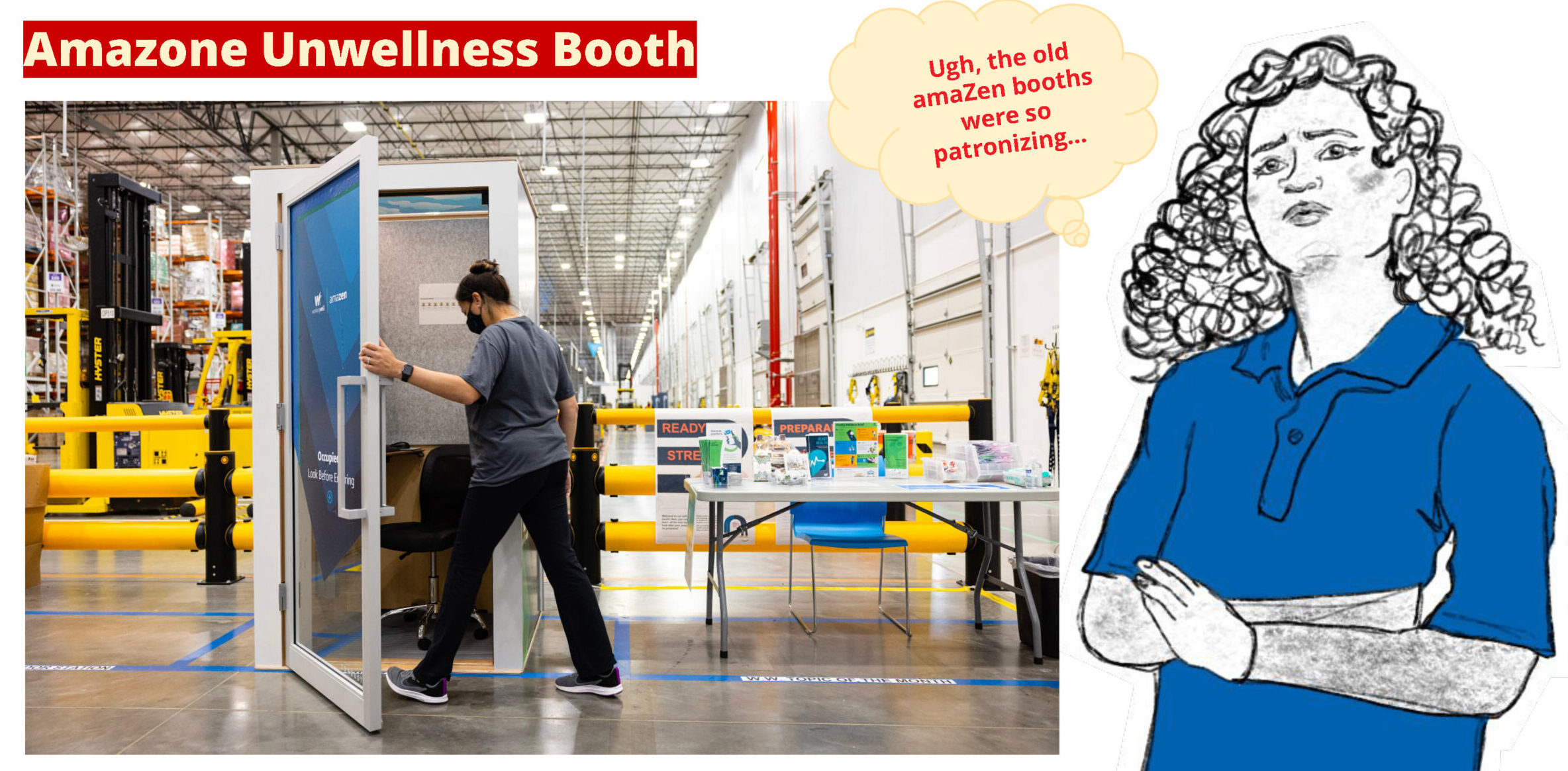
Among the experience features is an “Amazone Unwellness Booth” which displays emails from anonymous Amazon workers/unionizers discussing their grievances about the company. The large “telephone” styled booth is like one in Amazon warehouses where floor workers go to calm down and destress.
“The Sorting Game” recreates the stress warehouse workers face trying to meet their quota. Wearing a wristband that tracks productivity, players try to sort color coded boxes that quickly appear on an “assembly line.” If a task is missing, the watch emits a vibration; many tasks missed will produce a larger vibration. The watch is based on a real patent by Amazon to track workers productivity.
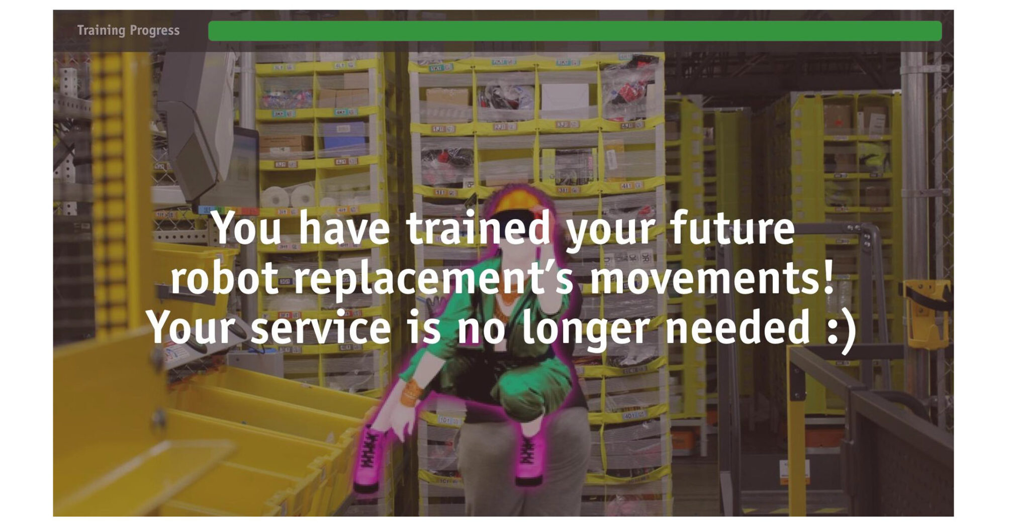
At the “Dance Dance Fulfillment Center,” players must synchronize their dance moves to match the ‘worker’ on a large screen; each miss or being slightly off-beat causes players to “lose money” or receive a message about doing a mediocre job. Since dance moves are being captured via AI, at the end of the game players are ‘fired’ since now robots can do their jobs.
Surrounding the experience will be feather flags with the logo—the traditional Amazon swish/smile upside down to create a frown—and text to resist Amazon. Branded stickers and t-shirts are available along with information on how to contact your local representative, urging for unions at Amazon.
 close
close
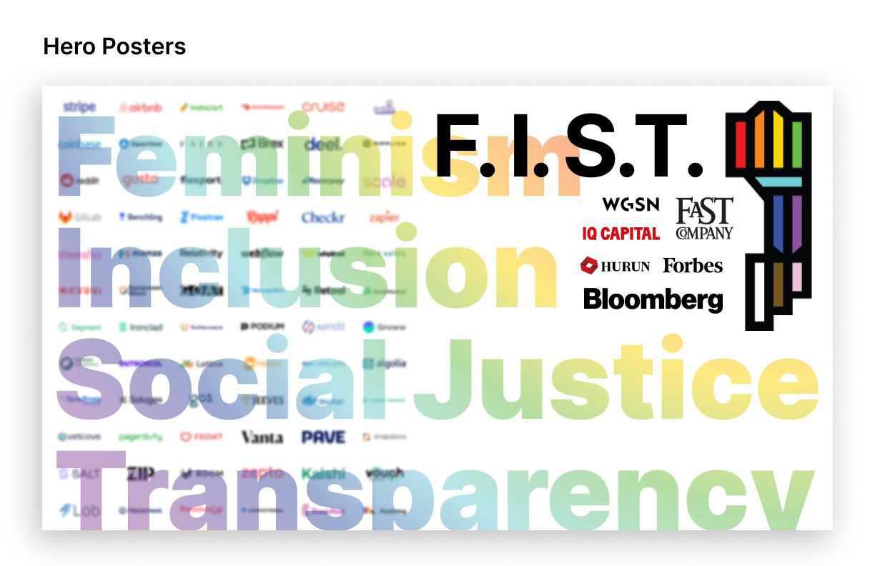
F.I.S.T. Feminism/Inclusion/Social Justice/Transparency
Read moreJustin Lee, Jingyi Ge (Albee), Serafina Yu
To promote gender equality in the workplace, this project creates a new certification status for responsible businesses that are working to close the gender gap.
Small and large businesses can apply for the impressive status by supplying information which measures and tracks quantitative and qualitative indictors. These requirements include such inclusive and workplace standards as: transparency as it relates to salaries associated with certain job titles, no sexual harassment complaints, recruitment and promotion opportunities, flexible working hours and others.
A deconstructed version of the upright fist is the basis for the F.I.S.T. logo. This multicolored “stained glass” design will become an important and sought-after icon especially for corporations and individuals who work there. The logo can be displayed on LinkedIn pages as well as on social media platforms. Posters and other graphic features can celebrate companies that achieve this designation.
The F.I.S.T. website lists all the companies that have passed the high standards when it comes to being a welcoming place for women, and for all genders.
 close
close
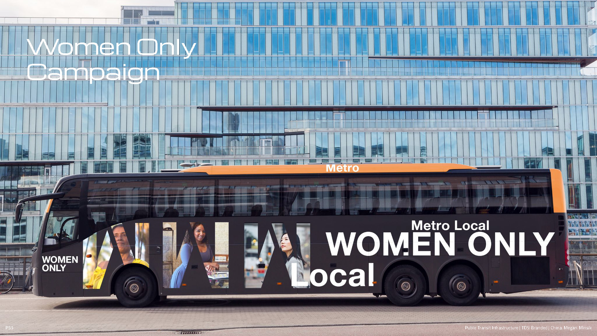
Transportation for Women
Read moreChera Park, Megan Ann Pantiskas, Minsik Nam
This project seeks to assist public transportation users in Los Angeles who are mostly women and rely on the service for work, child care, etc. but who often experience bad behavior from fellow passengers and feel unsafe for much of their ride.
A trio of campaigns can address the issues. One campaign encourages women riders to band together at transit stops by “making a commuter friend” which can ease anxiety and fear. An app can connect riders together; large one-colored posters displayed in transit areas announce the program.
Another idea helps riders who want to feel safe walking home from a transit stop at night; free Metro hand lanterns are found on trains/buses that can light up the walk for riders.
 close
close
Cruelty-Free Fashion Market Movement
Read moreJohnathan Kim, Shirley Lyu, Weide Zhang
To counter a long history of killing animals for clothing and the unsustainability of vegan synthetic apparel, this campaign is aimed at Gen-Z consumers and the social media generation.
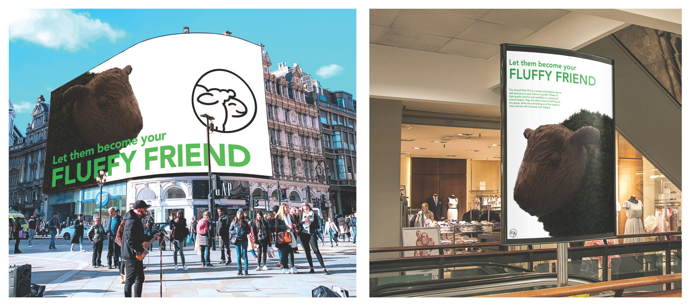
Avoiding the PETA In-Your-Face aggressive approach, the message of treating animals with kindness will be displayed and disseminated in gentler ways—and will center on a specific product, an animal plant pot.
Similar to Chia Pets, animal plant pots are ceramic pots in the shapes of animals that grow plants on their bodies that can add a touch of whimsy to living spaces and storefronts.
Partnering with popular fashion brands, the animal plant pot can be packaged in a box as Eco Fur with the tagline “Let Them Become Your Fluffy Friend” and distributed through partners’ established avenues. An accompanied brochure explains how to care for your new “animal” along with sobering statistics on how many animals are killed annually for fashion reasons.
Social media posts depict the Fluffy Friend, a friendly image that piques curiosity.
 close
close
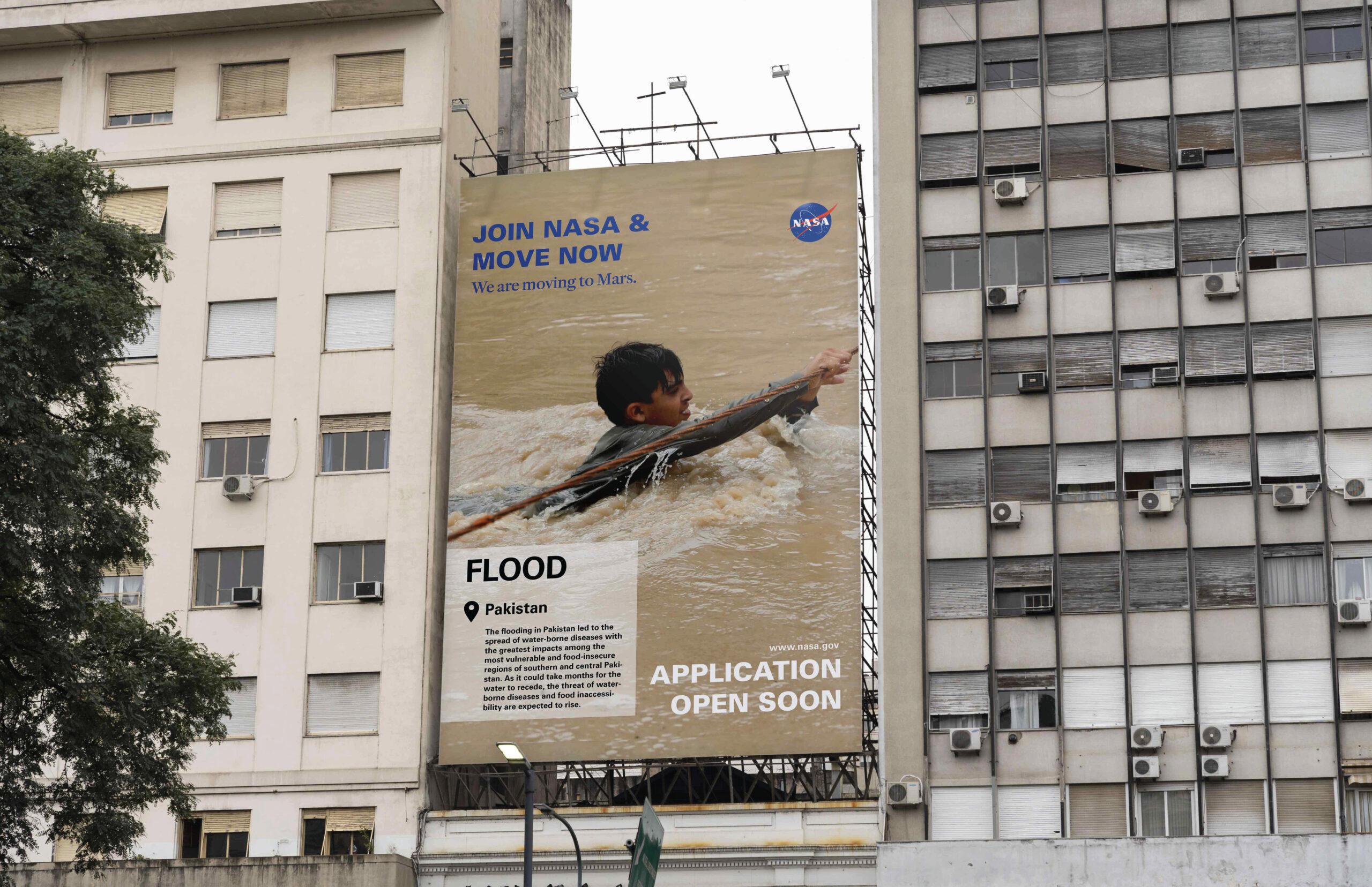
Climate Change: UnClimate
Read moreHarper Chen, Emma Yang
This campaign encourages individual action on climate change and sustainability showing how making everyday choices can have less harmful effects on the environment.
Using social media to reach younger audiences, campaign visuals/taglines can target three main areas of climate change: deforestation/overfishing/e-waste, environmental degradation, and habitat loss.
“Be Part of the Solution, Not the Pollution” features photographic images of people eating huge platefuls of seafood, misusing paper products and purchasing unnecessary electronic items.
“Humans! Join NASA, we Gotta Move Now” depict images of droughts and floods along with tongue-in-cheek advertisements for Mars as a new home for humans.
“Wake Up Humans, You’re Endangered Too,” shows animals with talking bubbles announcing that humans are also losing healthy habitats.
Campaign imagery will be featured on large posters, outdoor venues and other well-trafficked areas.