We Are Youth: UNFPA Motion Piece
A powerful PSA in support of the UN Population Fund calling for gender equality, reproductive health and an end to sexual violence and child marriage.

Spring 2012
Designmatters was invited by the United Nations Population Fund (UNFPA) to partner in developing a campaign with a powerful call-to-action for achieving the goals set forth in the Programme of Action of the International Conference on Population andDevelopment (ICPD), specifically the agenda guiding UNFPA’s mandate to advance the human rights of young people and ensure meaningful youth participation in decision-making processes.
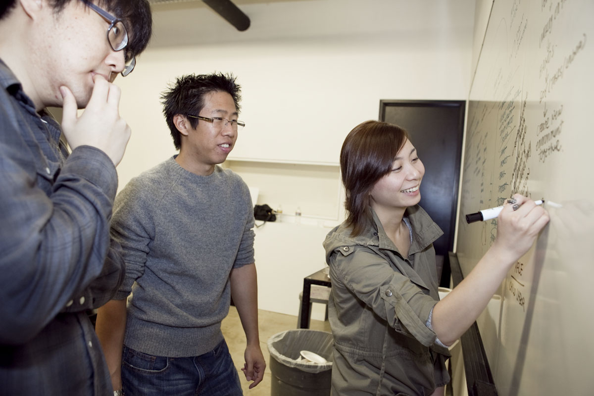
In this transdisciplinary studio hosted by the Graphic Design Department, students were challenged to create a strong integrated campaign, across several different vehicles, to advocate for young people’s rights to health, education, protection, respect and participation in decision making for their future.
I hope that as designers you realize the power you have in being able to convey messages and that you will continue to carry on these issues and use your skills to make the world a better place. You’ve already gotten off to a fantastic start.
– Prateek Awasthi, Adolescent and Youth Programme, United Nations Population Fund
There are over 1.8 billion people aged 10–24 years in the world today, making it the largest generation in history. In most developing countries, this generation of young people comprises more than a third of their country’s population. In fact, close to 90% of all young people live in developing countries, where they face disproportionately high levels of poverty and unemployment. Young people are the most significant demographic group in developing countries and are likely to remain so in the coming decades.
The Programme of Action of the International Conference on Population and Development (ICPD) is unfinished business in many regions of the world. Despite progress on most Millennium Development Goals, maternal mortality still lags behind. Poor, rural and uneducated women still lack options and access to family planning services. Child marriage is still widespread in many parts of the world. Complications from pregnancy continue to the the leading cause of mortality among adolescent girls aged 15–19. Young people aged 15–24 account for 40% of all new HIV infections, and in sub-Saharan Africa, young women make up 71% of pepole living with HIV. Across all economic strata, many adolescent girls and young women worldwide live under the constant threat of violence and abuse, and globally up to 50 percent of sexual assaults are committed against girls under age 16.
Amidst all these challenges, young people themselves represent a huge asset with their agency and leadership skills. In the past few years, political momentum has been building, putting young people high on the global agenda. This generation of young people is more interconnected than ever before and is getting better at representing their issues and demanding change. Countries cannot afford to postpone investments in adolescents and youth, their most promising assets.

A multi-disciplinary team of students, led by faculty from the Graphic Design Department, were asked to address the challenge of designing a persuasive and sophisticated visual campaign to advance the UNFPA agenda around advocacy for improving the status of youth, as well as support the presence of UNFPA at the United Nations Conference onSustainable Development (Rio +20) in June 2012.
The campaign would aim to bring to life, through various print and media-based solutions, the voice and perspective of youth around the world, with the goal of provoking a forward-looking call-to-action around many of the of advocacy objectives that have been a part of the 2011 International Year of Youth. Special focus was paid to advancing key issues such as universal access to sexual and reproductive health and reproductive rights, particularly for adolescent girls, global youth activism and participation in the decision-making affecting them.
This is profound work that you [students] are doing. This education you’re getting is about developing skills and your own creative capacities, but your understanding of its force and potential to make the world a better place takes it to the next level.
– Lorne Buchman, President, Art Center College of Design
A key instrument of the students’ research and data collection came from a United Nations (UN) report titled “Monitoring of Population Programmes, Focusing on Adolescents and Youth,” a document drafted as a follow-up to the recommendations of the International Conference on Population and Development in 1994.
The first step for the students was to extract a strong message from the information provided in the report—a message that had to perform double duty as both a call-to-action to UN officials as well as a message to global youth that they have a voice and that the UN will advocate on their behalf. Once the message was chosen, the students then established a visual brand for the campaign that would work across multiple mediums. As the class continued, the students split into three groups—print and collateral, interactive and motion— to seamlessly apply the brand across three different mediums.

The speech bubble represents giving voice to the youth. We wanted to give them a platform to be heard, to say what they’ve been wanting to say and to argue for themselves. We don’t want this to be a campaign that is implemented on them.
– Heather Grates, Graphic Design student
Student team: Andrew Chen and Heather Grates
 When establishing a logo, the students sought to create an identity that helped youth feel empowered and that conveyed the message that the UN can be a platform for youth to voice their concerns. After much consideration, they decided that a pencil was an apt metaphor for giving youth a voice—the acts of writing, drawing and erasing are all evocative of taking control of a situation.
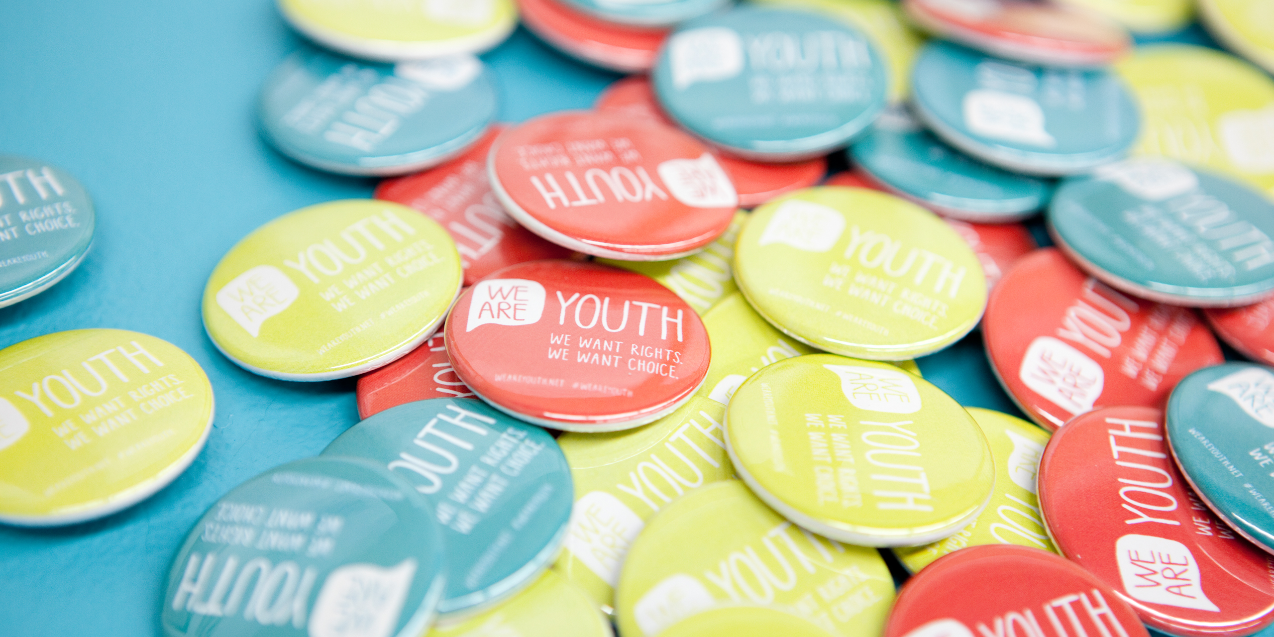
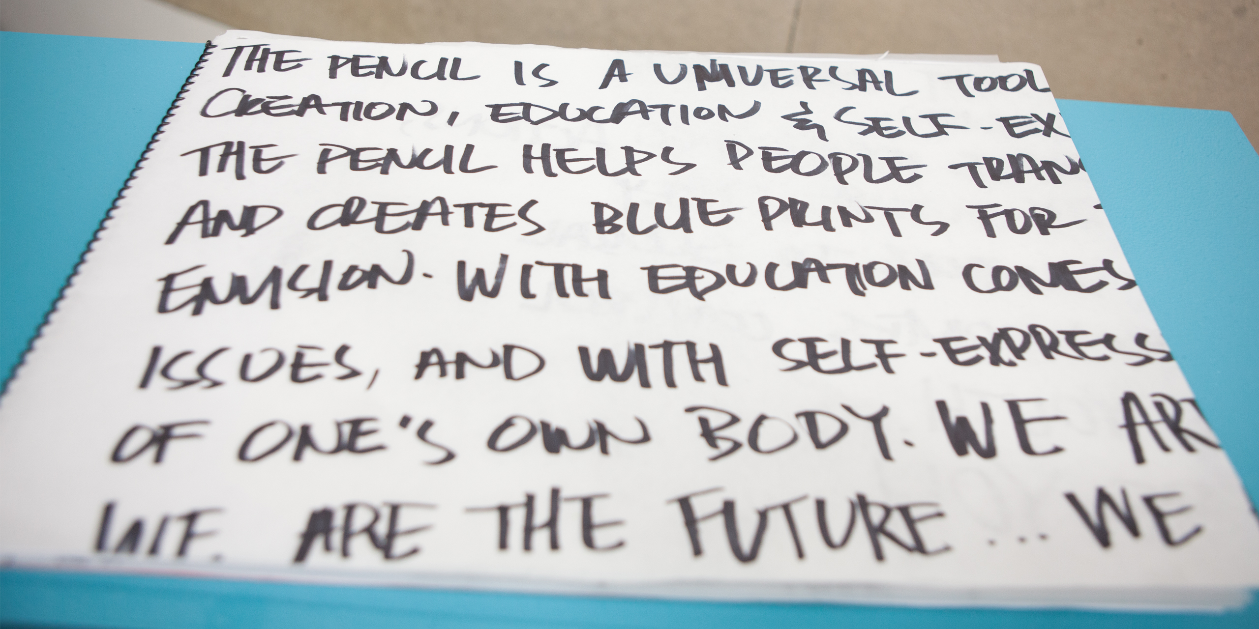
To complement the pencil metaphor, the students used a hand-written font called “Pamela” (named after Pamela Abolian, the Graphic Design student who designed the font in class) for their projects, which leant the materials a joyful and empowering identity. To emphasize the campaign’s main message that youth need to be heard, the students designed an appropriate logo—a speech bubble surrounding the words “We are” with “Youth” appearing adjacent to the bubble. The logo can be read as-is (“We are youth.”) but also has a built in flexibility as the “We are” sentence can be completed and adapted to suit a variety of needs (e.g. “We are citizens,” “ We are connected,” “We are 1.8 billion.”).
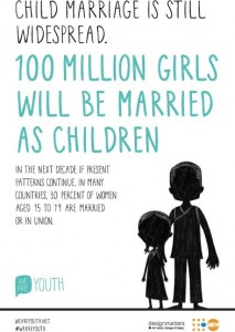
For collateral materials, the students further developed the hand-drawn aesthetic. For a series of posters highlighting major points from the campaign, they eschewed using pre-existing photographs, which they felt lacked the feeling and emotional connection they wanted to create. Instead, they incorporated a series of hand-drawn silhouette-like characters, created by Illustration student Hyunsun Yoo, that ranged from a pregnant teenage girl to a doctor. These characters were designed to not only look youthful and empowering (like the “Pamela” font) but also malleable enough that anybody, regardless of race or nationality, could identify with the silhouettes and the messaging. When it came to designing items that UN conference attendees could take away, the students created pencils, buttons, bookmarks and T-shirts featuring the “We are youth” campaign logo.
Advocacy for 1.8 billion youth across the planet is a daunting task and a huge responsibility. This was a difficult assignment with a very complex message. But that’s our job as visual communicators—to take complex messages and turn them into simple forms of communication.
– Gloria Kondrup, Faculty, Graphic Design
Student team: Pamela Abolian, Brett Beynon, Ka Kit Cheong, Jerod Rivera
In the interactive realm, the students designed a websitethat delivers the main messages of the campaign—gender equality, child marriage, reproductive rights—by engaging the user emotionally (primarily through a front-and-center embedded motion video,see below) and that guides them through the various issues without redirecting them to multiple pages or external websites. When designing the campaign’s website and accompanying social media presence (customized Twitter page, Facebook timeline, YouTube page), the students strove to make sure that every action taken by the user, whether logging in to the site or sending a tweet, triggers an acknowledgement of something good coming out of the campaign. Thus, every action the user takes reinforces the idea that people can positively change a child’s life.
The interactive team also suggested a number of additional ways to grab the public’s attention if the UN was interested in taking the campaign further: web banner ads on the The New York Times, Take Part and other websites that attract socially conscious readers; a Twitter visualization application that tracks tweets with the hashtag #WeAreYouth, geolocates them on a map, and shows the user what individuals in different parts of the world are saying about the campaign, thus sharing the campaign’s narrative and impact with the world; and a mobile app that mirrors the website but adds additional content, like a donation page that visually presents where the user’s donated funds will be going.
Moving beyond the screen and into the physical realm, the interactive team also suggested a number of spatial visualization concepts to extend youth’s voice into the public arena, including: projecting text messages from youth in the developing world into public spaces or on the exterior of the UN building; and kiosks with printers that could be installed at the upcoming Rio+20 conference that take Twitter messages from youth around the world and print them out as stickers for policymakers to wear or share.

Student team: Kevin Lam, Lamson To, Esther Park, Daniel Choi, Crystal Kim, Lisa Chen, Il Chan Chun, Hyunsun Yoo
Though there were other concepts under consideration (a tin can “phone” with a string attached; a tree of life), the students who designed the motion piece remained consistent with their colleagues and embraced the symbol of a pencil. The students felt the a child drawing a better future for themselves was an empowering message and that the monochromatic look and feel of pencil sketching reinforced the seriousness of the topics being addressed.
The students created a one-minute long narrative that addressed the key points of the campaign–gender equality, child marriage and reproductive health–and did so through a raw animation style that showed children literally erasing their nightmarish conditions and empowered to draw for themselves a more positive environment.
There’s nothing stronger than the image of a kid drawing on a piece of paper her hopes and dreams for her future.
– Kevin Lam, Graphic Design student
The campaign is slated to premiere at Rio+20, the United Nations Conference on Sustainable Development, in Rio de Janeiro, Brazil, which takes place June 20–22, 2012. At Rio+20, world leaders and thousands of participants from governments, the private sector, NGOs and other groups will gather to discuss solutions for reducing poverty, advance social equity and ensure environmental production. Additionally, UNFPA plans to make many of the campaign materials available to youth organizations.