Reimagining Access: Inclusive Technology Design for Archives and Special Collections

“In looking back on this term, we agreed that we each have a greater awareness of the need for accessibility in digital interfaces and other products, heightened sensitivity to various accessibility needs and their potential intersectionality…and a strengthened belief that accessibility should be a tenet of all design rather than an afterthought.”
– Elizabeth Costa (Interaction Design), John Ma (Interaction Design), and Anthony Palileo (Interaction Design), ArtCenter student team
Project Brief
This Designmatters Studio challenged ArtCenter students to design innovative ways to improve the digital accessibility experience at ArtCenter’s Archives and Special Collections which could eventually scale and expand into national guidelines.
Through co-creation with people with disabilities, students had a hands-on experience of incorporating human-centered design into their thinking, a process that could eventually shift traditional ideas about interaction and design.
Students were immersed in the history of accessible design through research and participation in ArtCenter’s Reimagining Access two-day symposium that featured experts and archival professionals. Through participatory interviews with those in disability communities, interacting with archival experts and working on their own prototype creations, students began to deeply understand the opportunities for creating a more accessible digital landscape.
“I believe the student’s final presentations were truly informed by the Participatory Design Process. I am very proud of the depth of insight and concern for ethics demonstrated by students in the class; this is reflected in the class work. I hope many of the learning outcomes from the class will carry forward into students’ careers after ArtCenter.”
– Todd Masilko, Interaction Design Faculty
Research and Project Development
Touring the Archives
The studio kicked off with a virtual tour by Robert Dirig, the Director of the ArtCenter Archives and Special Collections. Dirig showed the students the physical resources, tapes, film reels, manuscripts and other resources in this central repository; materials are arranged by collection and available for researchers to investigate in-person.
Dirig explained the different ways materials arrive at the archives along with the often complex decisions on which assets to keep. Does this item present a distinct memory of the institution, an important person, thing or event? Background context ensures that the item has continued purpose and use.
Additionally, Dirig presented an overview of the Virtual Archives that are open to the public. Both finding aids of collections and digital items are accessible through the site. Interns and students often are tasked with digitizing assets and there always seems to be backlog of newly added items to upload.
Students learned there are items with certain attributes that cannot be digitally duplicated. Often, specific elements get lost through digitization (feel, smell, etc.), but new ways of documenting imagery can express scale, movement, etc. Adding descriptions and alt-text can also add context to materials.
Typical users of ArtCenter’s Archives include students, faculty, alumni, staff and researchers. A later discussion delved deeper into the six persona behavioral patterns of online researchers that were developed in the first IMLS studio class: the promoter, explorer, scholar, archivist, fact finder and designer. Knowing who is using the information helps the archivist understand how to prioritize assets and categories.
Students were then engaged in a broad discussion on disability. Students were given a historical context on how attitudes about people with disabilities have evolved from the mathematical concept of “normal” through eugenics and up to the disability rights movement in the 1960-70s which led to the passing of the Americans with Disabilities Act (ADA). Today, disability justice spurs discussion and action on how designers can use their craft to respond to larger issues and how access issues can transcend environments both physical and digital.
At a following class, members of the Usability/Accessibility Research and Consulting (UARC) Group at Michigan State University, Director Sarah Swierenga and Senior User Experience Researcher Jennifer Ismerle presented the students an overview of the User Experience Research Guide, which they developed for this project. The Guide goes into detail on conducting participatory interview sessions with people with disabilities. In addition, they discussed the Website Content Accessibility Guidelines (WCAG) which contains accessible design principles and responses to common issues and challenges.
The discussion provided a framework for the students to examine specific disability attributes (how does low vision and blindness really affect a user?) be introduced to current technologies that are being employed (for blindness, it could mean screen readers, Braille output, magnifying tools, speech to text software, etc.) and delve into the user experience and usability. Here the importance of human-centered design became evident to the students.
The presentation also included a guide to proper research conduct, offering ways to recruit participants, a moderator guide, script samples, task scenarios, best practices for facilitating a session and other helpful and practical tips for active listening and analyzing results.
To help them formulate their research strategies, students engaged in a thoughtful Q&A session with representatives. The rich information shared gave the students new insights of perceiving the world in different ways – as those in the disabled communities do daily. This empathetic attitude would be important as the students worked through the process.
Symposium Participation
At week four, students were given an exceptional opportunity to hear from experts in accessibility and design at a virtual symposium Reimagining Access hosted by ArtCenter Library, Interaction Design and Designmatters departments.
The symposium provided important opportunities for students to gain research insights to help inform their design directions. By engaging with experts and stakeholders, students learned firsthand how the digital accessibility landscape incorporates current and emerging technologies. The two-day symposium consisted of one day of presentations from speakers and panelists that included designers, archivists, librarians, educators, scholars and activists; these experts provided participants with multidisciplinary perspectives about inclusive design accessibility from both professional and personal experiences.
The second day brought participants in closer conservation with accessibility experts; in Zoom breakout rooms students engaged one-on-one and delved deeper into details, uncovering opportunities where design can make a difference as they conceptualized possible prototype solutions. Teams were encouraged to think beyond Universal Design and mere replication.
The symposium offered a wide range of background and practical information while inspiring the students to kick start their research and ideation. Students were divided into teams which sifted through the information and gathered insights into possible projects. The MSU Guidelines became a touchstone for teams. Additionally, students often reached out to various experts, relying on their knowledge and expertise to help guide them through their processes.
Midterm Presentation + Refinement + Participatory Design Sessions
At week seven, student teams presented their initial design concepts that addressed a specific challenge while offering possible solutions. In the audience offering feedback were project advisors, symposium experts, and other stakeholders.
Teams shared an overall goal (e.g., modularity, multi-sensory, adaptability), their research, and ways to possibly achieve their objectives. Each team focused on a different aspect of accessibility in website design, customizable interfaces and alternative forms of navigation.
After each presentation, experts enthusiastically weighed in on the merits of each teams’ approach, offered suggestions, and gave students specific questions to consider moving forward. This feedback presented concrete signposts for the teams to continue the second half of the studio where they would refine their directions as well as engage in user testing of their prototypes.
To prepare for virtual sessions with members of the disability community for user testing, student teams learned more about the process of participatory design practices.
Students learned how to frame prompts and facilitate conversations that would best inform design directions. Given the constraints of time and platform, they focused on the three most important priorities. Teams prioritized questions, considered time limitations and focused on three main elements they most needed.
Teams created an interview script and planned down to the minutes but knew they needed to allow room for clarity and insight. Teams needed to present themselves as professional and well-educated about the research and work they were engaged in. Students were reminded to invite participants to share any new ideas or opportunities that came to mind while interacting with the prototype.
Teams divided up responsibilities with each member taking on a distinct role: interface, notetaker, verbal communicator, etc. and conducted a series of virtual sessions where they witnessed how participants reacted and responded to their prototypes. Participants were asked about the experience with assistive technologies and any possible shortcuts or workarounds they have discovered during their navigations. What are their personal preferences?
Informed by these experiences, teams modified their projects in anticipation for the final presentation.
“I was so impressed by the depth of the research the students did and their prototypes…and how engaged everyone was and their passion for the topic really came through in their presentations. The students covered a ton of content in just 14 weeks. I saw students grow in their knowledge base and in the domain of disability and design and accessibility. I saw them grow as researchers and being open to experimenting with participatory design for the first time. It was fantastic to see them grow in such leaps. They also grew as leaders…learning how to work with one another and collaborating and leading from many different perspectives, skill sets and strengths. They also learned the ethics behind why participatory design matters through testing their assumptions and often getting those assumptions disproven by the participants.”
– Josh Halstead, Designmatters Faculty
Outcomes
 close
close
Team Audio Assistant
Read moreRhema Gabriela, Ruiying Xu, Ziwei Lu, Yuxuan (Sara) Hua
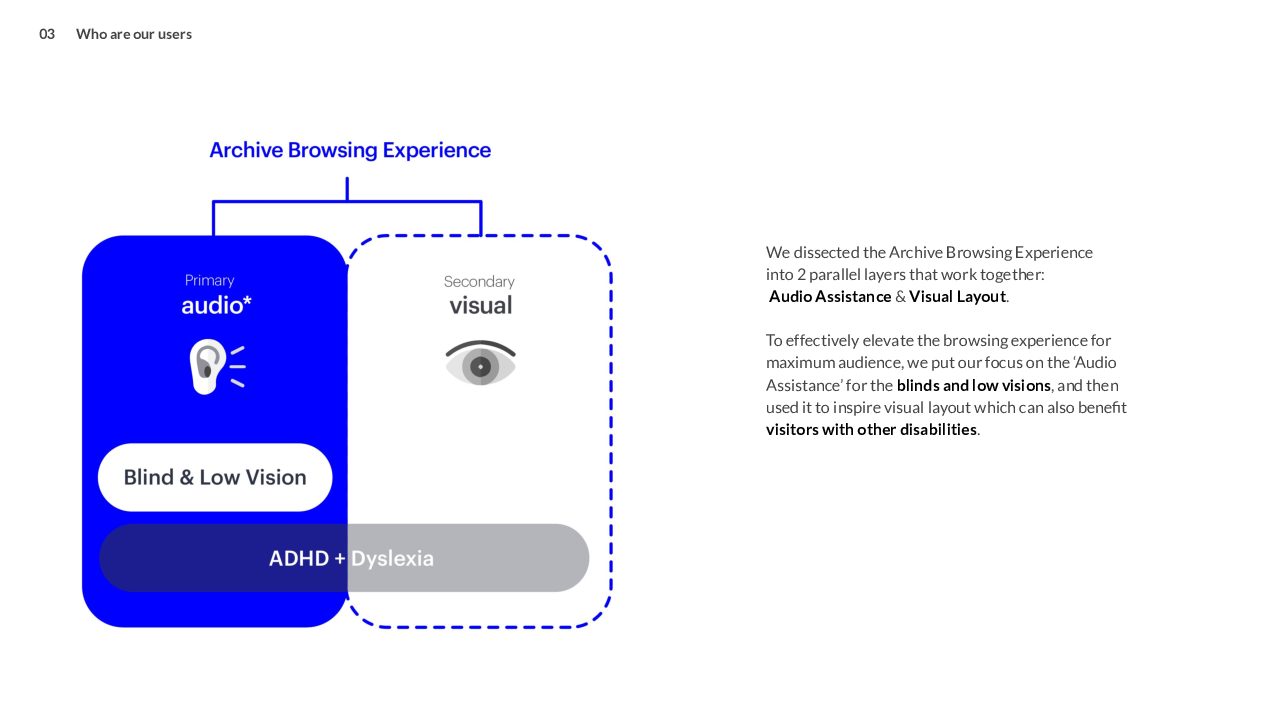
Current screen readers for blind and/or low vision users are time consuming and feature unclear structures which can confuse new users. With a goal to help users navigate efficiently and for archivist to complete their duties, this team conducted participatory sessions to learn about the current audio experience, how much assistance is needed and how to make the assistance not just effective but delightful to use.
During the sessions, team members and participants experienced different audio assistance locations on webpages; various possible audio effects; and explored physical interaction options (keyboard, mouse, etc.)
Teams assumed Three Big Ideas along with possible design concept directions.
Where Am I?
For those who can’t see the visual layout, audio assistance in the only way to navigate a web interface. Team members assumed these users don’t have a clear idea on where they are located on a webpage because these assistants read everything in a default order from top left to bottom right. Through research and interviews with their participants, the team learned it would be helpful to provide a shortcut for screen readers to jump from one section to another.
Technological examples for inspiration: automated phone attendant (callers choose submenus); and gesture controls through the Procreate graphics editor which can modify shortcuts.
Design Concept One: This prototype employs a universal audio language with a browser plugin. A shortcut function can be activated from the desktop menu.
Design Concept Two: The browser plugin can be used on touch-screen mobile devices such as a tablet and employ gesture controls. Fingers touching the screen can activate the shortcut menu.
What Is It?
The monotone voice of the screen reader sounds impersonal and robotic. The team members assumed that users would better enjoy the audio experience with a more delightful voice which could lead to a more effective interaction. Through research and interviews, the team discovered it would be helpful to create a universal audio language for websites and other interfaces that would be pleasant and friendly.
Technology examples: interactions typically found in children’s virtual games and the UserWay accessibility widget.
Design Concept One: Different analog sound effects can reinforce different types of media: photos, film, document, etc. which can help navigate a search.
Design Concept Two: As the screen reader ‘reads out loud’ the archival items, text and copy can be highlighted with high contrasting colors to assist those with low vision as well as those with ADHD/dyslexia. Navigation can be employed through mouse and keyboard control.
“I Need Help”
The “contact info” button is not very accessible since it does not show up on every page. The team assumed that audio-based visitors who would like to reach out for help, ask questions of the archivists, would find it frustrating and inconvenient to go backward in their search. Through their research, the team realized there are a lot of non-digitized items in the virtual archives and audio-based visitors might need help to access those backlogged items and its detailed information.
Technology examples: Siri’s speech to text functionality and the library website chat window.
Design Concept One: Create a shortcut menu in the chat “Ask a Librarian Online” and have it auto-filled in a voice message when user is requesting help. Drop down menu can offer FAQs and other popular requests.
 close
close
Team Pinpoint
Read moreAthena K. Aquino, Charlene Joy Dela Cruz, Xun Liu, Joey Serricchio
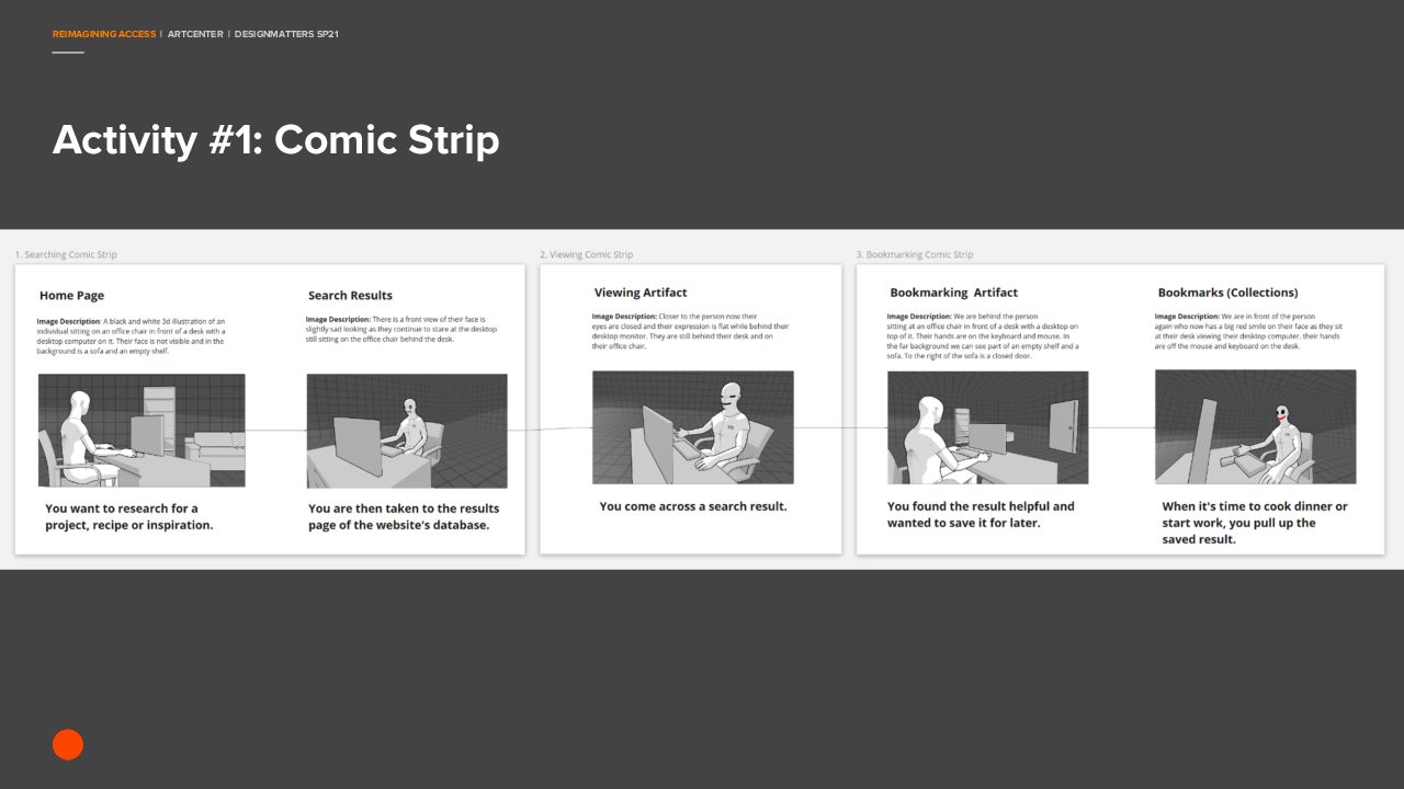
To leverage commonly-used assistive technologies, this team focused on how users with disabilities can best view and save digital research items and documents.
The team structured their participatory design sessions to understand current methods for saving and organizing web information; a follow-up strategy explored possible features and tools that could make the task more efficient. Participants were asked to demonstrate how they would capture information and save their research findings outside of the archives, libraries and other websites. Participants shared tools they commonly use: OrCam, Be My Eyes, Capti Voice, Zotero, Trello and more. Team members wondered about creating an internal clipboard/saving system and making the process reach across a wide range of tools and methods.
Team members learned that everyone has their own research process that works for them and tools they prefer to use; providing a new built-in tool would force users to learn one more tool. Why not let them continue to use what is currently working?
Insights produced three possible design solutions:
Key Insight One: Export
Create functionality in the current infrastructure that allows for individual and mass item exporting and citing that easily employs a variety of digital tools.
Key Insight Two: Organize
A multi-layered organization system -- color hierarchy, iconography, nesting folders, etc. – can assist visitors with organizing their found research items into easily recognizable symbolic drop-down categories.
Key Insight Three: Transfer
Information gleamed from the archives needs to be compatible with third party accessibility tools, especially the well-used and popular ones such as Capti Voice, Speechify and Zotero along with screen readers JAWS, VoiceOver, Google TalkBack and NVDA (Non-Visual Desktop Access).
 close
close
Team B.O.B.
Read moreElizabeth Costa, John Ma, Anthony Palileo
This project aimed to improve perception and usability of the ArtCenter Archives website utilizing current technology.
Team assumptions: using gestures can improve accessibility; and organizing the website into a block-styled linear layout (predefined sections) can help users access information more effectively. Assistive technologies that are using the current interface often provide users with extraneous information that can be confusing and overwhelming.
Team members distilled the existing website into overarching chunks to learn which parts of the archives interface was most (and least) important to participants. These chunk categories were written on cards: Search, Browse, Item Description, Item Images/Video, Login, Clipboard, Search Filters, Advanced Search, Similar Items, and Location in Archives.
During the user testing, participants were asked to “rearrange” cards putting them in order of importance; users reassembled the website according to how they typically use the interface with their assistive technologies. Participants also were asked how they would group specific digital features/categories for better navigation.
The team discovered that Search is of high importance and orientation is very important for assistive technologies; additionally, Search Items and their descriptions must be relevant and clear to understand.
When participants rearranged the interface, the team realized that assistive technology conveys content in a linear manner; visual layout was often not relevant but spatial separation and content management was. Other insights: lists are more effective than a grid system, and that ‘chunking’ together large information quantities provide easier navigation and overall perception.
Takeaways from participatory sessions: having a gesture interface will not solve core issues; archive content does not need to be altered; however, how information is organized – with proper labeling and descriptions – can benefit those who use assistive technologies and those who do not.
Three Design Concepts:
1. A modular information system
Blocks are indexed in a “table of contents” and navigation is top-down hierarchical that will “nest” sub-blocks to improve navigation.
2. Stackable columns
Stacking components into a single column provides a more consistent experience for sighted and non-sighted visitors. It makes searching on a mobile phone easier, too. Blocks can be scrolled through or skipped via hidden links.
3. Filter down for results (the Netflix approach)
Allow navigation that offers a base categorization with results broken down along user-specific filters of content categories (done effectively in many digital streaming platforms). Pre-categorizing breaks down large volumes into smaller manageable chunks and easier to access via assistive technologies.
Prototype Modular Navigation Systems
The team conceived an initial prototype relying on the specific WCAG requirement along with ARIA markup which ensures that assistive technologies are properly conveying content to users. The prototype demonstrates all content within each page but allows visitors to select which component to expand and explore deeper – without wading through other information.
Prototype Gesture Navigations
Understanding that some users will not access information via a mouse or keyboard (head pointers, motion or eye tracking, speech input software, etc.), the team tested their prototype with a prototype gestural device.
Final Presentations
-

-
Reimagining Access Final - Team Audio Assistant
-

-
Reimagining Access Final - Team Pinpoint
-
-
Reimagining Access Final - Team B.O.B.
